
This object is in archive!
Show skitours in vector maps
Completed
Please start to show piste:type = skitour in ski style of vector maps.
You currently show only piste:type = downhill in yellow.
I suggest to show both in light blue and double width than tourist trails and little bit of transparency (if possible) (because the winter tracks in snow are never that strict and they can change a little from year to year). How it is common to show them in winter maps:
I suggest both downhill and skitour to be the same style. Only indicate the direction for downhill if possible (that is their nature).
There are many skitours in OSM already (much more than downhills). I just realized you don't show them when I attempted to add the ones I tracked there.
Thank you
Files:
Screen Shot 201...
 I like this idea
Thanks, it makes sense. But I'm not sure about the color. Locus themes have defined different color for piste:type = downhill based on piste:difficulty If you can see yellow color for piste:type = downhill it should be slope for freeride.
So the question is: should be skitour
rendered also based on piste:difficulty tag or should we use only one transparent color?
What about to use the colors only when the piste:difficulty is set and the light blue otherwise?
The difficulty is typically used only in ski resorts and it makes sense there. I haven't seen them used on skitours or downhills alone yet. The difficulty is changing quickly in the free terrain so it does not even make much sense.
You can check e. g. around Argentière near Chamonix or Zermatt where are both pistes in a ski resort with difficulty set and free skitours with the only tag piste:type = skitour.
Bonus would be to differentiate the downhills by sparse arrows down if possible.
Well I tried to get some inspiration from other winter maps. I have to say that I like the idea to display skitours in one (probably transparent) color. But I don't want to add some arrows into downhill ways. Additionally downhill are sometimes areas, so it would be complicated to render them properly.
What about render skitours as dotted lines? See OpenSnowmap.org
So I would personally rather keep the downhills in a same style in light blue as skitours. I find dots confusing for next reasons.
I don't like a OpenStreetMap and derivates styles much because it is hard to understand what those styles mean without seeing the legend. I think the cartographers did a better job in intuitiveness of reading the map and their patterns are used across all the printed maps now. I would try to use similar style.
If you don't like arrows, I would suggest to give up on differentiating downhills and skitours. It is not that critical. But see pistes here: it might not look weird and it works in an intuitive way that the arrows indicates direction (down). Together with contours and hillshading it makes the map more readable. But I understand areas might be the problem.
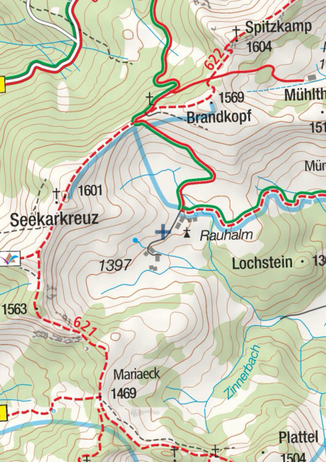
Just for an inspiration: another example of everything in one map: summer and winter together and yet it is lucid and readable:
I like these principles: less visible or even interrupted = harder to pass. Blue to differentiate winter snow tracks from summer.
So I would personally rather keep the downhills in a same style in light blue as skitours. I find dots confusing for next reasons.
I don't like a OpenStreetMap and derivates styles much because it is hard to understand what those styles mean without seeing the legend. I think the cartographers did a better job in intuitiveness of reading the map and their patterns are used across all the printed maps now. I would try to use similar style.
If you don't like arrows, I would suggest to give up on differentiating downhills and skitours. It is not that critical. But see pistes here: it might not look weird and it works in an intuitive way that the arrows indicates direction (down). Together with contours and hillshading it makes the map more readable. But I understand areas might be the problem.
Just for an inspiration: another example of everything in one map: summer and winter together and yet it is lucid and readable:
I like these principles: less visible or even interrupted = harder to pass. Blue to differentiate winter snow tracks from summer.
Any progress here? Winter is coming!
Any progress here? Winter is coming!
Thank you for reminding. Ski theme changed I also change the rendering of routes for nordic skiing (based on discussion with myneur) See the screenshots
Thank you for reminding. Ski theme changed I also change the rendering of routes for nordic skiing (based on discussion with myneur) See the screenshots
Replies have been locked on this page!