This object is in archive!
Roads are displayed too "thin" (or narrow)
Declined
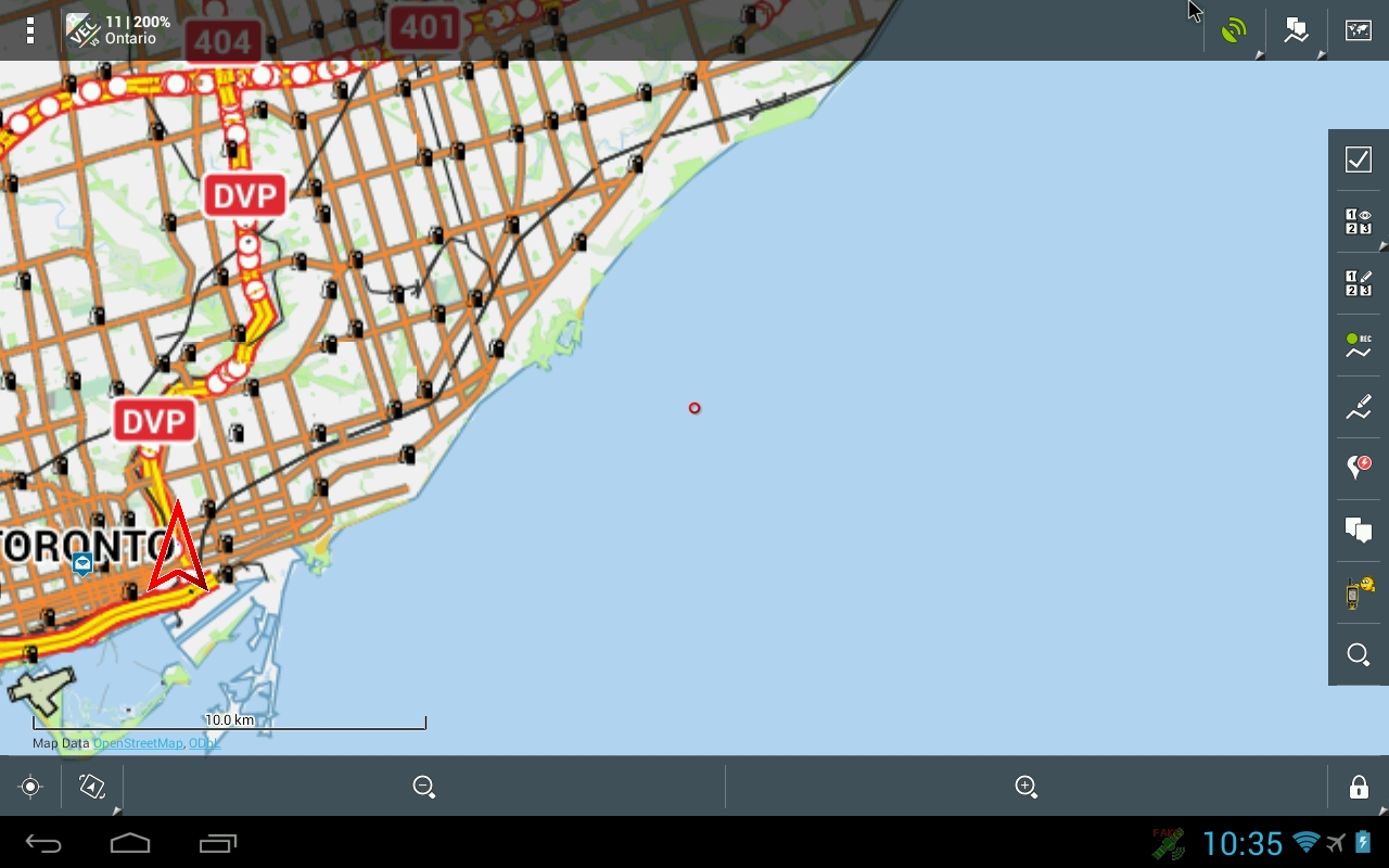
I am using Locus Pro (latest version from Google Play store) with OSM Ontario, Canada maps. Roads are rendered very thin and difficult to see at a glance, even when zoomed in to 100m. I would like to see the roads displayed either at a configurable width or similar to other GPS apps.


 I like this idea
http://docs.locusmap.eu/doku.php?id=manual:settings:map_advanced#advanced_settings
doesn't work?
What of map type isyour OSM Ontario, Canada map
and what app is a similar other GPS app - eg?
http://docs.locusmap.eu/doku.php?id=manual:settings:map_advanced#advanced_settings
doesn't work?
What of map type isyour OSM Ontario, Canada map
and what app is a similar other GPS app - eg?
No, it has no effect. I have "Resolution of maps" checked and "Scale resolution" set highest (3.0x) and the non-main roads are still too thin.
The exact map I am using was downloaded from:
http://download.mapsforge.org/maps/north-america/canada/ontario.map
OsmAnd displays the map more like a Garmin GPS does with the roads approximately 2x or 3x "thicker".
ah a vector map - ok
So you can use "themes"
maybe you will find what you need.
...and if you will not find a good theme - feel free to download or create you own.
btw.
http://download.mapsforge.org/maps/north-america/canada/ontario.map
is ok but try a Locus map from store (first 3 Dl are free)
last:
please let us compare between two screenshots
OsM*nd and Locus
These screenshots are from using the default theme on Locus Pro and OsmAnd+ of approximately the same location.
Can you recommend a theme that will make Locus look better? I tried the Elevate_L theme, which is better but the road labels disappear until zoomed too closely. I am sure I can tweak that out if I modified and/or made my own theme, but I don't have time to learn that right now.
Hi Mike,
Your screenshot form Locus Pro looks some strange. Is it really Hiking theme? (hiking is default).
Anyway I'll prepared for you official Locus vector map for donwloading, so please:
- download file http://server.asamm.com/tmp/ontario.zip
- unzip it and place it into folder /Locus/mapsVector/americas/canada on your device
- start Locus -> open Menu > Maps > Vector > long press on new downloaded Ontario map > select Hiking theme
- in menu > Settings > Map advanced > resolution set for example 1.75 or 2.0
- can you provide screen shot with this setting and theme?
I guess that you have device with high resolution screen, am I right? It caused small labels or all elements. In this case the map resolution can help and also for vector maps you can consider setting > Map advanced > Text size. But this settings influence only vector maps.
Locus is still more outdoor app then car navigation. Especially gynta can explain why he want to have thin roads...I can remember some discussion about it with him :)
Well.. looks similar ;)
and @petr
We talk about hiking theme because hiking-guys don't need visible motorways :)
Well.. looks similar ;)
and @petr
We talk about hiking theme because hiking-guys don't need visible motorways :)
Ok, let's try again... I am using Locus on a motorcycle and have used it in my car. I do not care about hiking or cycling themes. I want something that has thicker roads.
I guess the "city" theme is intended for walking?
What is best for driving?
Edit: I downloaded the Locus vector map from the store and it's almost identical to the vector map I was using from Mapsforge.
What about my screenshot above?
Looks different - isn't it?
Compare with your strange shot:
What about my screenshot above?
Looks different - isn't it?
Compare with your strange shot:
This is using the Ontario map downloaded from the Locus store with the "hiking" theme. It still doesn't look anywhere near the same. Why?
I am using a Google Nexus 4 phone.
This is using the Ontario map downloaded from the Locus store with the "hiking" theme. It still doesn't look anywhere near the same. Why?
I am using a Google Nexus 4 phone.
brrr
do you read petrs post above?
and load his map ?
do you use only hiking theme?
and why do you use Map color mode? try to turn off
http://docs.locusmap.eu/doku.php?id=manual:settings:map_advanced#advanced_settings
brrr
do you read petrs post above?
and load his map ?
do you use only hiking theme?
and why do you use Map color mode? try to turn off
http://docs.locusmap.eu/doku.php?id=manual:settings:map_advanced#advanced_settings
If you read Petr's post, he told me to create a screenshot with the hiking theme.
This is with Map color mode disabled and the map that he provided above. The colour of the roads isn't the same, but it looks better.
If you read Petr's post, he told me to create a screenshot with the hiking theme.
This is with Map color mode disabled and the map that he provided above. The colour of the roads isn't the same, but it looks better.
Also, FYI, the map does not display properly. It's fuzzy when the picture is displayed at actual size. I cannot explain why. If you notice the scale and under the scale, it displays properly.
Also, FYI, the map does not display properly. It's fuzzy when the picture is displayed at actual size. I cannot explain why. If you notice the scale and under the scale, it displays properly.
better :)
and other theme? city, street,...?
and what about this theme:
http://forum.locusmap.eu/index.php?topic=4060.msg30941#msg30941
btw.
you never will get the same like garmin or osm4nd
but maybe similar
better :)
and other theme? city, street,...?
and what about this theme:
http://forum.locusmap.eu/index.php?topic=4060.msg30941#msg30941
btw.
you never will get the same like garmin or osm4nd
but maybe similar
This is using the EmmEff theme...
It's better. The thickness of the outline is too strong and it's impossible to read road names.
The anti-aliased rendering of the map is still present.
This is using the EmmEff theme...
It's better. The thickness of the outline is too strong and it's impossible to read road names.
The anti-aliased rendering of the map is still present.
well, i think we should stop here.
what you need is a better theme.
jusc said it's easy to create - so maybe he can help in forum thread
topic was an idea - and the possibility for implementation already exists (almost)
well, i think we should stop here.
what you need is a better theme.
jusc said it's easy to create - so maybe he can help in forum thread
topic was an idea - and the possibility for implementation already exists (almost)
Any comments about the anti-aliased map rendering? This is seemingly a bug.
Any comments about the anti-aliased map rendering? This is seemingly a bug.
so you have to report a "problem" :)
so you have to report a "problem" :)
Hello Guys,
I'm sorry for late response - was couple of days out of office. I hope that themes and color modes are more clear now. From internal themes I can only suggest the Road theme together with enabled resolution of map.
Hello Guys,
I'm sorry for late response - was couple of days out of office. I hope that themes and color modes are more clear now. From internal themes I can only suggest the Road theme together with enabled resolution of map.
Replies have been locked on this page!