This object is in archive!
Sometimes the number is not displayed on the distance ring
Solved
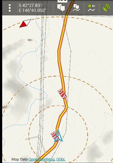
Not sure how to reproduce this but I often notice the numerical distance (eg. "2km") is not displayed on the distance ring. It could be when turning the "Hold center method" and/or "Rotate map" buttons at the bottom on/ off. It seems like a bug though.


 The same problem
Hello Andrew,
hard to say what to do with this "issue".
In Locus exists two types of rings. Time rings, which values are drawn on top of circle and distance rings, which values are drawn at bottom of circles.
So as is visible on screenshot, there is no place at bottom, where to draw distance rings values. To be true, in these cases when you use "Move map center", I have no clear idea, how to improve this "issue".
Thanks Menion. Yes, now I understand. I have never used the Time rings. I find the Distance rings a more readable alternative (larger text) to the distance scale - great feature thank you. Would it be likely a user has both Time & Distance rings enabled at once? Maybe when only a single ring style is enabled, and if the default location for the number would be off screen (probably when map center moved), then there are a series of fallback locations - A) number above the bottom of ring instead of below B) number above the top of the ring. The aim should be that at least one number is always visible, which is really all the user wants to see to estimate a rough distance (or time).
Thanks Menion. Yes, now I understand. I have never used the Time rings. I find the Distance rings a more readable alternative (larger text) to the distance scale - great feature thank you. Would it be likely a user has both Time & Distance rings enabled at once? Maybe when only a single ring style is enabled, and if the default location for the number would be off screen (probably when map center moved), then there are a series of fallback locations - A) number above the bottom of ring instead of below B) number above the top of the ring. The aim should be that at least one number is always visible, which is really all the user wants to see to estimate a rough distance (or time).
Menion - here's another possible workaround - when "Shift map center" is ticked, maybe just draw a smaller circle so that there is always space below the circle for the text. I don;t think the exact size of the circle (500m, 1km, 2km, 5km) really matters, could be 400m, 900m, 1.9km, 4.9km? I still think easier to have text above the circle.
Menion - here's another possible workaround - when "Shift map center" is ticked, maybe just draw a smaller circle so that there is always space below the circle for the text. I don;t think the exact size of the circle (500m, 1km, 2km, 5km) really matters, could be 400m, 900m, 1.9km, 4.9km? I still think easier to have text above the circle.
Attached is another example, even when "Shift map center" is unticked, where the number is not displayed because the circle is too large.
Attached is another example, even when "Shift map center" is unticked, where the number is not displayed because the circle is too large.
Replies have been locked on this page!