This object is in archive!
Use same track waypoint icon in navigation itinerary as displayed on map
Completed
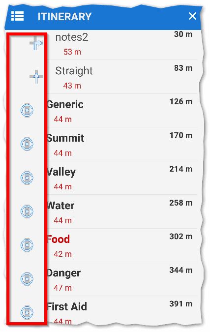
During navigation the itinerary displays correct icon on left side of list for each turn instruction, for example screen cap below shows right turn and straight ahead icons. Although why do these first two turn icons have extra space on left
hand side causing indent of text compared to the remaining lines? Wasted space?

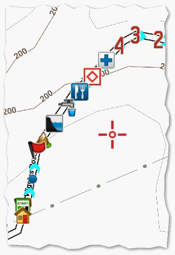
However for track waypoints only a generic circle (round about?) icon is displayed. Instead could those itinerary icons be same as waypoint icon displayed on track (as in screen cap below)? These icons are just standard ones when I import a RWGPS TCX file in which I had added my own cue points.

Files:
20161005-AJH-Wi...


 I like this idea
Thanks Andrew,
improved.
Thanks Andrew,
improved.
Replies have been locked on this page!