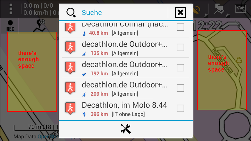
in search results, use more of the available width so names are fully visible
Gathering feedback
In the POI search results of v 3.2.3, only around half of the width is used, so virtually all names are cropped. Please use more of the available width (~90%) so more of the names are fully visible, and for those that still have to be cropped, more of the name is visble.

Yes, again portrait orientation, and very similar to
http://help.locusmap.eu/responses/in-track-screen-long-track-name-is-cut-and-cannot-be-seen-in-total
and http://help.locusmap.eu/responses/in-poi-dialog-scroll-long-names


 I like this idea
Replies have been locked on this page!