Adjust track pattern to map zoom level
Completed
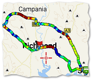
Here is a track using the new improved slope mode. It is very good:

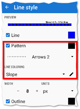
But when I add a directional arrow pattern to the track style:

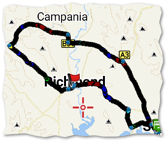
At low zoom levels the track is now dominated by the pattern, and the slope coloring is impossible to see. Even at higher zooms the coloring difficult to see because there is not enough space between each pattern symbol:

I suggest there should be more space between each pattern symbol, and the spacing takes better account of the current zoom level.
Note with simple coloring the track is good - the pattern spacing and the underlying color are both great. Maybe this issue is specific to Slope coloring mode?


 I like this idea
Good day Andrew,
this is more a problem I'm aware of. To make arrows in exactly same distance like without enabled coloring, result will be a lot slower drawing. I was discussing this yesterday with Ingo in different topic and I think I have found working solution. Result won't be perfect, but there will be at least a lot of arrows ( less then should be, but still enough to see track ).
Let me know how it looks on your device with next version. Thank you
Is this ,,next version" the current version? Pattern spacing doesn't work - it doesn't have to be in the exactly same distance - roughly would be enough.
Is this ,,next version" the current version? Pattern spacing doesn't work - it doesn't have to be in the exactly same distance - roughly would be enough.
I should be more precise ... anyway "next version" is really next version, so expect improvement in version 3.27.1 that will be published within few days.
I should be more precise ... anyway "next version" is really next version, so expect improvement in version 3.27.1 that will be published within few days.
Replies have been locked on this page!