This object is in archive!
Annoying items on locus vector maps
Answered
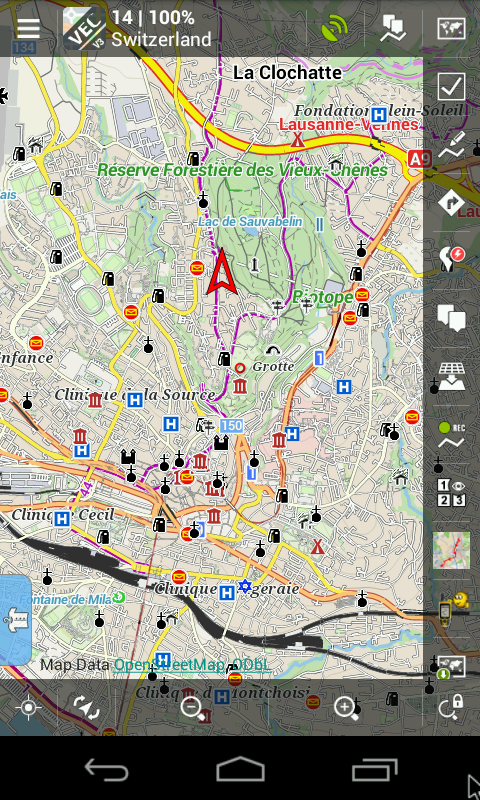
Is there a way to remove all of this unwanted items from map?
I have selected the cycle(!) theme.
Gas station? Church? Hospital? Post office? Place of worship?
Do you really think we need all this stuff? In a normal usage? B)


 The same question
It depends :) From my opinion are all POIs, you mentioned, quite important because they are parts of standard maps. OK, maybe the gas station should have lower priority for cycling. However I bet that the most used topo maps (alpenverain, compass, ign, OS maps) contains mentioned POIs.
It depends :) From my opinion are all POIs, you mentioned, quite important because they are parts of standard maps. OK, maybe the gas station should have lower priority for cycling. However I bet that the most used topo maps (alpenverain, compass, ign, OS maps) contains mentioned POIs.
I bet not pushy annoying like in locus maps and not twice :)
I bet not pushy annoying like in locus maps and not twice :)
Maybe this answer helps for this topic too:
http://help.locusmap.eu/topic/amount_of_place_names_on_vector_maps#comment-18762
Maybe this answer helps for this topic too:
http://help.locusmap.eu/topic/amount_of_place_names_on_vector_maps#comment-18762
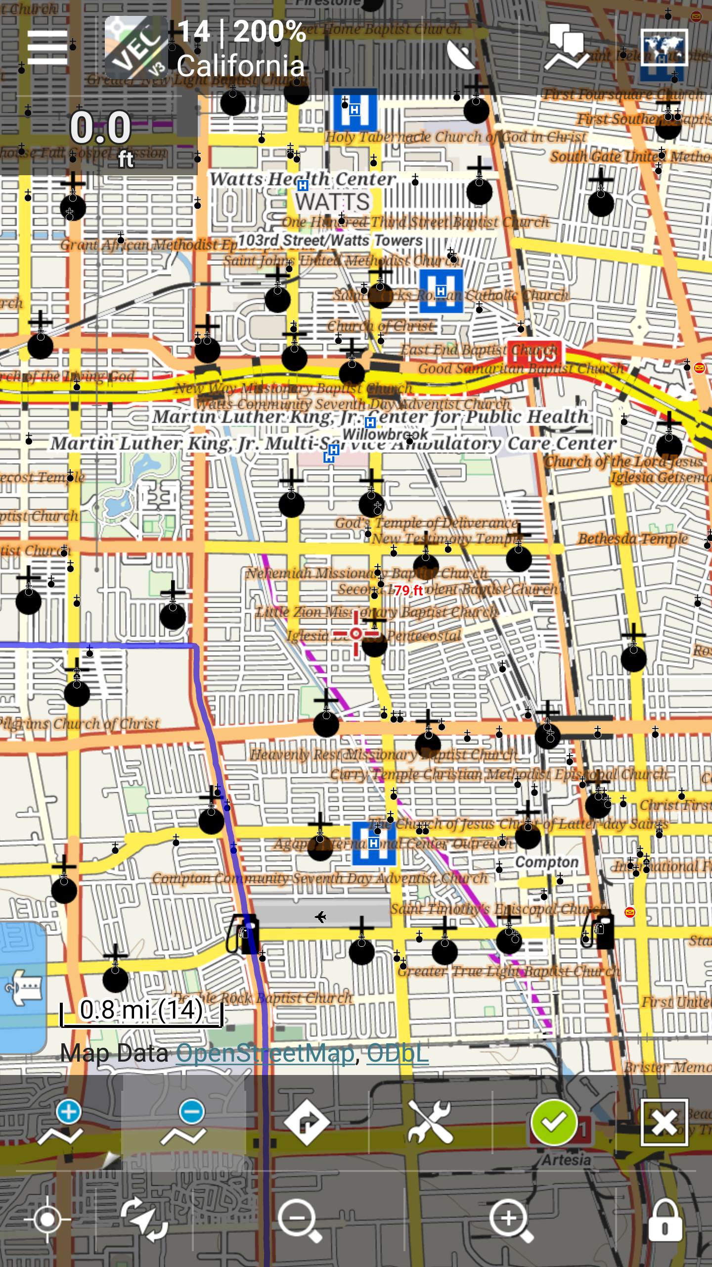
I have attached a screen shot of the area near my home. It shows 34 large church icons and 2 gas stations. This is annoying and creates too much clutter to make the map user friendly. Other maps give options to minimize clutter. Would it be possible to change Locus Pro to allow this? Aside from that I really like this app and will be using it next month in Europe.
I have attached a screen shot of the area near my home. It shows 34 large church icons and 2 gas stations. This is annoying and creates too much clutter to make the map user friendly. Other maps give options to minimize clutter. Would it be possible to change Locus Pro to allow this? Aside from that I really like this app and will be using it next month in Europe.
The screenshot above in my neighborhood has 34 churches (huge icons) and around 60 small church icons as well as around 30 large typeface church names that cover the map. If this was a map made especially for people trying to find a church to cycle to on Sunday that's great, but that's not what I'm looking for and I would rather see a clean map with no POI's. With other maps I have used you can select the degree of clutter. Have I missed something or is this the way Locus Pro will always display. Just curious, was this app put together by an ultra religious org?
The screenshot above in my neighborhood has 34 churches (huge icons) and around 60 small church icons as well as around 30 large typeface church names that cover the map. If this was a map made especially for people trying to find a church to cycle to on Sunday that's great, but that's not what I'm looking for and I would rather see a clean map with no POI's. With other maps I have used you can select the degree of clutter. Have I missed something or is this the way Locus Pro will always display. Just curious, was this app put together by an ultra religious org?
Hello Garry,
there is definitely something wrong with icons in your Locus. I can see that icons are rescaled in wrong way. There are 2x bigger than should be. It's very likely caused due to Menu > Settings > Map - advanced - Change map resolution. If you disable it, map will be OK. I'll inform main developer about this issue.
When it comes to number of churchs - Locus is developed mainly for outdoor activities and church is very important navigation point on the country-side (at least here in Europe). Unfortunately it can overcrowd map in city areas. For this reason has "City" theme different priority for churches but city theme does not contain cycle routes. So it's quite complicated to find balanced solution for city and for country side.
So we hope themes selector with selectable items is coming soon...
So we hope themes selector with selectable items is coming soon...
Thanks Petr for the help. I also changed the text size to 100% and now the map is much friendlier.
Thanks Petr for the help. I also changed the text size to 100% and now the map is much friendlier.
5 Month later...
about http://help.locusmap.eu/topic/annoying-items-on-locus-vector-maps#comment-18720
"Possibility to show some POIs using theme switcher is planned."
Any news?
5 Month later...
about http://help.locusmap.eu/topic/annoying-items-on-locus-vector-maps#comment-18720
"Possibility to show some POIs using theme switcher is planned."
Any news?
I don't mind that there are so many POI on my screen, but they shouldn't be clickable. Sometimes when I click on the map, I get a huge list of POI, but for what?
Seeing them on my map, yes, clickable no.
I don't mind that there are so many POI on my screen, but they shouldn't be clickable. Sometimes when I click on the map, I get a huge list of POI, but for what?
Seeing them on my map, yes, clickable no.
Replies have been locked on this page!