
Improve Change of Altitude track style/ mode
In the screen capture below the track is displayed with a mode of "Altitude". This is brilliant for cycle touring - I can see where the high and low altitude parts of the track are. For me it works far better than contour lines and/or hill shading, although I use all three methods anyway. They each have their benefits.
What I generally want to know as a cycle tourist even more than altitude is gradient (change of altitude), or more simply "where are the steep parts". BTW I tried to import a second screen capture showing the screen with Change of Altitude track style/ mode without success - maybe only one image can be linked to each topic? Sorry I digress. In this mode when zoomed out to show the whole track the overall track is mostly just green, with some *very* slight change to blue in parts. Only when I zoom c;lose in to sections where I know the track is steep (>6% for 10km) can I see cyan and yellow colors in places. When I display the profile graph of the track the elevation (altitude) and gradient (change of altitude) are both correct, and as I say there are quite hilly parts (>6%) over long sections (>10km).
As an ex-programmer I can imagine the issues, but also opportunities although maybe cycle tourist are a small market opportunity? I have converted other cycling friends to this app. Maybe the track color for each "icon" (I use an arrow) can be based on the maximum gradient for the section it is based on rather than the average? Maybe the track colors can be normalized to provide a wider range of colors - surely a hilly 6%/10km section should be shown as red? Maybe even a 6%/100m section when zoomed out and the icon represents 10km should be shown as red instead of the average gradient of that 10km?
 I like this idea
Hello Andrew,
you gave me a small "kick" over private topic (which I'll close, oki?), so I'll give you a small feedback here.
You firstly created this topic as an issue, but because I do not see this as an issue, but rather as a request to improving, I've changed it to idea. Seems that already a three people votes for it, so it won't be a total waste of time :).
So, where is a problem? When you enable "Gradient" as a color for track, it is not clearly visible which parts are really with a bigger changes right? You attached two photos to private topic. May you add them here too and mainly share a exported GPX track?
I may try to do a small test with your track and check why color of track is mainly green and gradient is not clearly visible, oki?
Hi Menion
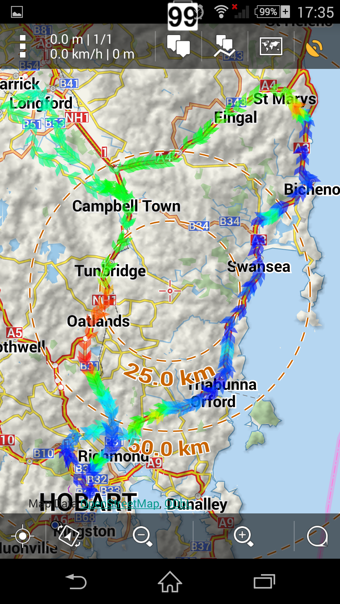
Forgive me, it wasn't intended as a "kick". I was a little disappointed there were no comments from other users. For some reason when I originally created the topic I was not able to include a screen cap of the track with "Change Of Altitude" mode. I have now created a 150km track in BRouter for you to analyze. The track is changing altitude a lot (quite hilly) as can be seen in BRouter web client chart below (the gradient between 125 & 150km is steep)
When mode=Altitude, the color is a good indication of the altitude when zoomed in. I think it will be improved when zoomed out as discussed in this topic thank you. See screen cap
When mode=Change of altitude, the color is all green when zoomed out - very misleading because clearly from the chart there are large gradients between 125..150km, and other places, and color is still not a good indication when zoomed in because only short sections are yellow and orange.
I hope this helps.
Hi Menion
Forgive me, it wasn't intended as a "kick". I was a little disappointed there were no comments from other users. For some reason when I originally created the topic I was not able to include a screen cap of the track with "Change Of Altitude" mode. I have now created a 150km track in BRouter for you to analyze. The track is changing altitude a lot (quite hilly) as can be seen in BRouter web client chart below (the gradient between 125 & 150km is steep)
When mode=Altitude, the color is a good indication of the altitude when zoomed in. I think it will be improved when zoomed out as discussed in this topic thank you. See screen cap
When mode=Change of altitude, the color is all green when zoomed out - very misleading because clearly from the chart there are large gradients between 125..150km, and other places, and color is still not a good indication when zoomed in because only short sections are yellow and orange.
I hope this helps.
Have a look on the diagram of the track showing e.g. on the left y-axis altitude and on the right y-axis change of altitude.
You will likely see that the change of altitude graph is very noisy.
A satisfactory change of altitude graph can in my opinion only be achieved if the data is de-noised by low-pass filtering.
tommi - agreed, but I would expect the data for track icon color is already low pass filtered. The BRouter track is have given as an example does go up and down a lot, there are very few sections where the altitude is constant.
tommi - agreed, but I would expect the data for track icon color is already low pass filtered. The BRouter track is have given as an example does go up and down a lot, there are very few sections where the altitude is constant.
Hmm problem in mentioned track is, that on one place is change of altitude around 3 metres on very short distance (4 metres). Result is big step, that moves with whole color range.
I do not wanted, but I spend some time on it now and seems that result is a lot better. I have also improved coloring a little bit for all values, so you will see in next version.
This has improved a lot in 3.7.0, thank you, but the mapping from gradient to displayed color could still be much improved. See the track in attached TEST.GPX for an example. This is a subset of the original track I posted.
The track is very steep in places, which is why I chose this track, with gradient well above +/-10% as can be seen in the chart below:
The track when displayed with Mode=Altitude is now a very accurate representation:
When the track is displayed with Mode=Change of Altitude, only green, cyan and blue colors are displayed implying the gradient is low, which is clearly wrong from the chart. Even when I zoom in there is no red or orange colors displayed:
In my testing I could only create a track with red gradient color when the track was very short and the gradient was more than 15%.
Could the track colors be normalized/ binned/ grouped so that the top 10% of gradients always maps into the red color for example?
Dear Menion
I've been following this argument for a while, now, and I think that gradient is very useful info but is very difficult to have it accurate due to low precision of gps gear.
Also when you plan a track is very difficult that the intersection between track and hgt info is accurate enough to have gradient well calculated.
I'd opt to another approach: instead of an automated heavy smoothing of the gradient plot, i would prefer one of this two (or even better the two together :-)
I attach here a small computed track I know very well that the gradient is fair until km 2.7 and quite steeper after, but from the graph you don't get it clearly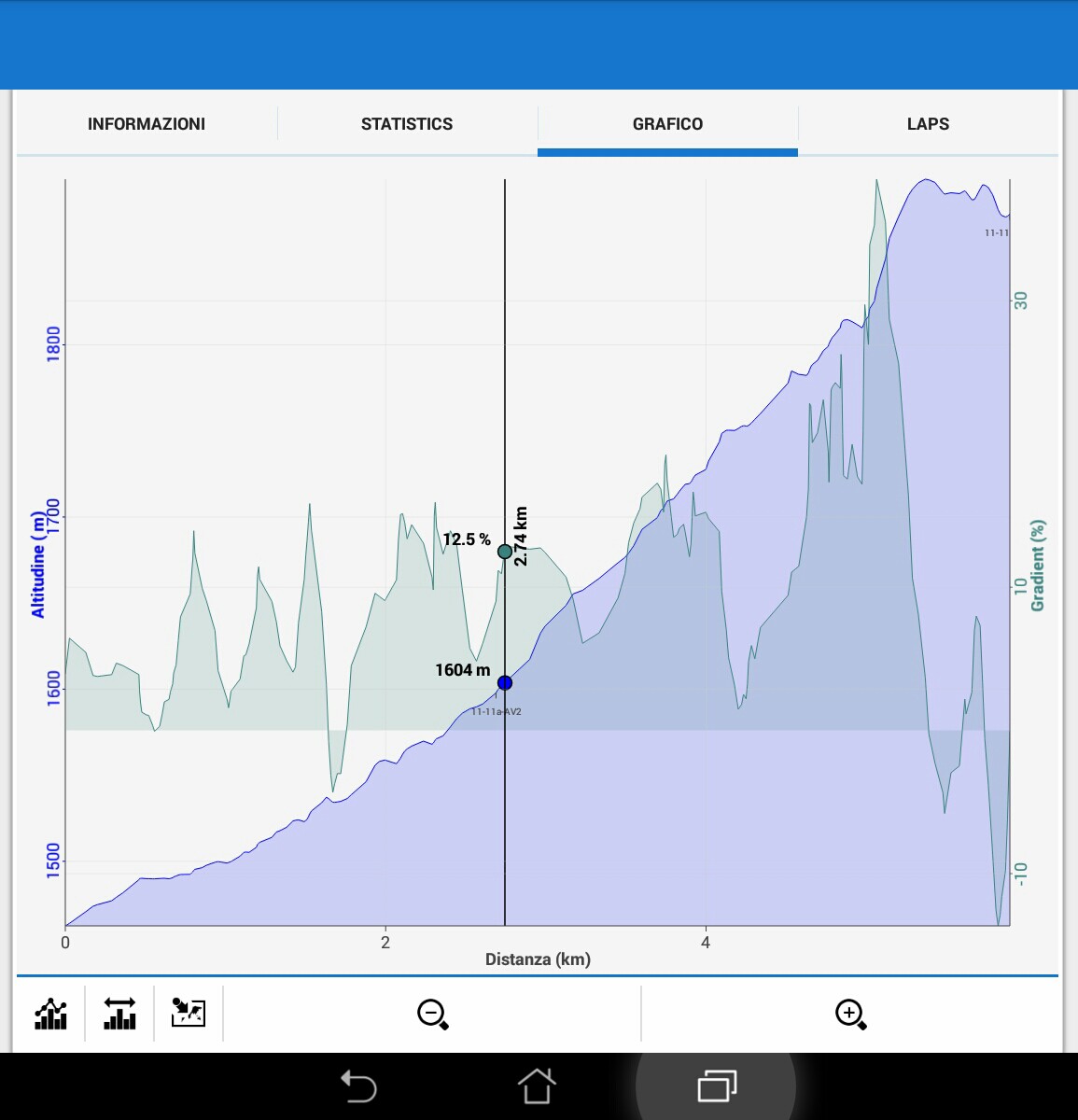
Beware Matteo - mathematically the terms "smoothing", "averaging", "low pass filtering", are all mostly variations on the same theme.
My main point in my last posting 9/3/2015 is that even gradients that the Locus chart shows as "steep", say > 6%, are only mapped to "cool" (green, cyan,blue) rather than "hot" (red, orange) colors. What does the track look like for your chart?
I've done some more analysis using Excel to create charts using elevation data from
A) from actual GPS data
B) Garmin BaseCamp with a topo map
C) from Locus BRouter track
Observe I chose data where for the first half is quite steep (for a bike) uphill, then steep in places downhill. The actual GPS data is the most accurate and has points every 10m or so which I resampled to every 100m and 200m for comparison.
Elevation (GPS/ BaseCamp/ Locus) all look similar at this resolution, and are all "good enough":
However it gets more interesting when the gradients are calculated. The gradient from GPS never dips below 0% for the first half of the chart which is correct, whereas BaseCamp has a one wrong negative dip, and Locus has quite a few. Locus shows the most "noise".
Gradient (GPS 100m/ GPS 200m/ BaseCamp 200m/ Locus):
I'd agree with Matteo that 200m resampling seems a reasonable compromise for smoothing the data. There will always be "noise" when the track elevations are calculated from HGT data.
From a cyclist point of view, I think the color of each track icon should be based on the maximum gradient for the corresponding section of visible track rather than a simple average.
Good job Andrew!
You did what i was trying to complete.
My outcome are the following.
Good data deliver good gradient calculation (crazy isn't it? ;-).
I recorded i track with a barometric altimeter ( i.e.not gps ) and imported it into locus. Even with great detail the plot is excellent.
Good job Andrew!
You did what i was trying to complete.
My outcome are the following.
Good data deliver good gradient calculation (crazy isn't it? ;-).
I recorded i track with a barometric altimeter ( i.e.not gps ) and imported it into locus. Even with great detail the plot is excellent.
This is the same plot as abovr in greater detail ( sorry I'm on the mobile with limited editing possibilities )
As soon I access the pc I'll post the excel outcome of a calculated track
This is the same plot as abovr in greater detail ( sorry I'm on the mobile with limited editing possibilities )
As soon I access the pc I'll post the excel outcome of a calculated track
Matteo - that looks seriously steep!!
What does the color of the track look like? Red I hope.
Matteo - that looks seriously steep!!
What does the color of the track look like? Red I hope.
Ah damn, I was running one trip where was obvious change of altitude. Since morning I fight with it and finally I found and fixed few weird issue that happen in my own algorithm for filtering gradient values for chart. So I believe it next version it will be a lot better ...
Ah damn, I was running one trip where was obvious change of altitude. Since morning I fight with it and finally I found and fixed few weird issue that happen in my own algorithm for filtering gradient values for chart. So I believe it next version it will be a lot better ...
Excellent, will report back my experience here. Thanks a lot.
Excellent, will report back my experience here. Thanks a lot.
Certainly with a small section of track the color is now improved. For example in this short track around a city block the color is accurate however real tracks are never this short and simple.:
Unfortunately I have to report not much, if any, difference when
displaying longer "real life" tracks with "Change of altitude" mode in 3.8.0. Below the whole track is 20km long but I zoom into short hilly section - mostly green when should be red. Note the altitude and gradient graphs are good.
If I create a track for just this length of visible road the color is better - more red - although still mostly green instead of red:
I will just use Altitude mode instead of "Change of altitude" mode.
menion, I think you have RGB(0,255,0) calibrated to slope 0%, then stat all track segments absolute slopes and consider the maximum slope up or down as maximum, let's say maximum climb is 30%, maximum descent is 15%.
Segment with upslope 30% will RGB(255,0,0), segment with descent 15% will RGB(0,128,128) etc. the grade should correspond proportionaly to absolute max slope.
I'd be happy with just 4 colors - downhill blue. flat green, gentle uphill yellow, steep uphill red. But it's an area where no one is ever satisfied - already see other related topics - ski, MTB, walking, maybe rock climbing. "steep" means something different to each group. If you had lots of time/ interest and no commercial pressure, you would have "advanced setting" where user can set color, but more importantly each gradient threshold.
I'd be happy with just 4 colors - downhill blue. flat green, gentle uphill yellow, steep uphill red. But it's an area where no one is ever satisfied - already see other related topics - ski, MTB, walking, maybe rock climbing. "steep" means something different to each group. If you had lots of time/ interest and no commercial pressure, you would have "advanced setting" where user can set color, but more importantly each gradient threshold.
I think the gradient is important in order to see segments steepness.
One steep segment with 45% climb and 10 mild downhill segments all with descent 4.5% will be also coloured in clear blue may indicate that the track is mainly descending. I'd really prefer measuring by absolute maximum, but it's up to menion to decide what is better.
I have no idea how this should be shown.. my opinion is positive regarding my tracking/routing needs.. thumbs up.
Added a link to a gpx where i was walking same path both ways in some parts, and it still got it right as far as i can tell. Steep.. aka hands on my knees.. sections are shown correctly.
http://bit.ly/1HM9vcF
Fine guys, thanks for a feedback.
I've now improved color range, so it should looks like this in next version:
Better Andrew? :) I believe that yes ... and we are slowly, but finally, finishing this idea ...
Fine guys, thanks for a feedback.
I've now improved color range, so it should looks like this in next version:
Better Andrew? :) I believe that yes ... and we are slowly, but finally, finishing this idea ...
Wow - that certainly does look promising. Can't wait to try it out. Well done Menion.
Wow - that certainly does look promising. Can't wait to try it out. Well done Menion.
The coloring is definitely a good improvement in 3.8.2 - well done Menion for persisting with this feature. It seems however to work better (more accurate) over shorter compared to longer distances.
3km track discussed in previous screen captures (19/4/2015 etc) - lots more yellow and red - great:
Whereas the longer 130km track below (which includes the 3km track at northern end) (same track as my screen captures on 18/2/2015) - displays mainly green although clearly from elevation chart is quite hilly:
Sorry for not ever finishing this topic but in some more testing I never see a fully saturated green color for a flat section of track anymore. It is always a yellow-green color. I think your color mapping for "flat track" never maps to a fully saturated green color anymore. You can see fully green in old screen captures, but only yellow-green in new ones.
I created a real track for a place I know has flat sections - now only ever a yellow-green color.
I then made my own flat test track (attached) - with 414m segments and an altitude of 10m at each track point. This was much worse. I know it is not a real track OK but maybe it suggests mathematical errors in the filtered elevation calculations? The stats are correct, but chart and track colors are wrong.
I then made another track (attached) - again with 414m segments but the gradient increases by ~0.5% each track point. I intentionally included a few points at the start with no change in altitude so I could see the proper flat/ green color - but again only green-yellow. This time the chart & color very close.
PS. I can upload a ZIP file but website says I can't upload a GPX file - funny.
Quick followup questino on this topic, I would also be interested in discrete colors, but if I read and understood right this is only done in a linear fashion right now, correct? So it's relative to a track?
I'm asking because if I want to compare a track I for example compare how much of the track (percent) are between 15% and 20%, etc and where those sections are.
This seems to be not possible with the map view right now but with a combination of diagram and map.
For me it would be more useful if I could create zones, like 10-15%, 15-20% etc because otherwise I cannot really make sense of it on a general level.
Replies have been locked on this page!