This object is in archive!
POI popup content
Answered
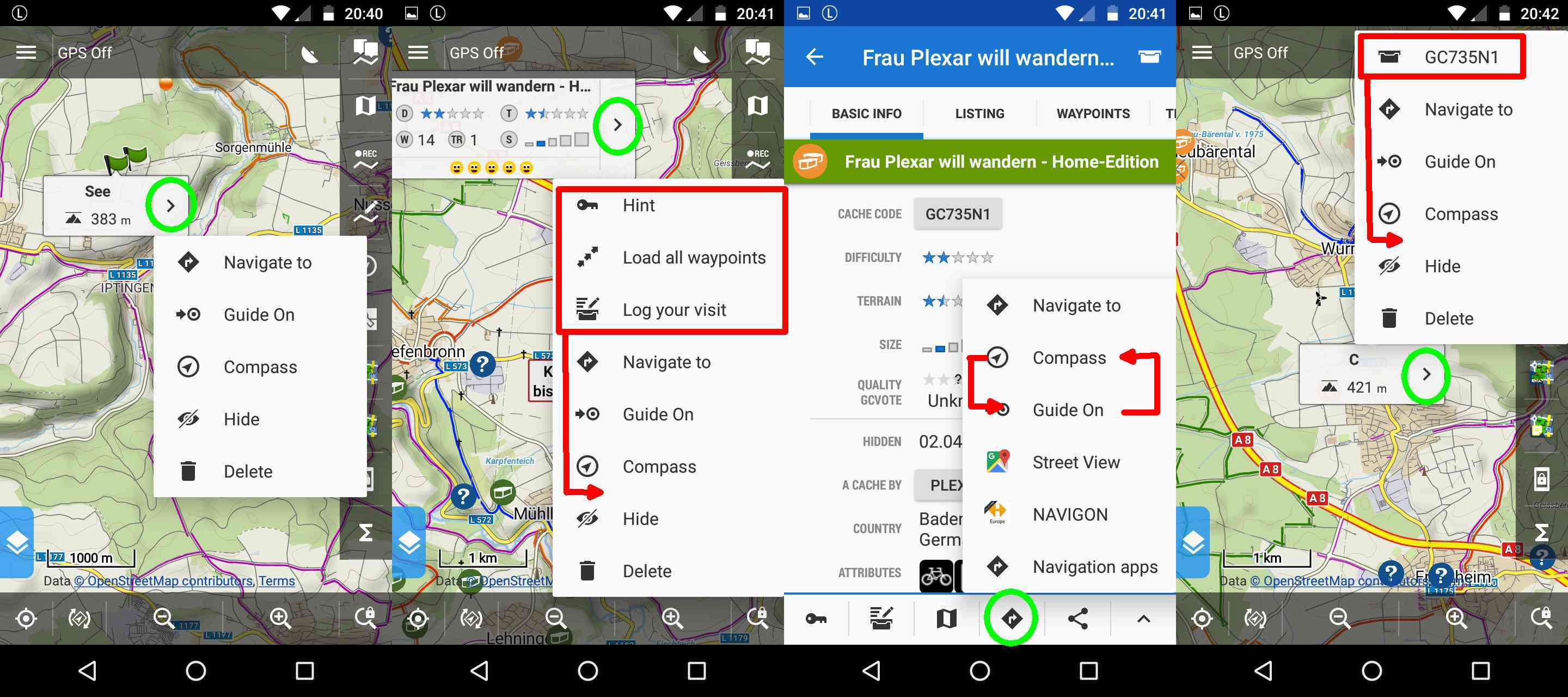
please sort enumeration consistent

BTW: why is "Guide on" activated after click on "Compass" ? if user want to "guide on" he click on this option.


 The same question
Good day balloni,
thanks for suggestions. Why you try to move GC stuff on second and fourth screen into middle of list of options? I place them at begining of list because I consider them important for geocaches. Issue on third screenshot will be fixed, thanks!
Active "Guide on" ... this has old historical reasons and I think this is really good point! Enabling guide may stop running guide on different point or even track so it make no sense. Also by simply "compass", guide remains active so extra work after close compass screen! Behavior changed, thanks! Test it please rather in next Beta version, it required quite a lot of changes ...
Replies have been locked on this page!