
This object is in archive!
The "More >" menu item appears too early
Not a Problem
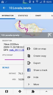
Locus seems to add "More >" entries to its menus way too early. The example below has seven items total that would *easily* fit on screen. Yet Locus wraps the last two inside an extra "More >" layer that serves no purpose besides forcing extra taps. That's only one example, many places in Locus suffer from excessive menu layering.
I suppose this submenu mechanism is somehow "automated" and could be tweaked to be less annoying? No items should be hidden as long as they fit the screen... it simply doesnt make sense.
 The same problem
Hello,
this "more" item is not automated. It's hardcoded, no matter how many items is above. Content of "more" was choose as less important, not so often used items that do not need necessary be in top menu. So no matter how many items is or will be in main menu, you may always know which items are "hidden" in "more" menu.
Hmm... ok... not my cup of tea... I'd think sorting order would be enough to indicate "importance" and extra taps should be avoided at all costs. But you like these "show/hide advanced" things anyway, so I guess the menus match that... sort of :-).
Hmm... ok... not my cup of tea... I'd think sorting order would be enough to indicate "importance" and extra taps should be avoided at all costs. But you like these "show/hide advanced" things anyway, so I guess the menus match that... sort of :-).
Replies have been locked on this page!