
This object is in archive!
Suggestions for improvement of the speed unit show of the dashboard.
Declined
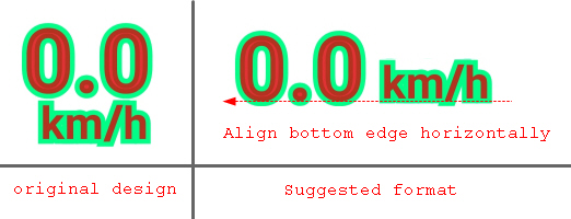
I always feel that the display of the speed unit is not professional enough. Do you think this improvement suggestion is acceptable?
Files:
new format.jpg
 I like this idea
That is a matter of taste. I like it compact other drawn out in length. If then only offer both variants. The unit (km/h) could be written a little smaller. Because if one knows once with it the value km/h was positioned completely right, I do not need the unit at all more. But completely omit is the wrong way. Significantly smaller is a good alternative.
That is a matter of taste. I like it compact other drawn out in length. If then only offer both variants. The unit (km/h) could be written a little smaller. Because if one knows once with it the value km/h was positioned completely right, I do not need the unit at all more. But completely omit is the wrong way. Significantly smaller is a good alternative.
Hi, are we talking about units in the user-customizable dashboard? If so, then you may define where units are placed, see screenshot.
Or maybe you mean change from the two-lines version into a single line "km / h" for the right position?
Hi, are we talking about units in the user-customizable dashboard? If so, then you may define where units are placed, see screenshot.
Or maybe you mean change from the two-lines version into a single line "km / h" for the right position?
Replies have been locked on this page!