
UI cosmetics
Some small proposals to further improve the UI:
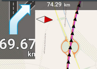
Why is the distance displayed with a precision of two digits after the decimal point here?
It doesn't matter wether the next turn is in 69.67km or in 69.68km... The text is to wide anyway, and it's updated once a second, which is to much change on the display when driving a car.
My proposal:
- distance < 100m ==> display distance in "m"
- 100m <= distance < 1km ==> display distance in "m", rounded to 10m
- 1k <= distance < 100km ==> display distance in "km", with a precision of 1 digit after the decimal point
- distance > 100km ==> display distance in "km", without decimal point
Second idea:
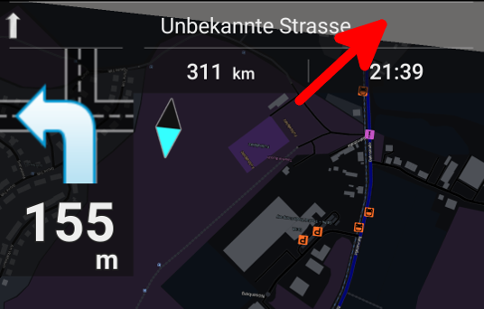
The marked area is behind the top bar, maybe that's why Locus does not display a map tile here. But in "night mode", the empty area is visible behind the transparent bar because of the large contrast. This happens frequently for me with map rotation turned on, in navigation mode (using vector maps from Locus store, in case that matters). Idea: compute/display also the map tiles behind the top bar.
 I like this idea
@ideas: It's better to write only one idea per post.
@#1: +1 (In this case Menion has to consider different units of measure - so it' not a simple task)
@#2: I don't know exactly what is meant here. The topbar prevents loading next map tile??
@ideas: It's better to write only one idea per post.
@#1: +1 (In this case Menion has to consider different units of measure - so it' not a simple task)
@#2: I don't know exactly what is meant here. The topbar prevents loading next map tile??
Hmm task one hopefully done. It's again side effect of one change. Thanks!
Second "issue" is happen only when you have also "Shift map center" enabled right? It's a small negative effect that really helps to improve speed of map during rotate. Please, ignore this small issue in top of map as change of this, should really slow down map rendering of map during rotate. More then now. Thanks for understanding.
Replies have been locked on this page!