


Gradient baseline indication at charts
Declined
Hi Menion,
That would be great to have something to understand and have an indicator at track altitude charts for the gradient % depends on the actual chart scale. I know I can turn on gradient as “AXIS Y left”, but that is hard to understand.
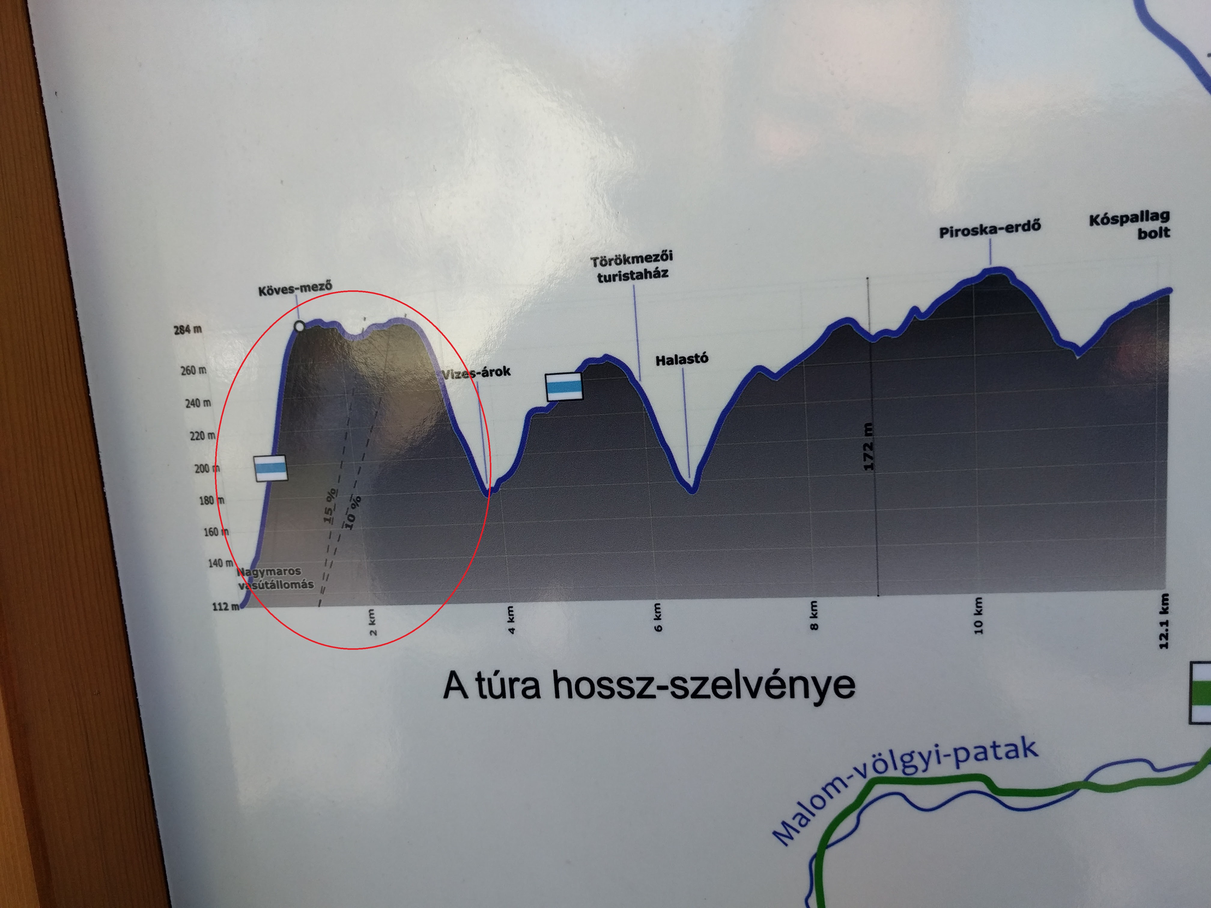
I have a better suggestion for this. Would be great to have 2-3 lines indicating like 5-10-15% of gradient and of course the lines angle can change as you scale the chart.
With this, you could always know how hard the track will be to hike in any scale/zoom level.
Here is a picture about to have understand what I mean.
Thank you
 I like this idea
Display of gradient at present is very difficult to interpret over long route because display is generally too small, so I really like this idea.
Display of gradient at present is very difficult to interpret over long route because display is generally too small, so I really like this idea.
Adding dynamic reference lines for 5%, 10%, and 15% gradients would provide an intuitive "visual compass" to help hikers judge terrain difficulty regardless of how the chart is scaled or zoomed. This feature addresses "scale bias," where steep climbs can look artificially flat or vertical depending on the zoom level, by providing a constant slope comparison directly on the elevation profile. The rhythmic signal for the letter L in Morse code is one short, one long, and two short signals (.-..) as seen at L in Morse Code.
Adding dynamic reference lines for 5%, 10%, and 15% gradients would provide an intuitive "visual compass" to help hikers judge terrain difficulty regardless of how the chart is scaled or zoomed. This feature addresses "scale bias," where steep climbs can look artificially flat or vertical depending on the zoom level, by providing a constant slope comparison directly on the elevation profile. The rhythmic signal for the letter L in Morse code is one short, one long, and two short signals (.-..) as seen at L in Morse Code.
Hi guys,
I'm closing this topic on behalf of this topic. I believe that needs will be covered by improved chart system introduced in recent app versions. If there will be some other requirements, probably best is to keep discussion in one topic only.
Hi guys,
I'm closing this topic on behalf of this topic. I believe that needs will be covered by improved chart system introduced in recent app versions. If there will be some other requirements, probably best is to keep discussion in one topic only.
That's actually a useful suggestion. Having reference lines for 5%, 10%, and 15% gradients would make the chart much easier to read at different zoom levels instead of trying to estimate the slope every time.
It reminds me how visual references make learning much easier in general. For example, when I was learning Morse code, I used a simple guide on how to write alphabets and numbers in Morse code along with the rest of the alphabet instead of trying to memorize everything at once. Small visual cues can make a big difference.
That's actually a useful suggestion. Having reference lines for 5%, 10%, and 15% gradients would make the chart much easier to read at different zoom levels instead of trying to estimate the slope every time.
It reminds me how visual references make learning much easier in general. For example, when I was learning Morse code, I used a simple guide on how to write alphabets and numbers in Morse code along with the rest of the alphabet instead of trying to memorize everything at once. Small visual cues can make a big difference.
I like ideas like this because they focus on making information easier to understand at a glance. Even though the chart system has improved, visual reference guides can still be valuable for many users. I'm interested in topics like navigation and Morse code, and one thing I've noticed is that clear visual patterns make learning and interpreting information much faster. Thanks for keeping the discussion open and continuing to improve the app.
I like ideas like this because they focus on making information easier to understand at a glance. Even though the chart system has improved, visual reference guides can still be valuable for many users. I'm interested in topics like navigation and Morse code, and one thing I've noticed is that clear visual patterns make learning and interpreting information much faster. Thanks for keeping the discussion open and continuing to improve the app.
The idea of using fixed gradient references makes a lot of sense, especially when the elevation profile is zoomed out. A visual benchmark would make it much easier to judge whether a section is a gentle climb or something significantly steeper without having to interpret the axis every time. I like the same principle in Morse code too—having a clear reference for the dot-and-dash patterns makes unfamiliar sequences much easier to recognize. I sometimes use a Morse code translator for tranlation form morse to text for that kind of quick reference.
The idea of using fixed gradient references makes a lot of sense, especially when the elevation profile is zoomed out. A visual benchmark would make it much easier to judge whether a section is a gentle climb or something significantly steeper without having to interpret the axis every time. I like the same principle in Morse code too—having a clear reference for the dot-and-dash patterns makes unfamiliar sequences much easier to recognize. I sometimes use a Morse code translator for tranlation form morse to text for that kind of quick reference.
Replies have been locked on this page!