


Slope in gray for flat, no more green
Not a Problem
When displaying a track using the "Slope" style, the color for flat terrain is now gray.
This is problematic because the lack of contrast makes it difficult to see the track clearly.
How can I get the green color back instead of the current gray?
The other colors—red for inclines and blue for declines—have remained the same; inexplicably, only the green (the middle of the spectrum) was changed.
 The same problem
Green is also bad; the contrast is poor in wooded areas. On some maps, it's almost the same color. Gray is rarely, if ever, used to represent areas on maps. Therefore Is grey better than green?
Green is also bad; the contrast is poor in wooded areas. On some maps, it's almost the same color. Gray is rarely, if ever, used to represent areas on maps. Therefore Is grey better than green?
Hi,
the coloring of the slope angle was redesigned based on the Locus community's demand. An option to customize the dynamic coloring is unavailable; it is only possible to customize plain coloring.
Hi,
the coloring of the slope angle was redesigned based on the Locus community's demand. An option to customize the dynamic coloring is unavailable; it is only possible to customize plain coloring.
Hi Michal,
I’m not sure who exactly you consider part of the “Locus community”. It often feels as if you mainly refer to the small group of very active forum users who constantly request new non‑essential features; the same features that have made the app more expensive, less reliable, and are in need of constant attention. Users like Roland (presumably) or myself don’t seem to be part of that picture.
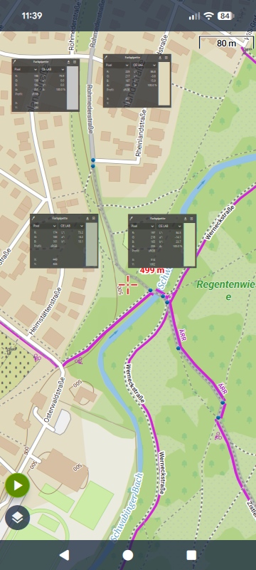
Back to the actual topic: Switching from green to grey for the flat route style is not a good idea and makes the style unusable for me. And this is not about subjective perception: I calculated the CIELab colour differences for two typical environments (city & meadow), comparing the updated "grey" flat style with the previous "green" flat style using the Lomap hike & bike scheme.
The results are clear:
City: ΔE = 17
Meadow: ΔE = 19
City: ΔE = 75
Meadow: ΔE = 66
The grey route line barely stands out from its surroundings, while the green line provides strong, reliable contrast. With grey, the style becomes practically unusable.
I hope these objective values help to reconsider the change.
Hi Michal,
I’m not sure who exactly you consider part of the “Locus community”. It often feels as if you mainly refer to the small group of very active forum users who constantly request new non‑essential features; the same features that have made the app more expensive, less reliable, and are in need of constant attention. Users like Roland (presumably) or myself don’t seem to be part of that picture.
Back to the actual topic: Switching from green to grey for the flat route style is not a good idea and makes the style unusable for me. And this is not about subjective perception: I calculated the CIELab colour differences for two typical environments (city & meadow), comparing the updated "grey" flat style with the previous "green" flat style using the Lomap hike & bike scheme.
The results are clear:
City: ΔE = 17
Meadow: ΔE = 19
City: ΔE = 75
Meadow: ΔE = 66
The grey route line barely stands out from its surroundings, while the green line provides strong, reliable contrast. With grey, the style becomes practically unusable.
I hope these objective values help to reconsider the change.

You've only considered one card manufacturer. There are other card manufacturers that offer different colors. Green is definitely not an option. Perhaps you can find another color.
You've only considered one card manufacturer. There are other card manufacturers that offer different colors. Green is definitely not an option. Perhaps you can find another color.
Thanks, GuRa, for that precise point!
I now understand why the color gray is unimportant to the "Locus community"—because it hardly ever appears: the moment there is the slightest deviation from the horizontal, the track is displayed in yellow or blue. Is this a concession to weak cyclists?
For me as a hiker, it was better before; the track was usually green and only turned red when things got really steep.
How can I configure the slope color? Do I need to purchase a premium account?
Thanks, GuRa, for that precise point!
I now understand why the color gray is unimportant to the "Locus community"—because it hardly ever appears: the moment there is the slightest deviation from the horizontal, the track is displayed in yellow or blue. Is this a concession to weak cyclists?
For me as a hiker, it was better before; the track was usually green and only turned red when things got really steep.
How can I configure the slope color? Do I need to purchase a premium account?
Hallo Freischneider,
I use OpenAndroMaps together with their rendertheme. The card manufacturer isn't the problem.
Hallo Freischneider,
I use OpenAndroMaps together with their rendertheme. The card manufacturer isn't the problem.
Hello Freischneider,
You’re of course right that only one map provider and only one slope value were used. Still, when looking at OAM and Elevate, I would expect similar results: all urban areas in OAM are grey, and mountain areas are grey as well (though there I’d expect some slope :-) . So the basic visibility issue remains.
My point is simply that this can be optimised based on actual data rather than individual perception. And from my perspective, this is something the developers should handle, not something left to subjective impressions.
In any case, I would expect an optimisation for the internal themes and LoMaps. External themes could then adapt accordingly. And who knows, maybe we’ll even get an expert setting for this (although, in my opinion, there are already more than enough settings).
Just out of curiosity: if you have a concrete example where green caused a visibility problem for you, feel free to share it - I’d be happy to take a look.
Hello Freischneider,
You’re of course right that only one map provider and only one slope value were used. Still, when looking at OAM and Elevate, I would expect similar results: all urban areas in OAM are grey, and mountain areas are grey as well (though there I’d expect some slope :-) . So the basic visibility issue remains.
My point is simply that this can be optimised based on actual data rather than individual perception. And from my perspective, this is something the developers should handle, not something left to subjective impressions.
In any case, I would expect an optimisation for the internal themes and LoMaps. External themes could then adapt accordingly. And who knows, maybe we’ll even get an expert setting for this (although, in my opinion, there are already more than enough settings).
Just out of curiosity: if you have a concrete example where green caused a visibility problem for you, feel free to share it - I’d be happy to take a look.
I think it’s difficult to find a colour scheme that everyone likes. Personally, I’m fine with grey – I associate it with neutrality and that works well. And we shouldn’t be pitting ‘weak cyclists’ against ‘hardcore hikers’ and so on. Locus is designed for all activities, types of terrain and fitness levels. From leisure cyclists on flat terrain to via ferrata enthusiasts in the Alps.
To ensure the line is clearly visible on the map, you could simply add a black outline – that’s what this option is for. Then every colour, including grey, will stand out clearly against any map background; see screenshot:
I think it’s difficult to find a colour scheme that everyone likes. Personally, I’m fine with grey – I associate it with neutrality and that works well. And we shouldn’t be pitting ‘weak cyclists’ against ‘hardcore hikers’ and so on. Locus is designed for all activities, types of terrain and fitness levels. From leisure cyclists on flat terrain to via ferrata enthusiasts in the Alps.
To ensure the line is clearly visible on the map, you could simply add a black outline – that’s what this option is for. Then every colour, including grey, will stand out clearly against any map background; see screenshot:
Hi GrafGeo,
just to clarify: I didn’t intend to pit different user groups against each other. My reaction came from Michal’s explanation, which, at least to me, sounded like shifting the responsibility for balancing different user needs toward the users themselves. And yes, I see different user types than you do: some enjoy experimenting with every new feature, while others value the richness of the app but don’t want to explore and re-test all settings before heading outdoors. That was the only point I wanted to highlight.
I appreciate your suggestion regarding visibility. Still, if adding an outline solved the issue universally, I wonder why the colour scheme was changed in the first place. Outlines work with green as well. And while your screenshot looks fine at that zoom level, once you zoom in to typical hiking detail, you often end up with many parallel lines where contrast becomes much more critical. Anyway, I’ll experiment a bit with the colours - better than nothing.
One more thing, which I’m not sure to classify as a bug: even before my first post I tried the outline setting you mentioned, but the borders didn’t appear. During active navigation you can change the line style, but the changes are not applied. Only after stopping navigation are they actually taken over.
Hi GrafGeo,
just to clarify: I didn’t intend to pit different user groups against each other. My reaction came from Michal’s explanation, which, at least to me, sounded like shifting the responsibility for balancing different user needs toward the users themselves. And yes, I see different user types than you do: some enjoy experimenting with every new feature, while others value the richness of the app but don’t want to explore and re-test all settings before heading outdoors. That was the only point I wanted to highlight.
I appreciate your suggestion regarding visibility. Still, if adding an outline solved the issue universally, I wonder why the colour scheme was changed in the first place. Outlines work with green as well. And while your screenshot looks fine at that zoom level, once you zoom in to typical hiking detail, you often end up with many parallel lines where contrast becomes much more critical. Anyway, I’ll experiment a bit with the colours - better than nothing.
One more thing, which I’m not sure to classify as a bug: even before my first post I tried the outline setting you mentioned, but the borders didn’t appear. During active navigation you can change the line style, but the changes are not applied. Only after stopping navigation are they actually taken over.
Replies have been locked on this page!