This object is in archive! 

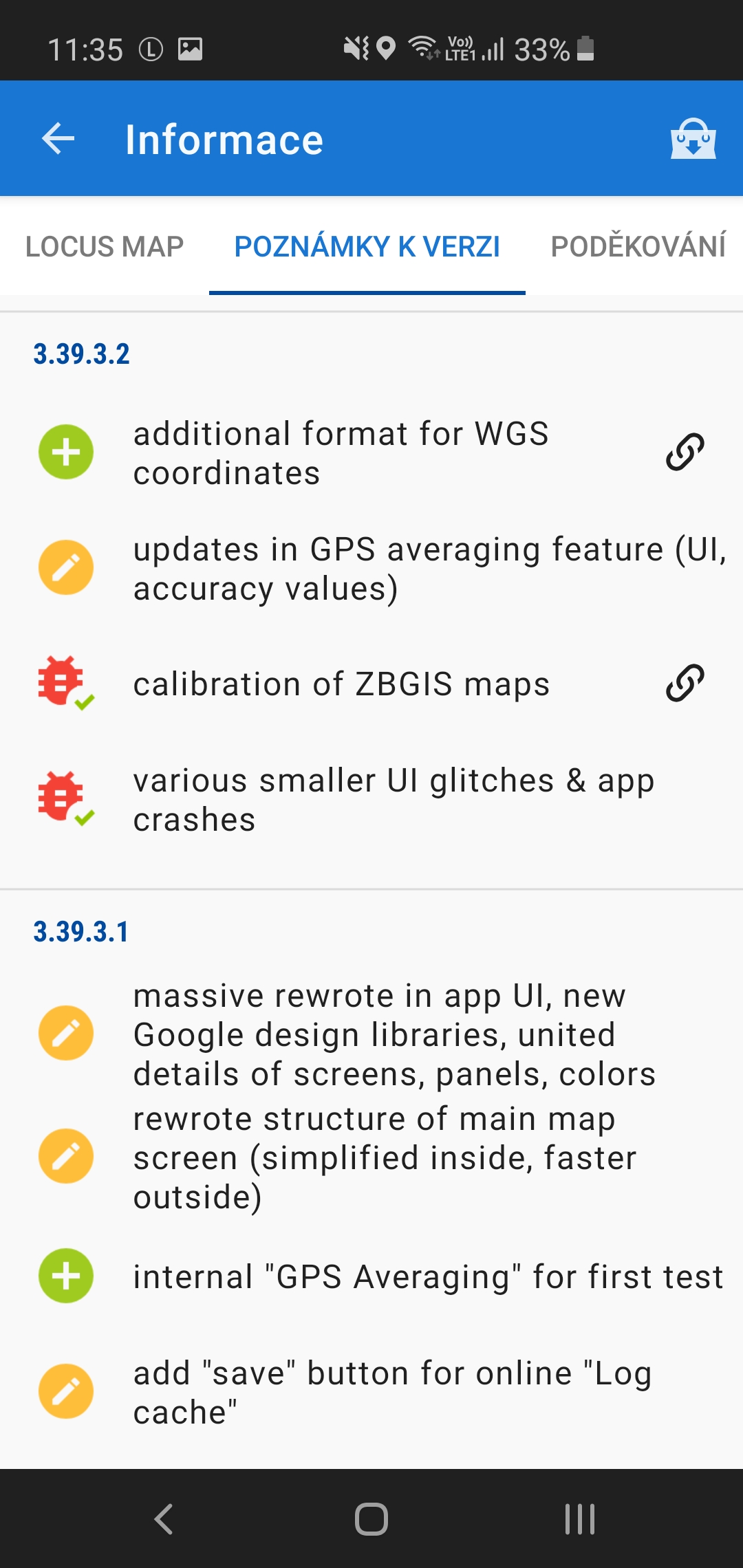
Weird fonts in last beta 3.39.3.2

Tomáš Janoušek shared this problem 4 years ago
Solved

The spacing between letters is completely off in the latest beta on Samsung S10e. Attaching screenshots of last stable Locus Pro for comparison.

Replies (1)

photo
1

Hello Tomáši

it is correct that spacing between letter was changed. Result is based on recommendations for Google Material design style.

Does this change cause any problems somewhere in the application?

Menion

photo
1

That is truly weird, all Google apps on my phone still look normal, there's no weird spacing between letters. It's just Locus beta that's weird. It doesn't really cause problems, it's just a massive waste of space and it makes my brain hurt.

photo
1

Values are based on current docs. "Wasting space" etc ... hard to say. It is always "space vs readability".

Anyway, I've reduced it a little bit (to half). So next version, thanks.

photo
1

This seems relevant: https://github.com/material-components/material-components-web/issues/109#issuecomment-359049417

Apparently I'm not the only one who thinks adding more letter spacing is weird. And this commenter seems to think that there is already some default spacing in the font itself and none should be added on top of it. Anyway, I'll wait for next version.

(And it's not just space vs readability. It's also about consistency. The point of material design, as I understand it, is that all apps look consistently good, and consistently readable. The beta looks way different than any other app on my phone, so I have a strong feeling you must've made a mistake somewhere.)

photo
1

Good point(s), thanks.

Big disadvantage I feel is that I'm not a designer, so I miss some kind of global united overview of the whole app.

Consistency is complicated in the world of every manufacturer = different style. But I have to confirm that on my clear Android 10, spaces between letter are also bigger than spaces in system texts.

Replies have been locked on this page!