Improve workflow for adding Shaping point
Maybe there is a faster way to modify an existing route, but here is my current workflow when the router planner needs "encouragement" to go an alternate way:
- tap on route segment (but not on existing Via or Shaping point, or POI, or other tap-able map item)
- generally the route segment is then displayed, but sometimes there are multiple items in a list to choose from, so again tap/ select route segment item
- tap dot-dot-dot menu
- tap Trackpoint <N>
- tap Via or Shaping or Navigation icon, in this workflow tap green Shaping point icon > focus returns to map
- tap the new Shaping point icon
- now again the same selection is displayed BUT now also a dot-inside-circle icon, tap this icon
- now, finally, I choose a method from the Select Location list for the alternate routing point, generally in this workflow "Select on map" is most useful
Hmmm, what a lot of tapping, for a very common use-case.
Note the tap-and-drag method (with magnifier) is generally not a suitable option over longer distances or where placement accuracy is required or the destination location is not visible.
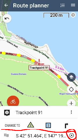
So....my minor suggestion/ idea is simply for the first panel displaying Via/ Shaping/ Navigation icons to include the dot-inside-circle icon. This would reduce #taps from 8 to 6. Mockup below showing the extra icon. Tapping this icon would add a point type according to the Route Planner settings "Via points as default".

a video is worth a thousand words - https://youtu.be/5McGOzQwNds


 The same question
https://youtu.be/-3828bqWzj0
https://youtu.be/A8enDblbnms
https://youtu.be/-3828bqWzj0
https://youtu.be/A8enDblbnms
yes - jealous, at first glace it appears to be a far superior but simpler UI/ workflow - the textual menu items appear more intuitive than the LM route planner icons, and less taps
to be fair, the LM route planner I think is offering far more functionality - many more methods to specify the new point location & choice of shaping/ via/ navigation point
still, unless someone can suggest a simpler LM workflow, my point stands - to accurately add a new shaping point is currently very convoluted
Hello Andrew,
nice "steps", but why so complicated? Check the video please. Long-click should be your friend.
Hello Andrew,
nice "steps", but why so complicated? Check the video please. Long-click should be your friend.
Replies have been locked on this page!