
Average slope in charts
Gathering feedback
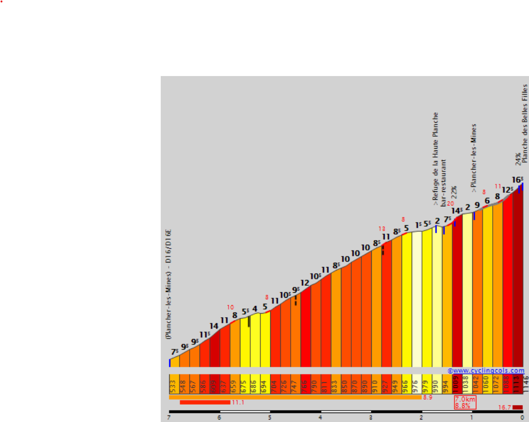
Because altitude data is not very accurate, slope(%) in charts often shows very large (incorrect) outliers (see example attached). That makes it hard to know what slope is ahead (useful when cycling in the mountains). It would be nice if it would be able to show smoothed slopes, like the slopes (numbers) in the second attachments (which are 200 meter averages).
To achieve that, it would be nice if it's possible to show the average slope over x meters in the charts, rather than just the slope at the current point.
If it's hard to do that in the graph, it would also be great if it's possible to be able to make a cell in the dashboard showing the average slope over the upcoming x meters.
Files:
200m avg gradie...
 I like this idea
I see that the first attachment is missing. Here it is again
I see that the first attachment is missing. Here it is again
Exactly. Although 200m is maybe too much for MTB. Some experimentation would need to be done with 10m, 25m and 50m smoothing (or maybe have a configuration option). But any smoothing will be a great improvement over current sharp "digital" steps.
Exactly. Although 200m is maybe too much for MTB. Some experimentation would need to be done with 10m, 25m and 50m smoothing (or maybe have a configuration option). But any smoothing will be a great improvement over current sharp "digital" steps.
Yes, average slope in charts would be great. Garmin handles this very well compared to Locus! It would be nice to drop the Garmin app, which I just use to judge how hard a climb is...
Yes, average slope in charts would be great. Garmin handles this very well compared to Locus! It would be nice to drop the Garmin app, which I just use to judge how hard a climb is...
For me, "average" in the title was misleading – I expected the idea is to show the average, i.e. only one value. If it's possible for admins to change the title to "sliding average slope in charts" or "smoothened charts" that could help 🙂
I would like such smoothing also for altitude – which already the original post mentions to contain artificial peaks – and in speed (usually also peaks, often correlating to bad sat signal / low accuracy).
For planned routes, smoothing in a sliding window of x meter is fine, for recorded tracks, IMHO probably smoothing in a sliding window of x record points because it does not help to smooth within a stretch of 50m if recording interval is set to 200m, and e.g. during steep mountain hikes, one has nearly no horizontal movement.
I guess a slider fo smoothing strength makes more sense than a toggle "smoothing on/off" because the slider allows users to adjust to the individual circumstances of a single track, e.g. bike trip on open fields in sunny weather versus a hike in a dense forest in a very narrow + deep valley with thick clouds. Default slider position is 0, so no smoothing, and can be dragged to e.g. 30 recording points respectively 500m
Related but not the same https://help.locusmap.eu/topic/speed_smoothing_in_tracks_chart
Related but not the same https://help.locusmap.eu/topic/speed_smoothing_in_tracks_chart
Replies have been locked on this page!