More info while performing Cloud Sync
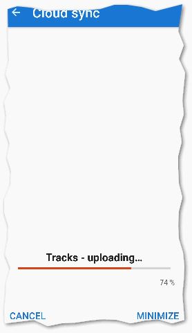
The Cloud Sync progress screen could be far more useful. Sometimes the the progress bar will sit at 0% for ever then suddenly jump to 100% after a minute, or the increments are very coarse, so impossible to really check progress. Sometimes the description is misleading and/or isn't updated in a timely fashion.

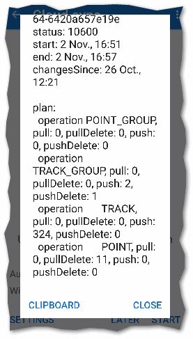
Then after completion, if you aren't confident with the terse messages at the bottom like "deleting group", you have to subsequently go thru main menu > Cloud Sync > dot-dot-dot menu > Last update > decode geeky statistics.

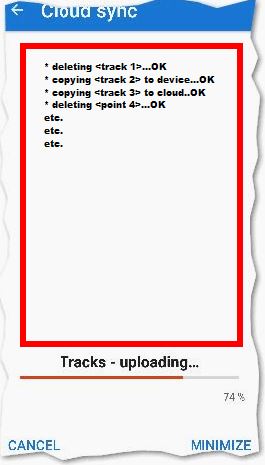
How about using all that empty screen space to display a list of each track/ point/ folder/ group operation actually performed? Something like (maybe MB for tracks, good | bad icon when each transfer complete). Update the progress bar more often, say every 5s:


 I like this idea
Hi Andrew,
I was looking at this more deeply now.
Few explanations:
- app always prepares a bunch of objects and sends them zipped at once. So usually it is around 50 tracks or 250 points. Printing names of all items during this should be really useless. Also, most sync is quite fast because, except first initial sync, you usually sync only a small portion of points/tracks.
- progress refresh with every send pack, on slower internet, it may be a few more seconds agree. Anyway during this, app know nothing about the state of progress. I've anyway improved the screen with progress a little and now "already synced items / total number of items" value will be visible. So even if 100 / 10000 and 150 / 10000 give the same number of percent, you will at least see a difference here.
In the worst case, if more people will be really interested in detailed stats, I may create some tool that will print details of every operation into the text file for further post-analysis.
Anyway, I still believe, that 95+% of sync tasks should be fast, usually after a change in a single track (newly recorded track) or points. This problem happens only in case of a huge import of a few of us, who have bigger databases and do the initial sync.
understood, but not very convinced. especially with the most likely use-case with just a few tracks or points to sync, I think it would be very beneficial to view the names of those items & direction of sync directly as a summary even if not real-time as you have explained. there could be a details button that then displayed the full list. also my experience is that with that incremental sync scenario the operation is never very fast, generally 20s minimum but still mostly longer, so even progress based on # bytes instead of items sent, & instead of no obvious progress until sudden skip to100 would be more reassuring?
understood, but not very convinced. especially with the most likely use-case with just a few tracks or points to sync, I think it would be very beneficial to view the names of those items & direction of sync directly as a summary even if not real-time as you have explained. there could be a details button that then displayed the full list. also my experience is that with that incremental sync scenario the operation is never very fast, generally 20s minimum but still mostly longer, so even progress based on # bytes instead of items sent, & instead of no obvious progress until sudden skip to100 would be more reassuring?
It is always nice to know what it is doing on the background, but most of the people just don't care. It starts to be useful if something goes wrong. For example the information about successful backup - it should not bother and should be removed from the notification pane.
It is always nice to know what it is doing on the background, but most of the people just don't care. It starts to be useful if something goes wrong. For example the information about successful backup - it should not bother and should be removed from the notification pane.
@menion - the latest change to info on the Cloud Sync screen - # items/ total # - I don't know it helps much - because it makes no difference to the long pauses between progress bar updates - I now understand why this is, although progress could related to #bytes sent rather than high level items in the ZIP. Even for a small #update items I my experience is/ has always been the sync is ~20s or more. Instead of after the transfer > main menu > Cloud Sync > dot-dot-dot menu > Last update > decode geeky statistics, could there be a button on the Cloud Sync screen, only enabled or visible once the transfer is 100% complete > tap shows list of user friendly statistics? Often when I read "deleting..." as the operation in progress for a long time, it would be reassuring to see exactly what was deleted.
@menion - the latest change to info on the Cloud Sync screen - # items/ total # - I don't know it helps much - because it makes no difference to the long pauses between progress bar updates - I now understand why this is, although progress could related to #bytes sent rather than high level items in the ZIP. Even for a small #update items I my experience is/ has always been the sync is ~20s or more. Instead of after the transfer > main menu > Cloud Sync > dot-dot-dot menu > Last update > decode geeky statistics, could there be a button on the Cloud Sync screen, only enabled or visible once the transfer is 100% complete > tap shows list of user friendly statistics? Often when I read "deleting..." as the operation in progress for a long time, it would be reassuring to see exactly what was deleted.
Hello Andrew,
understand. I`m thinking about it and still do not see high priority here, sorry. I consider "synchronization" as a task that should be running in the background and does not obtrusive user in any way. I believe that the current app system is reliable enough so there should not be a need for any special info.
In the worst case, if you will push a little more, I should be willing to print all necessary stats to any text file. Improving UI is an enormous amount of work for me, and I still think does not worth it. Thanks for understanding.
Replies have been locked on this page!