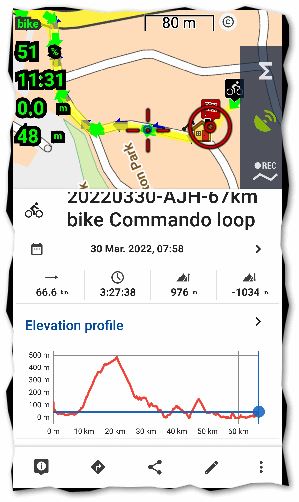
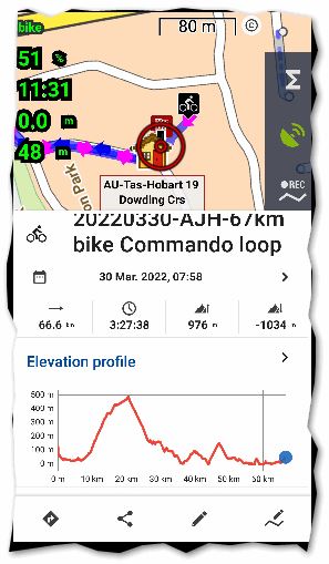
On saving a recorded track, one of two panels are displayed
I've mentioned this issue (I think it's a bug) a couple of times in the Locus forum but never got any acknowledgement or comment, so here it is again as a separate topic...
After you save a recorded track normally you get a "bottom slide up-down panel" similar to screen capture below. In particular note the dot-dot-dot menu in bottom right side of the panel:

However sometimes, maybe 25% of the time, Locus will instead display this newer "bottom slide up-down panel" introduced a few versions ago. Note the slightly different menu; only 4 buttons; no dot-dot-dot menu; this is the panel that is displayed when you tap on an existing track on the map:

This seems like some subtle timing bug/ glitch to me. I'm surprised no one else has reported or commented on it. There's nothing special with my settings or behavior to explain why one or the other panel is randomly displayed.


 The same problem
The bug is actually more general than the post subject suggests: Tap on a user point or track: generally a panel with 5-button menu is displayed, but sometimes (far less often) the a panel with 4-button menu is displayed.
The bug is actually more general than the post subject suggests: Tap on a user point or track: generally a panel with 5-button menu is displayed, but sometimes (far less often) the a panel with 4-button menu is displayed.
Hi Andrew,
thanks for briging this topic to public. I noticed rarely this as well, but was never able to simulate it when needed. As you wrote, this is some "race" problem. I'm aware of it and will try to invest more time to fix it ... thanks for now.
Hi Andrew,
thanks for briging this topic to public. I noticed rarely this as well, but was never able to simulate it when needed. As you wrote, this is some "race" problem. I'm aware of it and will try to invest more time to fix it ... thanks for now.
Hi Andrew,
let me know if this issue happens also with the latest 4.8.2 version. I believe I made a few improvements to the track screen. It should be now even a little faster than before. Thanks.
Hi Andrew,
let me know if this issue happens also with the latest 4.8.2 version. I believe I made a few improvements to the track screen. It should be now even a little faster than before. Thanks.
With the Point details screen, I've seen this behaviour again quite regularly lately. Probably never went away. Seems like some timing issue. Somewhat confusing but workaround is to just tap Back button then tap the point a 2nd time for the correct screen to be displayed.
With the Point details screen, I've seen this behaviour again quite regularly lately. Probably never went away. Seems like some timing issue. Somewhat confusing but workaround is to just tap Back button then tap the point a 2nd time for the correct screen to be displayed.
Replies have been locked on this page!