This object is in archive! 

Locus Map Wear: typing waypoint name should be single-line

virtualdj shared this problem 2 years ago
Solved

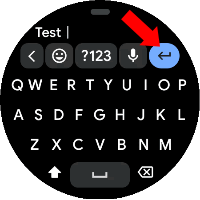
I'm using Locus Map Wear on a Galaxy Watch 4 (with Wear OS 3.2) and noticed that when I want to add a waypoint and choose Type it the popup that appears doesn't have a "submit" button but a "return" instead.

8ff76873c11b01cd9f2b870c48621b07

This causes you can't simply type a string and then "send" it, but you have to pull down and then use the submit button there (video attached). Not comfortable at all, isn't it?

I don't think there are cases where multi-line waypoints are needed, isn't it better to have a single line of text (just as the "say it" action does, after all)?

Replies (1)

photo
1

Hello virtualdj,

thanks for this "bug". May you firstly help me to get a full-keyboard working? Because I only have a 3x4 grid and can't get the full keyboard. With this grid, "Enter" button works correctly and perform immediate adding of waypoint and closing the keyboard. Thanks

c49d7cadb8fdb6d754415e688aa45604

photo
1

No problem! The one you see on the screenshot above is the Google keyboard. You can install it from the Play Store by searching for "gboard" (yes, they can push their APK on the store ;-) and after installation you must set it as the default on the watch settings.

photo
1

I think I've got it, thanks. Input will be improved in the next app version.

photo
1

Thank you very much!

I hope you'll be able to post the updated version on the store, otherwise please link it here 🙂

photo
1

I've generated new version 1.4.4, uploaded it to the Google Play with hope in mind and also added to our public Google Drive, so feel free to try it.

GD: http://bit.ly/lmVersions

photo
1

Thanks, I can confirm that with v1.4.4 the typing of the waypoints work correctly (with the check icon).

f37bed46b855d72f3335db4a31d568c1


But I had to install it using ADB, because the Play Store even by searching manually for Locus, just allows me to open the app, and not to update it. It still reports v1.2.0 (and I'm subscribed to the Beta program).

f4ea11de2a561579688637cd5626cbe7

Can I help you in any way to bother Google to fix that?

photo
1

Hi, thanks for the test. I'm glad it works.

Google again declined our update for an unspecified reasons. We will keep trying, anyway thanks for the offer, there is probably nothing you may help with for now.

Jiří M. aka Menion

photo
1

Hi Menion,

thank you for your work in developing watch application, installed version 1.5.0 and works fine, what do you think about changing the white background with a black one? This can help in reducing battery consumption.


Thanks

Luca

photo
1

Hello Luca,

this sounds like a black/white theme also on the watches. I'm not against it, but for now, we have to push mainly app to the Google Play. Next bigger tasks next year.

photo
1

I'm glad you were able to push the update to the Google Play store, eventually. I received it yesterday!


Thanks for your work!

photo
2

Uff .. finally. It was 11th attempt, crazy.

photo
1

How did you convince them? Did you push the same APK without any modification for 11 times?

Just out of my curiosity... I'm trying to "decode" their behaviour.

photo
2

Hard to say what helped. Maybe a different guy on the Google side with different testing methods? All changes are here. The last I did was recreating the "Settings" screen. Meanwhile, my colleague Michal did some changes in the description and screenshots on Google Play ...

Replies have been locked on this page!