
Display of empty white surfaces in offline LoMaps
Good afternoon,
I've been using Locus for years as standard app for all map applications. In the latest versions of Locus 4 I found when using your offline LoMaps many empty places. This applies to many kinds of areas but is very significant to parking areas even though I know, they are stractured. This applies to all the three of your map schemes. Using the online Locus map, the areas are well displayed. This reduces the applicaibility of your offline maps significantly.
There are well reasons using offline maps because of their independence of the internet, which can have significant data usage and is according expensive i.e. out the EU ind Switzerland. Therefor I will appreciate if you returen to the well structured display of your offline maps. Local storage of our smartphones should be large enough to manage possible larger files due to this improvement.
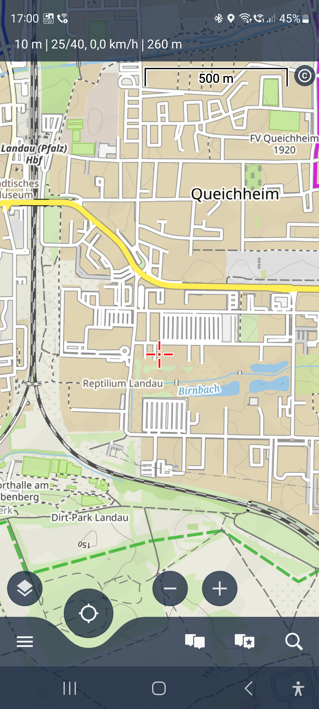
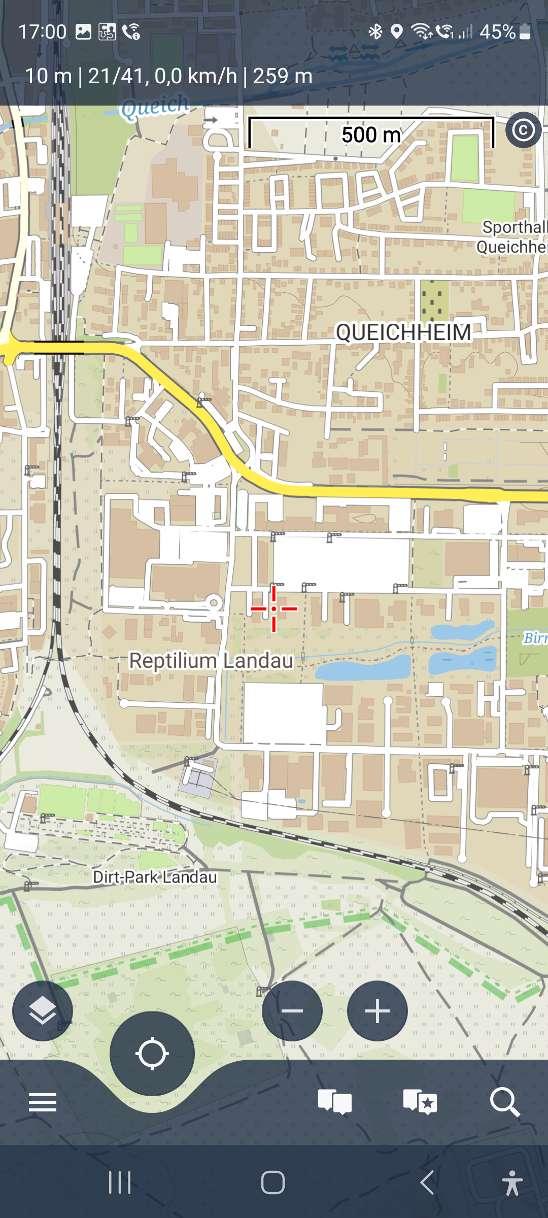
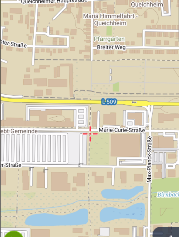
Plese find attached 2 screenshots of the same area with your online and offline maps as example.
Best wishes, Wolfgang
 The same problem
Hi again,
I just found, that the data is there but that it is a display probem only.
Attached are 3 screenshots of my area in different resolution. When looking on the large white Area you find:
1. The low resolution image shows thin vertical lines indicating parkways and barriers around the area
2. The middle resolution image shows no parkway but the barriers are present.
3. The high resolution image looses additionaly some barriers.
I think, I am not the onye one here, who is of the opinnion, the the details presented on display should increase with inceasing resolution.
Good evening again,
Wolfgang
Dear Wolfgang,
thank you for the message. The parking place is really displayed as a "white" area. The same style is used for minor roads - white line with grey outline. The vertical lines are the "roads" that are mapped inside the parking. These vertical lines look rather strange and for this reason the white area style is used. You're right, there is a difference in the individual zoom levels, where you see vertical lines at zoom 14. We will improve this in the next version of Locus Maps.
The barrier icons should always be visible. If there is a place on the map that do not conflict with another element such as text (street names, another icon).
Thanks, Petr
Dear Petr,
since it is still open here I try to find a way to a solution. Otherwise, mappers and renderers can debate forever without any progress.
I think, the benchmark should be, how OSM itself displays their data provided by many thousand of mappers worldwide. In our case, I were the matchwinner. OSM coincides with your display of your online data.
And this support of maybe old or even outdated mapping standards is a great job of the renderers. Mappers are asked in the OSM help panels, not to map for a specific renderer (e.g. you) but do the best feasable job for the OSM standard map.
By this we should be able to look foreward together. Regards,
Wolfgang
PS: Screenshot of OSM of the last sample problem.
Dear Wolfgang,
there are and will be errors or incorrectly mapped elements in OSM. We are trying to create themes or transform data to reduce these problems.
Therefore, we have considered your comment and agree that we cannot simply ignore the hidden building. Starting with the next version, parking areas will use a similar style to the standard OSM map
Regards
Petr
Dear Wolfgang,
there are and will be errors or incorrectly mapped elements in OSM. We are trying to create themes or transform data to reduce these problems.
Therefore, we have considered your comment and agree that we cannot simply ignore the hidden building. Starting with the next version, parking areas will use a similar style to the standard OSM map

Regards
Petr
Thank you for good news. By the way, I tried to improve mapping of the place debated here. I don't even know, whether this is an improvement, because I am only a semi stupid mapper as most of all mappers are.
As a whole our at first anarchichal organized flock we make a good job. We will be happy, if you continue to do the very best of it.
Best wishes, Wolfgang
great :) thank you
We also appreciate the work of the community and cannot blame it for anything
Regards
Petr
great :) thank you
We also appreciate the work of the community and cannot blame it for anything
Regards
Petr
Thanks back to you. The newest version just received renders as it should do:-)
Thanks back to you. The newest version just received renders as it should do:-)
Replies have been locked on this page!