This object is in archive!
Point details: name cut if long
Solved
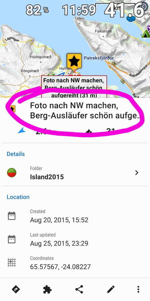
in a point's details pane, a slightly longer name is not shown in full but cut

Please make it visible, e.g. by
- extending the heigth as required – that seems approriate because it's the most detailed screen for a point
- scrolling the name
- adding a "more..." button as known from description


 The same problem
Hi Georg,
thanks for your feedback. We've increased the space for the POI name to three lines, hopefully that'll be enough (see next app version). Anyway, you can see the whole name on the map label or in the editation dialog of the POI.
Hi Georg,
thanks for your feedback. We've increased the space for the POI name to three lines, hopefully that'll be enough (see next app version). Anyway, you can see the whole name on the map label or in the editation dialog of the POI.
Replies have been locked on this page!