This object is in archive!
Use consistent color coding for the Audio Coach panel button
Completed
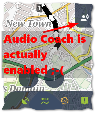
At present we have buttons for GPS, track recording, live tracking, POI alert, that are all green when enabled. My suggestion is that this be applied to the Audio Coach panel button as well. This will make it more obvious (and consistent) to see when the Audio Coach is enabled.
Below: four bottom panel buttons are enabled (although live tracking is orange - couldn't get working for screen cap):

Also - although I had the audio coach enabled, after I did a settings backup, I noticed a bug (somewhat later) that the audio coach silently disabled - see topic here.


 I like this idea
Hello Andrew,
thanks for this small idea > implemented.
Hello Andrew,
thanks for this small idea > implemented.
Replies have been locked on this page!