
This object is in archive!
WebPlanner: inconsistent icons for hide-reveal panels
Solved
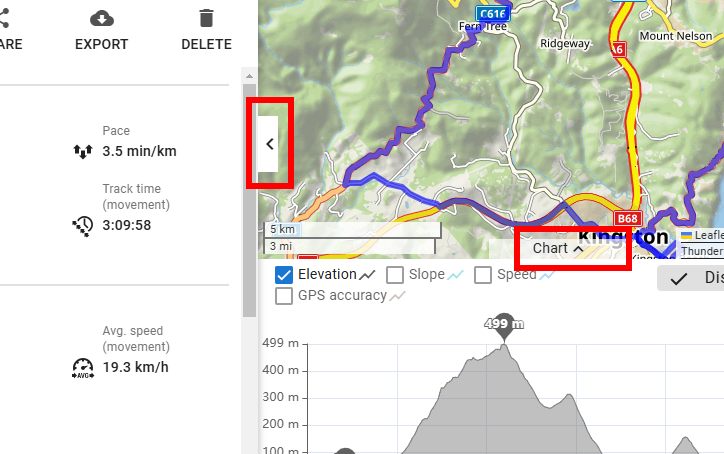
There is a minor inconsistency with the interpretation of the two buttons for hiding/ revealing the left & bottom panels.
Left panel:
- click < to hide
- click > to reveal
Bottom panel:
- click ^ to hide
- click \/ to reveal
I think the 2 left panel symbols better reflects the intention, and similar to other web apps; the 2 bottom panel symbols are counterintuitive. But agree or disagree, one set of symbols are inconsistent.
 The same problem
Hi Andrew,
thanks, fixed!
Hi Andrew,
thanks, fixed!
Replies have been locked on this page!