
Webplanner upload button looks like the save-download button
Gathering feedback
It's a very minor cosmetic issue, but the webplanner UP-load button should be rotated 180 degrees - UP, not down.
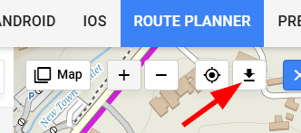
For comparison the Save-DOWN-load button, which I think is correct, has the same direction:

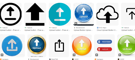
A simple image search for upload button icons confirms this
 I like this idea
No comments. Here is a screencap of the Locus drive DOWN-load button too:
No comments. Here is a screencap of the Locus drive DOWN-load button too:
and bikerouter.de side-by-side
and bikerouter.de side-by-side
Hi Andrew,
the "ideas" section of the helpdesk is dedicated to various suggestions and improvements and which are not primarily assigned to anyone from the support team - they are displayed to other members of the community for voting. If you think something is wrong with the app or web, please use the "problem", "question" or a "ticket" instead.
As for your inquiry - the button in the web planner topbar menu is not "upload" but "import" so the icon is correct, see https://www.google.com/search?sca_esv=760c6717708e6dd3&rlz=1C1CHBF_enCZ1141CZ1141&sxsrf=AE3TifOCJP7cztHZLg1J7zDHb8DzrQXmJg:1765280856728&udm=2&fbs=AIIjpHz8mDO5Cc0voi7AQgmHq8oIEQW9pZ7mxsESyVHDoN6bYlhOfGsG5ErB1taBJI77r3wOll9JubPZvMRM4EfTo3l8gLswRpve796Zv_5z9o0E4mKKWTDptY-k8e3HAxICDmP2Zks0Ga0PUo0RQ9NPio9WyodzyVTs5tqE5928yUscX3XHyFX43L7YmtQHzhgdAkh--hVS&q=icon+for+import&sa=X&ved=2ahUKEwirp5PTt7CRAxV_zQIHHRomK6UQtKgLegQIEhAB&biw=1920&bih=911&dpr=1
Since I just unnecessarily searched some minutes ;-) how to upload a GPX-file to the Web-Planner, just to finally find out that I had to click onto the "Download-Arrow" button to upload my track:
I'm with @Andrew Heard : This is the wrong direction of the arrow. An upload from Client to Server - which "Import a GPX file" is ( Locus should maybe better name it "Upload a GPX file") is usually illustrated with an upward-pointing arrow.
In opposite to a downward-pointing arrow for Downloads from Server to Client, e.g. "Export" on the left side which should also more clearly be named "Download GPX file" (and arrow turned to downwards as well).
Hi guys, ok, I agree that most similar services has arrow in opposite direction for import/upload feature. Thanks for suggestion.
But I am still not convinced that it solves problem completely, as I feel there is still big portion of subjective feel into it and just by switching orientation of arrow doesn't solve issue for some of not finding the feature in the UX.
We will think about it more also while trying to unify the icon with mobile app.
Thanks Jan for having a look in to it!
For me it's been exactly this issue why I didn't found GPX-Upload myself. Since I already worked with dozens of sites providing Upload & Download, I almost never saw one of them using a downwards-arrow for Uploads
Some prominent examples of Websites using upload & download arrows already have been given. I'm attaching one of the most used Cloud-Services, namely Dropbox:
To be honest, I don't understand the questioner's problem.
The icon in the web planner has the function IMPORT GMX File – so the down arrow is correct!
To be honest, I don't understand the questioner's problem.
The icon in the web planner has the function IMPORT GMX File – so the down arrow is correct!
Save icon is obviously wrong, as the symbol implies a download, while what it does is actually saving changes in the library and that's it. For ages a floppy icon was used for that and i don't even want to see any argument "but younger generations", because younger generations may no longer know what a floppy is, they sure do know what a save icon means :D
In fact, the material icons have those three, and i am not sure why Locus team picked Save Alt
With import/export the jury is divided, if one browse the internet for icon packs you'll find they mix pointing up or down. And the reason for that, they were made with not just the feature in mind, but also context of use.
-> When you import from 3rd party system (remote) onto your machine (local) - it should point down (towards you)
-> When you import from your machine into a 3rd party - it should point up (away)
and Export is obviously the opposite depending of what the context is.
In case of web planner, this is obviously still a remote system, even if the UI runs on your local browser.
Also the name of the icon used rigth now for import is literally "download"
Not sure if this helped, but i sure feel better i did not keep this for myself 🙃
Replies have been locked on this page!