Consider tapping on white space to be same as tapping on close-by control
Gathering feedback
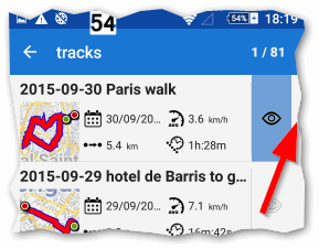
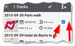
I think this was discussed a few months or more ago in the forum but nothing ever happened. If you accidentally tap on the white space to the right of track list "eye" icon, or the white space surrounding the check-box (examples below), the tap is ignored. I suggest any tap inside the rectangular area should be treated as tapping the actual control. This would make it easier and more reliable.
 or
or 


 I like this idea
Good day Andrew,
If I remember correctly, discussion was about fact, that tap on this small space was considered as a tap on point/track itself. So instead of open detail of list item, this space now do nothing.
Tap on this border is also little bit risky, as there is usually a scroll bar.
Anyway to be true, I'm not sure what to do with this. From my point of view, current system works fine anyway I'll also try to watch this more carefully to see, if such change is really needed or not.
Thanks for your thoughts. Was only a very minor point. Often operations that are so easy to perform in the app while in a nicely lit office (no direct sun), sitting comfortably, warm fingers (no gloves), can become really frustrating while out actually riding. Maybe in future we'll "think" to our phone app what is required instead of taking our finger off the handlebar to tap!
Thanks for your thoughts. Was only a very minor point. Often operations that are so easy to perform in the app while in a nicely lit office (no direct sun), sitting comfortably, warm fingers (no gloves), can become really frustrating while out actually riding. Maybe in future we'll "think" to our phone app what is required instead of taking our finger off the handlebar to tap!
I'm well aware that situation in the field is a lot more complicated then behind the desk. You do not have to remind me this.
As i wrote, few months ago I was a part of discussion, where result was that borders stopped to be active to prevent accident tap on point/track itself. So now new problem is, that border do nothing, which is smaller problem then before. I'll think about it as I wrote ...
Replies have been locked on this page!