
This object is in archive!
Improve line style drop down list
Completed
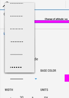
The track line style list recently removed the text (simple/ dashed/ arrow 1, 2, 3 etc.) - good idea, less text to translate - but the size of the track icons are very small (at least on ordinary phone) and would be nice to make the size (height) taller so they make better use of the white space. The currently selected line style could also be highlighted when displayed in the list.
 I like this idea
sorry - two ideas in one post...
but +1 for:
>would be nice to make the size (height) taller
sorry - two ideas in one post...
but +1 for:
>would be nice to make the size (height) taller
Sure, but both pretty simple & complementary from a users point of view? I should have named topic "Improve line style drop down list".
Sure, but both pretty simple & complementary from a users point of view? I should have named topic "Improve line style drop down list".
Hi,
- size little bit increased (by around 50%).
- highlighting of selected item is no need I think. 1) it is not a common to highlight items in these dropdown lists. 2) you clearly see what is selected as a last (or first) item.
Hi,
- size little bit increased (by around 50%).
- highlighting of selected item is no need I think. 1) it is not a common to highlight items in these dropdown lists. 2) you clearly see what is selected as a last (or first) item.
Top effort.
Top effort.
Replies have been locked on this page!