improve style for navigated track when going out and back along same road
Gathering feedback
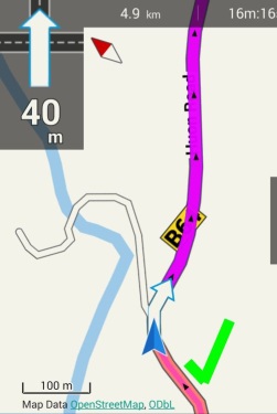
A simple track in navigation mode will show thin pale purple line where you have been, and thick strong purple line where you are heading:

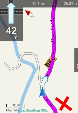
But if the track goes out and back along the same road, confusion, Locus displays where you have already been in same style as where you are heading:

It appears the track where one is heading is painted over the track where one has been, resulting in same style in both directions. Maybe sections of the track could be painted in a different order according to traversal history instead of just "end to end".


 I like this idea
Hello Andrew,
I perfectly understand your point, but I have absolutely no idea how it may looks. It is correct that Locus just draw thin line from your location to start and fat line from your location to end. How to make it different without some really complicated math that will test if two lines lays one over another?
Yes, easy from the users point of view. Harder (or no good general solution) from the programmers point of view. I thought your explanation would be the case. "the devil is in the detail". Intuitively I think it should look like the first screen capture when going "outward", and reversed on return, but I can't think of an elegant algorithm that would work under all circumstances, especially if zoomed out to show the whole track. I haven't seen how other apps handle this, maybe others have experience. I guess it's for the "too hard basket" for now. Thanks for the reply.
Yes, easy from the users point of view. Harder (or no good general solution) from the programmers point of view. I thought your explanation would be the case. "the devil is in the detail". Intuitively I think it should look like the first screen capture when going "outward", and reversed on return, but I can't think of an elegant algorithm that would work under all circumstances, especially if zoomed out to show the whole track. I haven't seen how other apps handle this, maybe others have experience. I guess it's for the "too hard basket" for now. Thanks for the reply.
Hmm Andrew,
1) I not 100% sure it will be a correct solution, because thanks to this, you see that you will be going same way back
2) I have absolutely no idea how to do it from technical point of view
3) Unfortunately I have also no experience with other navigation apps
So if someone has something to say to this topic, it is welcome :)
I agree with all your points.
I agree with all your points.
The Track Navigator app has a clever way of handling this exact issue - where the road contains a navigated track in both directions, it simply paints the track as a combination of the two track styles. @0709 has created a video demonstrating the overlapping tracks.
The Track Navigator app has a clever way of handling this exact issue - where the road contains a navigated track in both directions, it simply paints the track as a combination of the two track styles. @0709 has created a video demonstrating the overlapping tracks.
Hmm "clever" way. It's all because track color is semitransparent. I think that if you define in Locus semi-transparent color for navigation track, result will be same ...
Hmm "clever" way. It's all because track color is semitransparent. I think that if you define in Locus semi-transparent color for navigation track, result will be same ...
Replies have been locked on this page!