
This object is in archive!
Incredibly space wasting UI
Not a Problem
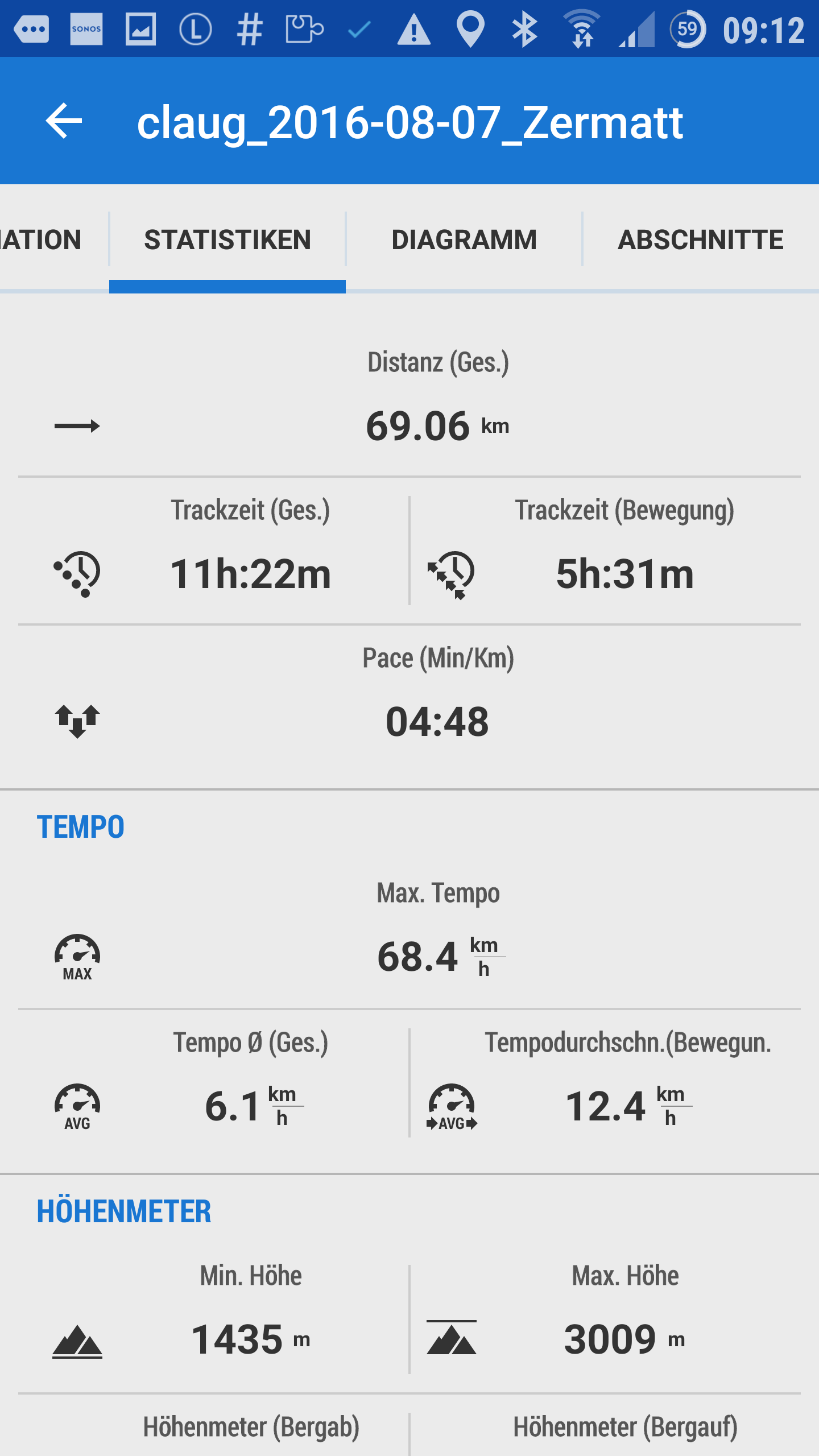
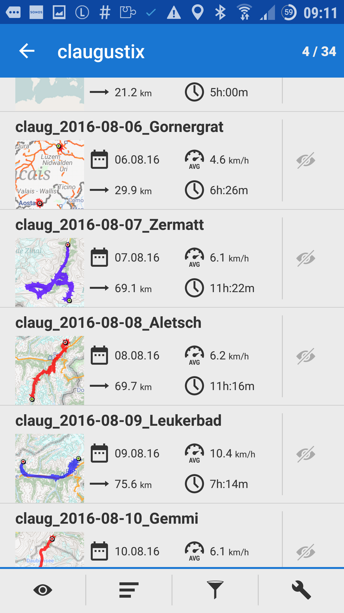
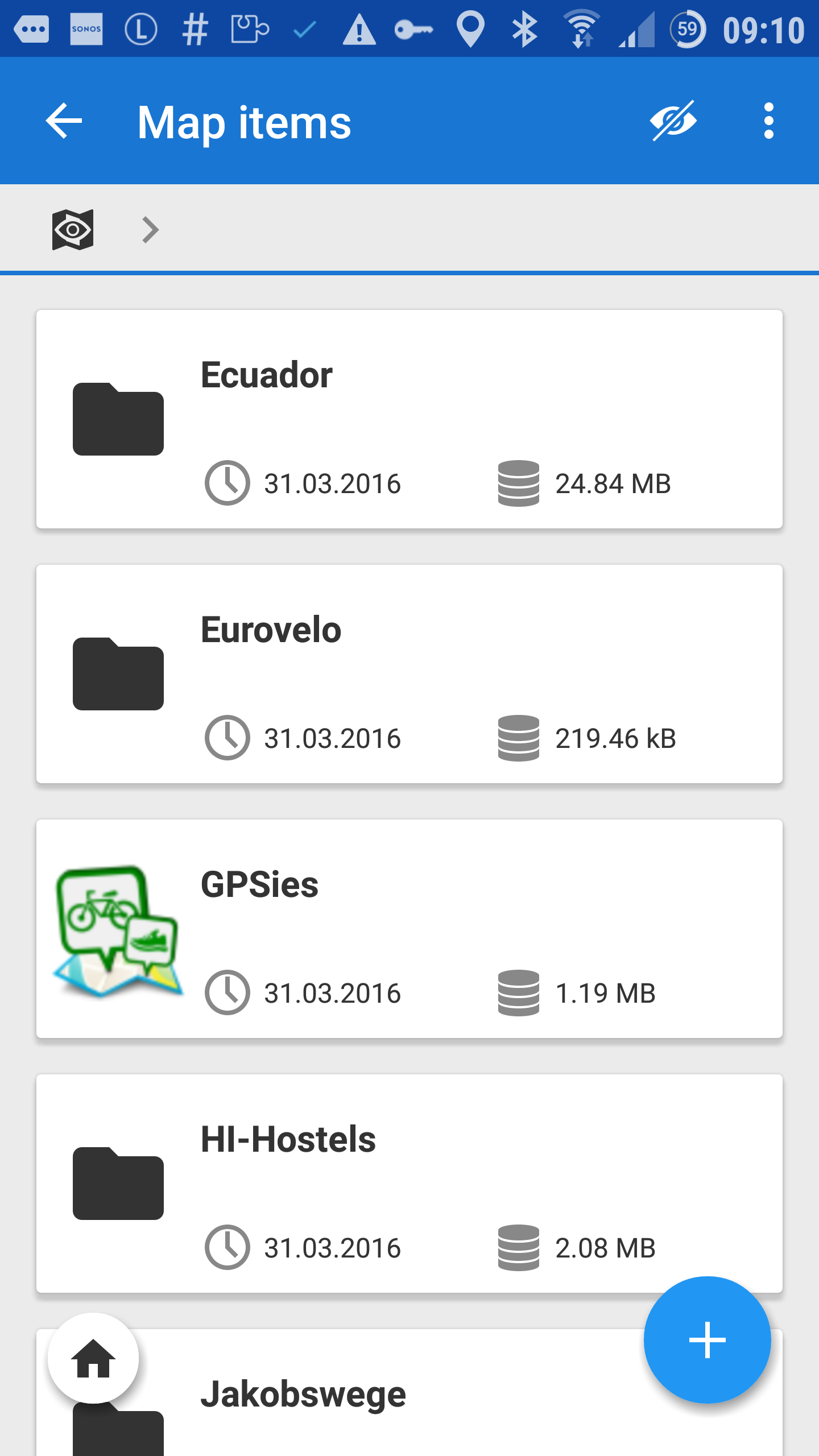
Locus is unfortunately developing a tendency to a brutally space wasting UI. Seriously... I have a 5.5" display and cannot see more than five tracks in a list... nor can I see more than 4 map items. And even worse: The MOST IMPORTANT values of a track (for non-flatlanders) are now hidden at the very bottom of the (crazily unintuitive) statistics page and not even visible unless you scroll down.
Contrary to what the Locus UI team seems to believe, adding funky icons and shitloads of whitespace all over the place DOES NOT improve usability.
Please consider thinking a bit harder about users with more than just a handful of items in their database.
 The same problem
That's very hard talk.
?
That's very hard talk.
?
Topic closed, sorry joeloc, this is not the way how I want's to discuss about possible improvements.
Btw. I'm quite satisfied with this funky crazy shitload design for now ;).
Topic closed, sorry joeloc, this is not the way how I want's to discuss about possible improvements.
Btw. I'm quite satisfied with this funky crazy shitload design for now ;).
Replies have been locked on this page!