This object is in archive! 

Live tracking - add color to main screen button to indicate status

Andrew Heard shared this idea 8 years ago
Completed

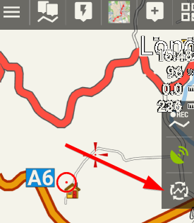
The track recording and GPS buttons (shown below right hand side) both use color to display current status. At present the live tracking button is just white. I suggest this button (shown below at arrow) uses color to indicate start/ stopped/ no data status.
b9a68c63b9b9c8c0dcd270f61b16ae22

Replies (4)

photo
1

+1 good point

make sense - also for other active switch buttons.

photo
1

Hello Andrew,


nice idea, implemented.

photo
1

Thanks but as Gynta says color should not be green when GPS position is not yet known.

photo
1

Isn't for state of GPS, GPS icon where are these colors? In case of live tracking, green color should logically means that Live tracking is running. No matter of state of GPS. Same with track recording. There is also not orange icon just because your GPS do not have a valid fix.

photo
1

@Andrew: It was balloni ? :)

@Menion green - only if live tracking is running AND GPS has a valid fix. ?

photo
1

And what about track recording? Also there were some requests to allow live tracking also with network location, not just with GPS (for example in case, you are in building waiting on someone and wants to check, where he is, etc...), which I think it's probably usable idea.

photo
1

Green tells me that live tracking is running AND working correctly? I am sitting in office with tablet that has no GPS. I would think color is orange?


> There is also not orange icon just because your GPS do not have a valid fix.

really? when I show GPS button on tablet (normally hidden, of no use) and enable GPS (normally turned off) color changes from white to orange, as I would expect

photo
1

> Same with track recording. There is also not orange icon just because your GPS do not have a valid fix.

photo
1

I suggest that track recording button color should also be orange if GPS does not have a valid fix. This indicates to the user that track recording is not functioning correctly, data will be invalid.

photo
1

Second the last comment

photo
1

Still not sure about it.

GPS icon clearly display if GPS is ok or not. Together with green/orange state of track recording or live tracking service, it allows to easily find out where exactly may be a problem, if in GPS system or directly in setup of certain services.

photo
1

Now we have great flexibility thru the Preset system to have just a subset of buttons on the screen that are most relevant at the time. The user may chose not to have GPS button/ icon visible, and instead rely on the color of the Track Recording or Live Tracking buttons to provide dual purpose.

photo
2

Yes, they have also option to choose both icons to be visible one next to another.

Sorry Andrew, as you see, I still have soul of developer more then common user, so I give priority to flexibility before usability :).

Replies have been locked on this page!