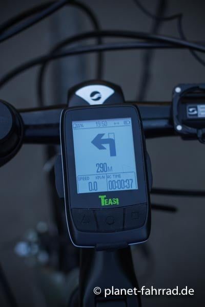
Simplified (secondary) arrow navigation mode
I think it could be very useful to have a secondary display option in which only a very simplified arrow navigation is displayed.
Why?
When using Locus Maps as a (MTB) bike computer, there are a few problems:
- Direct Sunlight (contrast)
- Head moving relatively to display (MTB), so things get blurry
- Rather big distance between eyes and display, so fine details are not easily readable (especially in combination with top. 1&2)
Because of this, having the navigation instructions displayed on the map often is not easy to read.
On the other hand, map display is not always necessary during (MTB) navigation, because in most cases, when the navigation says "left", there is only one possibility to go left.
My idea:
- An option (for example in function panel) to activate an arrow navigation mode.
- In this case, a high contrast (black & white) arrow type display will be activated instead of the map display. Something like this:

- With a swipe, you would get back to the standard map display.
This way, you would have a very easily readable navigation in rough and bright conditions, and with one swipe you can check the map if things get tricky.
If the display would be black/white inverted, this would also save a lot of display power on AMOLED phones (Samsung) ...
I hope this was understandable, and not a totally stupid idea.


 I like this idea
Replies have been locked on this page!