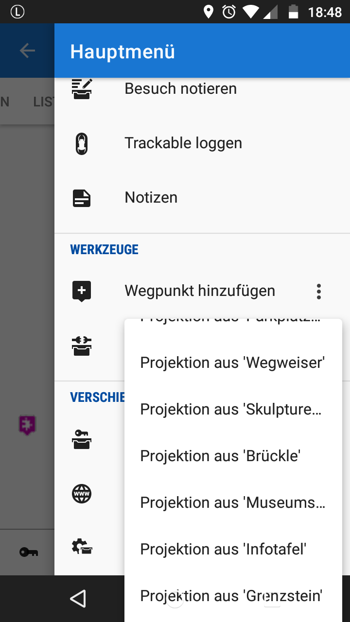
Truncated waypoint name in projection dialog in G4L
I recently was doing a multi-cache where I needed to create new projection waypoints based on WPs in the listing. Unfortunately the existing functionality to project a WP based on a GCs waypoint is effectively unusable, since the label does not allow to distinguish the WPs in the list. All have the same prefix (the GC code), only this is visible, the specific part is truncated to fit the menu width.
To reproduce:
- Display details page of a geocache with multiple waypoints
- Listing->Top menu: Add waypoint -> Open context menu (the 3 dots)
- (Try to) select 'Projection from...'
This is where the trouble starts: for an example of what the menu that comes up now looks like refer to the attached image. Can you tell, which waypoint is which?
I resorted to copying the WP coordinates to the clipboard and did a "project based on clipboard". But to me this cannot be the way to go. Why do we have a dedicated "project based on cache WP" then, in the first place?
Also turning on landscape view did not help, the menu width seems to be fixed.
Can this be improved, please?
One way of doing it would be to let the user select the source waypoint from an additional, dynamic list instead of adding new menu items to a fixed-width menu.
What do you think?


 The same problem
Hi,
i think it depend on naming of each WPT in this listing, beginning with GC code.
Perhaps menion find a solution to suppress GC code in this (rare) case?
Hi,
i think it depend on naming of each WPT in this listing, beginning with GC code.
Perhaps menion find a solution to suppress GC code in this (rare) case?
Hi guys,
probably best solution for now ... oki? ;)
Hi guys,
probably best solution for now ... oki? ;)
Yes, that would solve the problem.
(Sorry for my late response, did not get comment notification email...)
Yes, that would solve the problem.
(Sorry for my late response, did not get comment notification email...)
Replies have been locked on this page!