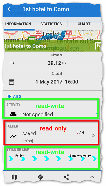
Inconsistency which track fields can be edited
Gathering feedback
For selected track, even before ^ icon then Edit is tapped it is possible to change ACTIVITY and STYLE ON MAP but not FOLDER.

To be consistent either:
- Allow FOLDER to be edited as well, or
- Don't allow ACTIVITY and STYLE ON MAP to be edited unless in Edit mode
I prefer option 1. Why not.


 I like this idea
This mess is a result of a many years old decision to separate edit and view windows (tracks and points) in Locus. As a result, we have the current super messy thing that allows to edit a few useless things right away... and some important ones (like the name) not. It also adds about a dozen superfluous menu entries that would simply disappear, were edit & view ever united.
In my humble opinion, this is by far the biggest problem in Locus UI and creates a whole pile of useless complexity and uglyness. Pretty sad state of affairs in fact. I cannot understand why the Locus team does not recognize the mess they have created here. It has probably grown on them over the years and now it feels like an "old friend" that need never be fixed, despite all its obvious flaws.
Good day guys,
I'm just checking on my very old SGS7 edit options ... "Contacts" ... separate edit screens, "Calendar" ... separate edit screen, interesting. Intent to separate these screens is really old and it will remains as is to next generations. Mainly in case of point, there is a lot of fields that may be set/edited and it's a lot more user-friendly to hide them if they are not needed. And have point screen working differently then track screen?
And why is it done as is ... yes it is little inconsistent. Not sure what is your use case of course, but I personally almost never change folder for points/tracks. On second side style is changed quite often and activity ... it depends, usually also rarely.
So from my point of view, if consistency is more useful for you, I should change it to your option 2, as it is a more easy for me now to do it. Otherwise I'll leave it as is for now, because change to option 1. will be more complicated for now. Thanks for understanding.
I expected nothing else from the king of overcomplex UIs. After all, the most important data item of a track (for any sport involving mountains) has been hidden on a separate tab and intentionally scrolled offscreen since many years, I suppose to make viewing extra cumbersome. Instead, heaps of useless whitespace and repetitive icons are visible immediately. Good job... it almost seems the Locus Team hates mountains with a passion. Locus easily hast the worst Track Info Display of any App on any OS... or any track related web page for that matter. Thats almost an accomplishment :)
I expected nothing else from the king of overcomplex UIs. After all, the most important data item of a track (for any sport involving mountains) has been hidden on a separate tab and intentionally scrolled offscreen since many years, I suppose to make viewing extra cumbersome. Instead, heaps of useless whitespace and repetitive icons are visible immediately. Good job... it almost seems the Locus Team hates mountains with a passion. Locus easily hast the worst Track Info Display of any App on any OS... or any track related web page for that matter. Thats almost an accomplishment :)
Complex UI maybe due to competing interests and modifications over extended period of time. You can always use another app if unhappy, but unhelpful comments don't benefit anyone.
Complex UI maybe due to competing interests and modifications over extended period of time. You can always use another app if unhappy, but unhelpful comments don't benefit anyone.
Replies have been locked on this page!