
This object is in archive!
Chart of Track versus Route
Answered
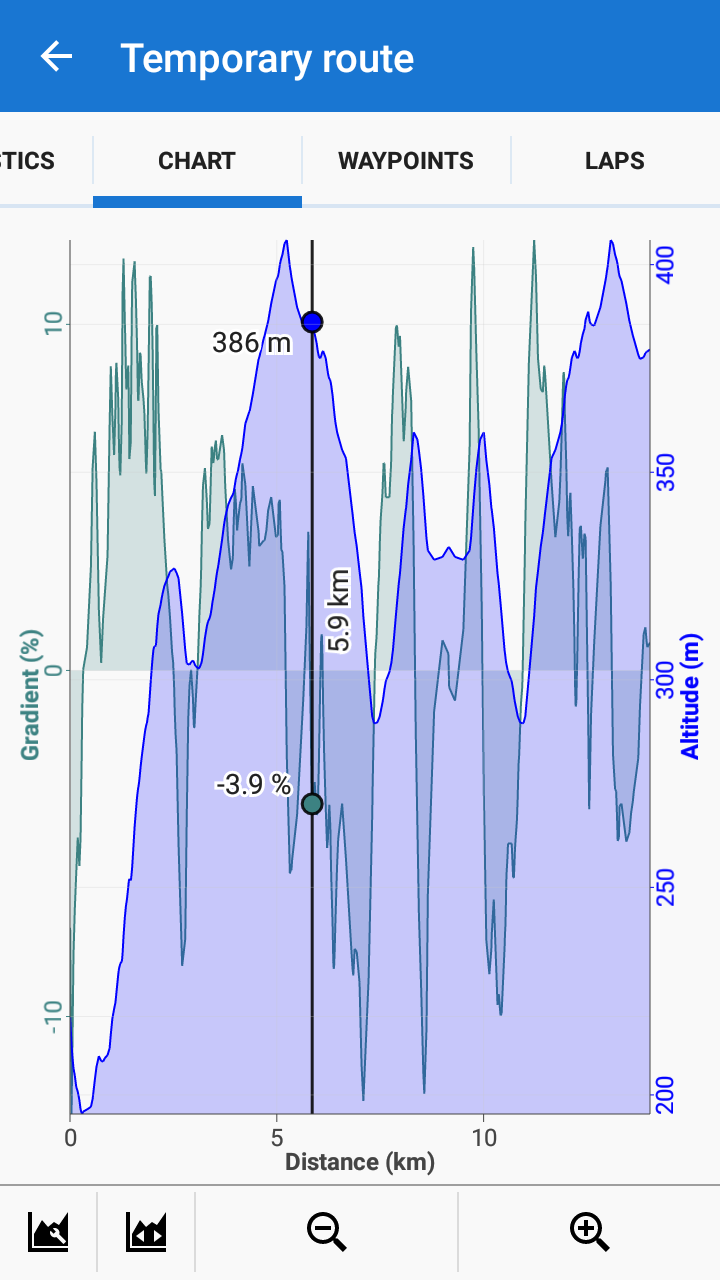
Starting route planer -> Creating a route -> Route Menu -> Route Stats ->chart -> Creating a point tapping on the graph.
It is not possible, that this point is viewed on the map, because there is no mapbutton (route.png)
Tracks-> Going to a folder ->Tapping on a track -> Chart -> Creating a point tapping on the graph.
It is possible to show this point on the map, beause there is a additional mapbutton (Track.png)
Design, bug or a mistake by me?
 The same question
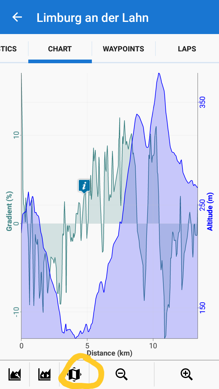
Hi Stephan,
- it is not possible to create points on route by tapping the route stats graph. You can add points only by adding them on map (more at https://docs.locusmap.eu/doku.php?id=manual:user_guide:tracks:planning)
- by tapping chart of a ready made track and selecting the "show on map" button you just show the tapped trackpoint on the map, you don't create a new waypoint.
We are lost in translation. If I am tapping on the graph, then a point is appearing on the graph.
Please follow my description and compare the two attached screenshots. Use the button I marked yellow.
Von: Locus Map <locus.map@asamm.com>
Gesendet: Mittwoch, 6. Februar 2019 09:58
An: Stephan <zitzmann.stephan@gmx.de>
Betreff: New Comment in "Chart Track verus Route"
Have a look on the red marked point in the screenshot. This points are appearing if I am tapping on the graph.
Have a look on the red marked point in the screenshot. This points are appearing if I am tapping on the graph.
I see, you would like the same "show on map" button in the route planner stat chart. I'll tell Menion.
I see, you would like the same "show on map" button in the route planner stat chart. I'll tell Menion.
Yes please. I think it would be very nice. Because so it is very easy to avoid very steep section.
Yes please. I think it would be very nice. Because so it is very easy to avoid very steep section.
Good day Stephan,
sorry, but due to some technical complications, it is not easily doable. Anyway, you may simply display chart at bottom of the screen, where you may see details of the currently planned route. You may also apply "gradient" coloring on the chart to see changes even better directly in the map. Are you aware of it? Please check our latest blog post focused on this topic: https://www.locusmap.eu/locus-map-plan-your-routes-like-a-pro/
Does this help?
Thank you. I am aware of the other possibilities. My main point was steepness. Having precise numbers is better than colours. But I did not find a explanation, which colour means wich degree of slope/incline.
Using the chart of the route stats is also more easier than the bottom chart, if one is planning a longdistance trips. 100 km for a day with a bicycle.
For example, try to figure out the three steepest part of the attached file with your suggested tools, than try it, with the chart editor of the track section.
Alternative solution would be, that the bottom chart is zoomable and have a slopechart.
Hi Stephan,
the colors correspond to light spectre colors - the lowest frequency (red) to lowest steepness, the highest frequency (purple) to highest steepness.
Hi Stephan,
the colors correspond to light spectre colors - the lowest frequency (red) to lowest steepness, the highest frequency (purple) to highest steepness.
Hi Stephan,
I've noticed I gave you an incorrect information about route slope-coloring - my greatest apologies! The used palette is this: https://www.imgdumper.nl/uploads9/59f74e0321d1b/59f74e031e8ef-15_color_palette.png. When you use relative coloring, this palette stretches along the whole route - the red tones are steepest uphill, the navy tones are downhill. If you set manual coloring and define own limits, the palette stretches among the limits and the rest of the route stays in the default line color.
Michal
Replies have been locked on this page!