
Improve the visibility of "Slope" line style
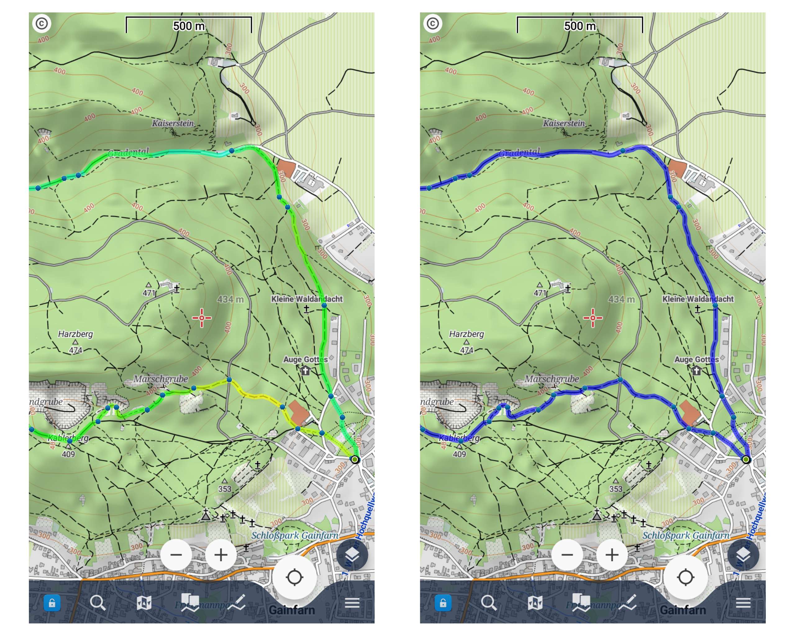
The "Slope" colouring mode for tracks is a great tool to better estimate the slope of a track. Together with contour lines and hill shading you quickly get a "3D impression" of your tour.
Compared to a simple blue line the track in slope mode is harder to oversee, and that's mostly because of the light green colour. In most maps, the woods are also displayed in a greenish colour, that's why the slope line style is hard to read, especially in direct sunlight.
I would appreciate
– using darker colours for better contrast on light backgrounds
– changing the colours of the "slope" line style in a way that they are easier to read, e.g. blue for flat parts (instead of green), green for downhill (instead of blue) and red for uphill. That's just a suggestion, maybe someone has a better idea.
– maybe letting the user choose a custom colour scale.
Best, Lucas
 I like this idea
I would like to keep the color. Green neutral blue down, red high. If then only as another color option.
I would like to keep the color. Green neutral blue down, red high. If then only as another color option.
Hello Lucas,
this is really complicated "task". Also on a single response from @freischneider you may see, that same opinion may be a problem here.
Darker colors may be useful on LoMaps, but when using satellite images or any other map theme, it may not be a win.
So sorry, I would rather stick with the current solution.
I see a solution in your case to define some colored border. With this, you lost line semi-transparency, but you get definitely a lot better contrast.
Menion
Okay, Jiří, understand.
Nevertheless thank you for your answer.
Best, Lucas
Okay, Jiří, understand.
Nevertheless thank you for your answer.
Best, Lucas
Replies have been locked on this page!