This object is in archive!
Route planner undo button covered
Solved
Dear all,
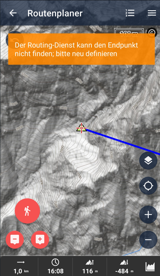
when using the route planner and putting a waypoint into an area where the routing engine can't find a way to (when using something else than manual drawing), this orange box pops up.
It mostly covers the undo button and only disappears after a few seconds. It would be awesome if you could narrow this box a bit so the button can be used.
At this point thanks a lot for your amazing support!
Best,
Vincent


 The same problem
Hello Lopus,
I perfectly understand your point. I was moving with this message up and down and was searching for the optimal place. There is anyway always something covered and the undo/redo buttons were less important than the content on the bottom of the screen. So sorry, I currently do not have an ideal solution. I have moved them down a little more with the hope, that it will help here and not cause any other collisions in different places. Thanks for understanding.
Jiří M. aka Menion
Thanks for your quick reply.
A few ideas how it might work. No clue if one of them is feasible:
- Making the box narrower only on the left side, so that the undo button becomes less covered (it is still clickable at the moment but very hard to hit every time), maybe in combination with a smaller font size within the box so that all text is still displayed or with more space "downwards" so that text can break in 3 lines
- Change the z-index of the box so that it is displayed behind the undo button
this suggestion could help too https://help.locusmap.eu/topic/27745-hide-warning-message-by-tapping-on-the-message
this suggestion could help too https://help.locusmap.eu/topic/27745-hide-warning-message-by-tapping-on-the-message
Hmm "tap to close" > oki, done :).
Hmm "tap to close" > oki, done :).
Replies have been locked on this page!