
This object is in archive!
New color for menu (blue + "baby blue") - very bad idea.
Not a Problem
Hello,
Please consider reverting the menu colors to their previous state. The new (bright light blue) colors are very annoying. The old shade was optimal.
I think the best option is to make it configurable from the "expert menu". Or just put it back the way it was.
Thank you.
 The same problem
Hello,
we understand that the new colors may not be to everyone's taste and that you need to get used to them. However, they have been chosen based on Google's recommendation for better contrast in both light and dark modes.
At this time we don't have a plan to revert them immediately back :-)
Have a nice weekend.
Zdenek, Locus team
Dear Zdenek,
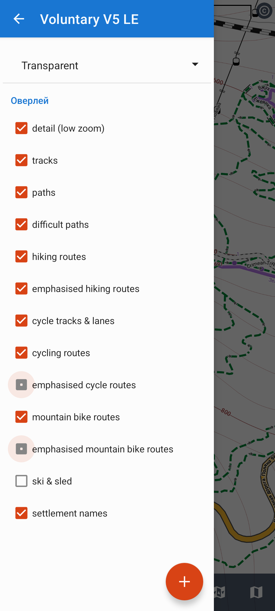
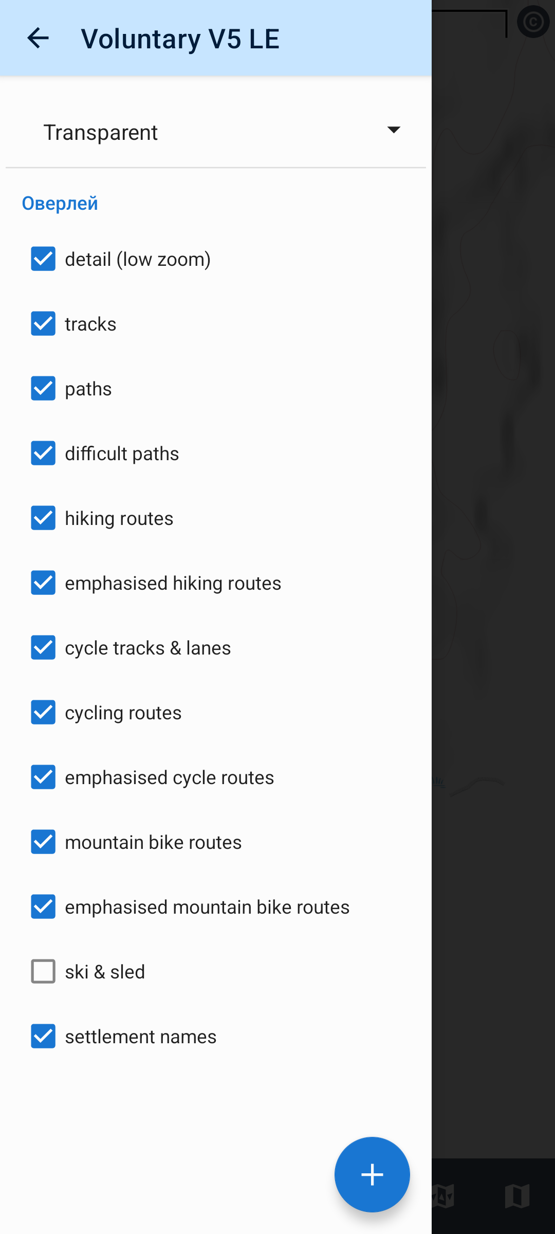
thank you for the answer. I will stay with critics, the new color scheme is not as good as described by Lous AS or recommended by Google. Please see the attached screenshot from the wms settings menue. The upper dark gray field ist near black, so that the action button In full black are nearly invisible. I had to check twice today to confirm my settings action properly. Please hold on developing the colors, to keep a minimum usability of this in all other fields superp software.
Thank you,
Veit
Dear Zdenek,
thank you for the answer. I will stay with critics, the new color scheme is not as good as described by Lous AS or recommended by Google. Please see the attached screenshot from the wms settings menue. The upper dark gray field ist near black, so that the action button In full black are nearly invisible. I had to check twice today to confirm my settings action properly. Please hold on developing the colors, to keep a minimum usability of this in all other fields superp software.
Thank you,
Veit
Hello,
yes, this is a bug. Thank you for the feedback, it will be fixed in the next version.
Regards,
Zdenek, Locus team
Hello,
yes, this is a bug. Thank you for the feedback, it will be fixed in the next version.
Regards,
Zdenek, Locus team
Hi Andres N.,
probably you have seen, that I also would better miss the new baby blue. I switched to have always the dark theme and most of the baby blue is banned. This is not the best solution, but helps hopefully for the next time till a new app setting for colour selection is implemented. I will try the dark scheme for a week or so...
Hello,
"unfortunately", as I said, we have no plans to change the colors again in the near future. Some tweaking on GUI and its colors is still in progress, but there will be no changes in colors, only deeper implementation, and unification across the app.
Regards,
Zdenek, Locus team
Hello,
"unfortunately", as I said, we have no plans to change the colors again in the near future. Some tweaking on GUI and its colors is still in progress, but there will be no changes in colors, only deeper implementation, and unification across the app.
Regards,
Zdenek, Locus team
Replies have been locked on this page!