This object is in archive!
How avoid dashboard overlaps with transient UI elements like recording button, navigation,...
Answered
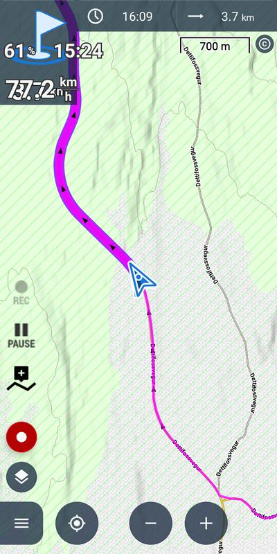
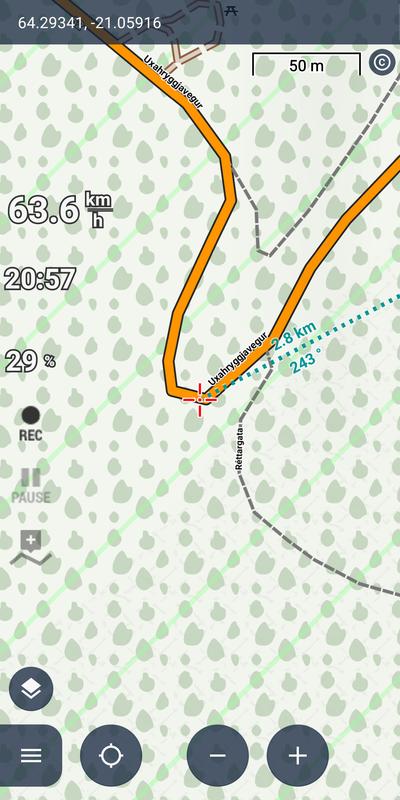
I migrated from Locus 3 to 4.25.1 and have major difficulties layouting a dashboard because Locus 4 has many more transient/temporarily visible UI elements, e.g. recording button, navigation bar, padlock icon, mini compass,... and size of map scale does vary greatly. So despite everything is looking fine during dashboard creation time and hours of using Locus, suddenly overlaps appear like at top left here

What are solutions for this?
I tried but failed with these approaches:
- Dashboard does not automatically resize or move and I did not find a setting described in https://help.locusmap.eu/topic/dashboard-does-not-resize-correctly
- I did not find a row/column/cell style "remaining space" for flexible auto-width / auto-heigth cells
- I did not find a row/column/cell style "as much left/top/right/bottom as possible"
- I did not find a "float around other UI elements"
- I did not find a way to show all possible UI elements during dashboard creation
Best solution is to position all dashboard elements in the middle of the screen – which is looking odd in my eyes when none of the transient UI elements are shown:


 The same question
Hi Georg,
firstly, we do realize the dashboard has glitches and it is awaiting a major overhaul. Nevertheless, there are options to place the dashboard values above, below, on top or bottom of the main screen and the top or bottom panels can resize it, see https://docs.locusmap.app/doku.php?id=manual:user_guide:tools:dashboards#position.
Hi Menion,
thank you for pointing out the positioning options; I was not any more aware of them.
Maybe it's rather quick and easy to add an option to dashboard's settings that toggles between transparent and function panel's background? 🙂
Detailed motivation: If I choose top/bottom screen overlay, the dashboard gets a rather dark background which makes the map hardly legible in the whole dashboard area – while in Whole screen overlay, only the text itself blocks the map readability – and the display does IMHO not fit visually appealing into the elegant look of Locus v4: Black icons on grey background have low contrast while all other icons have strong contrast, which is important for readability in strong sunlight. The dashboard produces a large dark block with rectangular corners while the rest of the screen is nearly completely bright except few rounded dark elements (I have empty bottom function panel and auto-high top + side panels).
If the big overhaul is needing some time, maybe one of the following changes is quick & simple to implement to make dashboard position setting Whole screen overlay useable without overlaps 🙂
BTW, in https://docs.locusmap.app/doku.php?id=manual:user_guide:tools:dashboards#position the heading "Position" shall be changed to "Settings" as this is the term in the app and in that dialog, also other stuff besides position can be configured.
Best regards,
Georg
Replies have been locked on this page!