
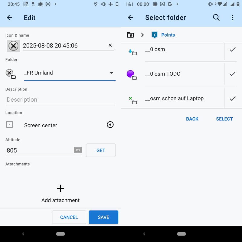
Add/edit point: MRU and/or favorite folders
When adding or editing point and selecting a different folder, I would like to select the desired folder more quicky. Two ideas that can be combined:
- In my experience, during one trip, I use only very few of the roughly 50 folders I have, so a few "most recently used folders" at the top would be most helpful. This concept is known from Vespucci, browsers (URL suggestions), and other apps.
- Across trips, I use some folders (e.g. TODO OSM, TODO edit details) regularily. These folders could be called favourite folders. This concept is known from Total commander, browsers (bookmarks), and other apps.
They could be displayed as one line per folder above the full folder list (and also additionally within the full list!). Between some visually prominent separation, e.g. a thicker horizontal line. An amount of maybe 5-7 folders seems to be the sweet spot beween too few & too many; maybe configurable, maybe a fixed amount.
Alternatively, they could be one MRU and one favs folder at the very top with a visually distinuishable design, e.g. inverted front + background color, prominent icon,... When taping "Favorites" folder, it simply lists the configured favorites like all folders show their sub-folders, so no need to restrict the amount. For MRU, the amount may be limited or not, the sorting shall simply be by last used timestamp at top.
------
Motivation in detail for those, that are interested:
I often want to add a point also while biking/walking. Then I want as few interactions as possible to fully focus on the way again as quickly as possibile – so it is not only an efficiency thing, but also has a security/health aspect.
While biking/walking, my mobile is shaken, so when I intend to scroll only, I often unintentionally tap a folder (then need to do more taps go back), and if I want to tap a folder, it's not really seldom I tap the wrong one.
The desire existed somehow for years, but got intense with new My Library UI where one must scroll more than in old library because
- more whitespace
- often, only 3 folders are visible at once (no idea why it's sometimes 3 and sometimes whole screen)
but less whitespace is not desired by me in this use case (in contrast to ultraslim topic) because mobile is shaken, so a different approach is required.
 I like this idea
agree +100%
To workaround this issue while away recently and intensive LM folder usage, I moved all the most used folders "close together" under the one parent folder. Now that moving & arbitrary folder depth isn't an issue, this was a good workaround.
agree +100%
To workaround this issue while away recently and intensive LM folder usage, I moved all the most used folders "close together" under the one parent folder. Now that moving & arbitrary folder depth isn't an issue, this was a good workaround.
Replies have been locked on this page!