
Consider making an even more compact style in the new library, especially for folder display
Completed
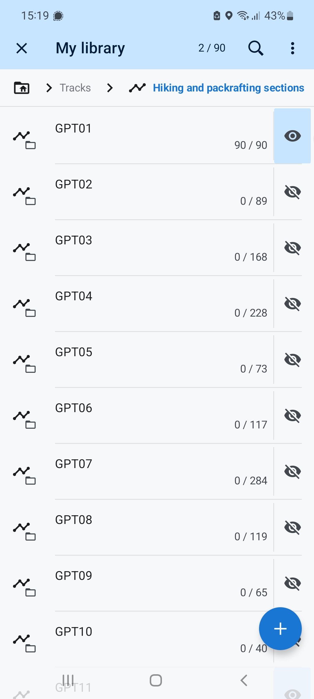
I overall like the new library, but I think the display of folders (expecially with a folder that only contains folders) could be made even slimmer. See screenshot attached - there is a lot of whitespace. Since there are 90 folders in the folder, I would appreciate having more in the single view.
I imagine a style that would have roughly half of the vertical space per folder, showing all the info as now in the screenshot. Basically as high as the eye icon. Then for tracks and points, it would only show icon/miniature, name and the eye icon (so everything would be on one line). I know this might not be for everyone, especially people with thick fingers would suffer, but I am quite sure I would love this. Maye it could be called "ultraslim".
Files:
Screenshot_2025...
 I like this idea
I would prefer to leave it as it is. Elements that are too narrow are more difficult to operate.
At best as an optional setting.
I would prefer to leave it as it is. Elements that are too narrow are more difficult to operate.
At best as an optional setting.
As only half (!) of the amount of points are visible in new MyLibrary and 75% for tracks, and this despite a whole row more space is now available (bottom icon bar is now a menu), I'd really like a third + forth option "compact slim" + "compact full" besides current list modes slim and full. Nothing fancy, just less whitespace and more dense font as we had before, i.e. as visible in top right compact but in contrast to lim (right bottom) including elevation meters, first words of description, and a bigger thumbnail. Just for comparision, same data in v4.23.1 (top) versus v4.30.1.7beta (bottom)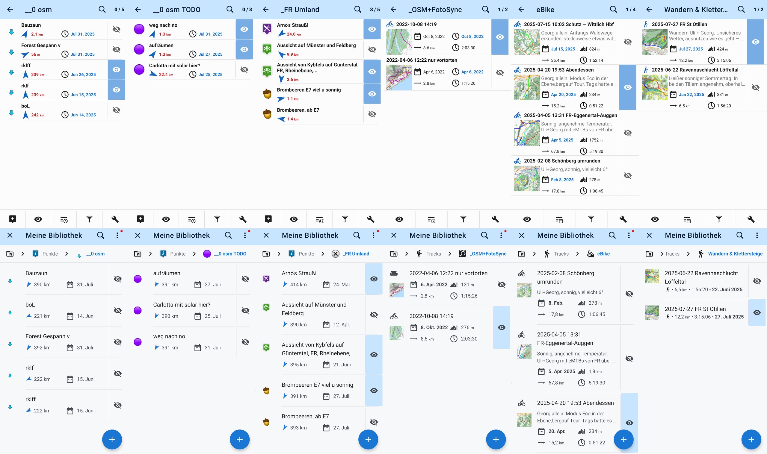
As only half (!) of the amount of points are visible in new MyLibrary and 75% for tracks, and this despite a whole row more space is now available (bottom icon bar is now a menu), I'd really like a third + forth option "compact slim" + "compact full" besides current list modes slim and full. Nothing fancy, just less whitespace and more dense font as we had before, i.e. as visible in top right compact but in contrast to lim (right bottom) including elevation meters, first words of description, and a bigger thumbnail. Just for comparision, same data in v4.23.1 (top) versus v4.30.1.7beta (bottom)
Also for points and tracks! There's waaay to much whitespace.
Also for points and tracks! There's waaay to much whitespace.
Hi guys,
thanks for the idea and detailed description (mainly @Georg D). Current design is heavily based on Google team recommendation. We are not always perfectly OK with all the suggestions, but in case of items in the scrollable list, we try to follow it and also keep it consistent across the app (at least new UI items we work on it).
So, for now, I would like to stick with current design. Creating even "more slim" layout is technically more complicated, because we will have to write completely new components next to these united re-usable items we already have. I understand that currently more-spacey design may be little un-usually compare to old design we all used for years. But it brings a lot easier manipulation in the field, easier separation of items and generally better usability and polished design.
I'll leave this idea open for now and we will see if number of votes will grow. I hope not to be true ... thanks for understanding.
The old thumbnail view was also too small. You couldn't see anything on it before either. That's not what it's there for. It's used to switch to the map immediately, and it's big enough for that. So please don't make it any bigger and use the space for important information.
The old thumbnail view was also too small. You couldn't see anything on it before either. That's not what it's there for. It's used to switch to the map immediately, and it's big enough for that. So please don't make it any bigger and use the space for important information.
I agree with Graf Geo. Everything should stay as it is. It's very good. You could set the style for folders and tracks separately. I would make folders slim and tracks full.
I think most people are satisfied. There are only 3 or 4 who want it differently. You can't please everyone.
I agree with Graf Geo. Everything should stay as it is. It's very good. You could set the style for folders and tracks separately. I would make folders slim and tracks full.
I think most people are satisfied. There are only 3 or 4 who want it differently. You can't please everyone.
Hi guys,
in the recent 4.30+ version is a little bit improved "Folder" style in the slim mode. I've found a minor issue in multi-line texts, so it will be fixed in the next version.
Anyway this is a result of the slim mode. Max two lines of the main text, name and stats in single line for folders, max. one line of the extra info text for points & tracks. That's all I want to do for now. Thanks for understanding.
You'll get used to it. You can't please everyone. Most people are very happy. downdrade Up to 4.2 is possible. The versions are on Drive
You'll get used to it. You can't please everyone. Most people are very happy. downdrade Up to 4.2 is possible. The versions are on Drive
Menion,
Thanks for this improvement.
Menion,
Thanks for this improvement.
Replies have been locked on this page!