This object is in archive!
Point icon on navigation screen
Completed
I want some feature which can display icon(s) of TCX on Navigation Screen.
1) On navigation screen,
Icon such as LEFT, RIGHT, STRAIGHT is displayed, but most of other icons such as Generic, Summit, Valley, Water, Food etc is NOT displayed.I want these icons will be displayed on Navigation Screen.

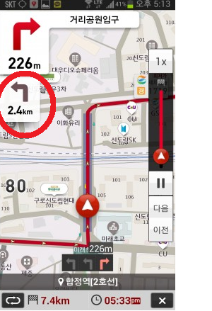
2) Just like other navigation (for car),I want a current icon + next icon (distance after current icon) is displayed somewhere on screen (e.g. below current icon)It helps for user to prepare the next situaiton.

I hope these two features will be implemented.Thank you very much.


 I like this idea
Good day trinitii, Willy,
I was just fixing some issue in navigation and because "next navigation command" was something I wanted for some time (I'm almost sure that here on help desk exists a topic with this feature-request), I said "why not".
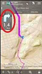
Here is a result together with your wanted icon for via-point as a small badge. Icon is just a small badge mainly because these icons are available in really low resolution and even on screenshot is clearly visible that "red flag" is not perfectly sharp.
So, should be? ;)
Hi Trinity,
I can support your first part of the idea. So I add a 0,5 + vote OK ?
But for the second part I have some reservations.
As I also want to keep enough free space to see the map.
By not covering the whole display with too many Icons.
Preferably not making the actual direction indicator smaller.
As that indicator now is also a nice active Big button.
So I do not reject, but just wait opinion of more users.
I suppose you know in advanced settings: Double instruction.
A next nearby (<100m) Nav instructions also is announced by TTS ?
Good day trinitii, Willy,
I was just fixing some issue in navigation and because "next navigation command" was something I wanted for some time (I'm almost sure that here on help desk exists a topic with this feature-request), I said "why not".
Here is a result together with your wanted icon for via-point as a small badge. Icon is just a small badge mainly because these icons are available in really low resolution and even on screenshot is clearly visible that "red flag" is not perfectly sharp.
So, should be? ;)
Menion that's incredibly fast !
For me it's not important, no need, as I noticed this proposal already in tcx forum discussion tread for some time.
But if Trinity asks, and it can be done, I have no reason to reject this.
I see one negative vote for now, but no comment ?
So Trinity welcome and be invited to see some of my other recent idea's about flexible adding via priority points and or adding free named info priority points by tcx<Generic> or gpx <flag>
Direct applicable in the Locus app and without need for external program.
If you like such idea pse vote + , if not vote - and add a comment or suggest eventual improvement.
This is great! Thanks
This is great! Thanks
Thank you very much!!!!!!!!!!!!!
I'm very happy that my idea is accepted and looking forward to next riding with locus!
Thank you very much!!!!!!!!!!!!!
I'm very happy that my idea is accepted and looking forward to next riding with locus!
I also like the idea of displaying the "next navigation command"! However, this feature does not seem to work in current Beta 3.18.9.4, should it? The changelog suggests the Beta has support for it.
Or do I maybe have to enable it first? I did not find a way to enable it in the UI.
I also like the idea of displaying the "next navigation command"! However, this feature does not seem to work in current Beta 3.18.9.4, should it? The changelog suggests the Beta has support for it.
Or do I maybe have to enable it first? I did not find a way to enable it in the UI.
For me it worked out of the box. In attachment: my testcircuit.
Aaaha during this comment edit I found !
Must set: In Navigation -> Advanced settings -> Tow commands at once: SET !
For me it worked out of the box. In attachment: my testcircuit.
Aaaha during this comment edit I found !
Must set: In Navigation -> Advanced settings -> Tow commands at once: SET !
Hello zosenbart, Willy (0709) observation is correct. Feature is controlled by also by "Two commands at once" settings in advanced navigation settings.
Hello zosenbart, Willy (0709) observation is correct. Feature is controlled by also by "Two commands at once" settings in advanced navigation settings.
Thanks for the hint. It's working now.
However, if it is dependant on "Two commands at once" setting enabled, I will almost never use it, because I normally use Samual (Morse code) voice for bike navigation and with this the "two commands at once" announcement gets very annoying and confusing...
Thanks for the hint. It's working now.
However, if it is dependant on "Two commands at once" setting enabled, I will almost never use it, because I normally use Samual (Morse code) voice for bike navigation and with this the "two commands at once" announcement gets very annoying and confusing...
You are right, Willi, maybe a special morse code sign for "zigzag ahead" would be useful. But that's a little bit off-topic here.
But I'm also fine with disabling the double audio notification for now.
As I understand it, in the final version, double visual sign enabled and double audio notification disabled will be possible?
First of all, I really thank you for implementing "next navigation command". It helps me a lot especially on long distance riding.
I made a tcx course file nearby my house, and tested it.
It works fine, But I hope
1) In this command area(upper), All of icons(badges) in TCX will NOT be displayed. Summit, Water(?) icon is displayed well, but others(food, valley, ...) does NOT displayed. All of icons(badges) in map area is displayed well.
2) In next command area(lower), NONE of badges is displayed. I hope badge will be displayed in next command area just like this command area(upper)
Thank you very much.
Replies have been locked on this page!