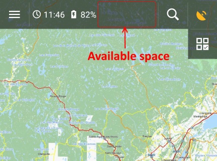
Survey question for Temperature is misleading.
The latest survey question (displayed at the top of the this forum) is misleading.
The choices appear to be simple:
Battery temperature in top status bar (under time & battery )
1) Useful information (display)
2) Not needed waste of space (remove)
The second reply suggests Temperature is a waste of space. This is demonstrably false because there is plenty of available space for it. In addition, Temperature was removed but not replaced by anything. So something that was useful to some users was removed and replaced by empty space.
What remains, time and battery status, is redundant because these two parameters are already visible in Android's status bar. In other words, by removing Temperature, a parameter not readily visible in Android, V3.3 created a less useful status box (more, not less, 'waste of space').
Temperature has always been quietly tucked away in the status box and used by a few people like myself. I see no harm to restore it for the convenience of those who use it. Removing it and replacing it with nothing is not an improvement.


 The same question
Good day Taras,
top status panel with time and battery info was made since begin, to improve usability of full-screen mode, where these values are not visible. Nothing more!
In your case, your top bar has only two buttons, because you removed one of them. Most of users has by default three and as I saw many times, many users try to put into top panel more icons then three.
So I still think that
And as I see from result of few votes, it only confirm that almost nobody needs this.
Solution? One of unlimited number of apps on Google Play like my favorite: https://play.google.com/store/apps/details?id=com.gsamlabs.bbm
Menion,
With 5 buttons in the top menu, none of the other info box options have enough space to display properly.
With 4 buttons, the info box's contents are displayed properly (except sunrise/sunset). With 3 buttons there's plenty of room to display each option properly.
With 4 buttons, there's plenty of room to display Time, Battery, and Temperature. It can be done using two lines, just like it's currently done for Title, Map, Coordinates, Track recording, Sunrise/Sunset, etc.
Locus Map already has the ability to get the battery temperature, it has the room to display battery temperature, and there are users, like me, who use it. Please bring it back.
Waste of (empty) space ? ? ? V3.27.1_&_V3.30.0
@ Taras: Good observation = indeed a very misleading survey question.
I too see no harm to restore it for the convenience of those who use it.
More Info: Version 3.30+ : See minor changes in list of news:
http://help.locusmap.eu/topic/battery-status-in-header-bar
"February 28" -> "Feb 28" ? September 28 -> Sep 28 ? etc... better ?
Waste of (empty) space ? ? ? V3.27.1_&_V3.30.0
@ Taras: Good observation = indeed a very misleading survey question.
I too see no harm to restore it for the convenience of those who use it.
More Info: Version 3.30+ : See minor changes in list of news:
http://help.locusmap.eu/topic/battery-status-in-header-bar
"February 28" -> "Feb 28" ? September 28 -> Sep 28 ? etc... better ?
Replies have been locked on this page!