This object is in archive!
Add 3rd option to track recording panel - "no panel"
Declined
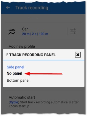
At present when track recording is enabled screen space is required for either a side or bottom panel. But note it is also possible for a user to access this functionality via Menu > More > Track Recording, or add their own function button. Below shows green side panel at bottom/ left, and my own function button on right:

To maximize map space/ reduce screen clutter/ simplify the screen, I suggest a third option in the track recording panel settings - "no panel".


 I like this idea
I've also noticed when in track creation mode the track recording panel sometimes interferes with the track "+" button, so another reason why would be nice to have option to hide all panels.
I've also noticed when in track creation mode the track recording panel sometimes interferes with the track "+" button, so another reason why would be nice to have option to hide all panels.
If you don't need panel - hide it...
edit
hint
settings
hide if you don't need for x seconds
set timeout to 9999
doubletap for hide panels
If you don't need panel - hide it...
edit
hint
settings
hide if you don't need for x seconds
set timeout to 9999
doubletap for hide panels
thanks @gynta but I don't see any option for hiding the left side panel - only top & right - menu > settings > Map - controls & panels - hence my topic.
I tried long tap & double tap on left panel, no help. I don't want to hide top & right panels, only the left Track Record panel.
thanks @gynta but I don't see any option for hiding the left side panel - only top & right - menu > settings > Map - controls & panels - hence my topic.
I tried long tap & double tap on left panel, no help. I don't want to hide top & right panels, only the left Track Record panel.
The double tap (on screen) was only for bottom, top and right panel. hm, for the left record tab
there is no way to hide.
..and about collision. i don't think there is any real situatio, record while draw.
But then you can double tap twice and there is no more collision :)
The double tap (on screen) was only for bottom, top and right panel. hm, for the left record tab
there is no way to hide.
..and about collision. i don't think there is any real situatio, record while draw.
But then you can double tap twice and there is no more collision :)
>i don't think there is any real situatio,
sure this is a real situation, I didn't "draw" the screen capture, the record panel is visible because of auto start, and I may want to create a new track any time, isn't that real enough?
double tap on the record panel is just the same as single tap - to make the full panel (start/ stop/ pause/ track name) visible
so is there current solution? I think my suggestion is valid for voting
Hmm collision is a problem that should be solved, thanks for it.
Anyway I personally see no reason for this idea. If you do not want a left green button, then use "Bottom panel" for track record and hide it after you start recording.
Hmm collision is a problem that should be solved, thanks for it.
Anyway I personally see no reason for this idea. If you do not want a left green button, then use "Bottom panel" for track record and hide it after you start recording.
Thanks Menion. As I've tried to explain, maybe not well and the idea evolves, but I try, the idea is that when the setting says "automatic" it means
>I personally see no reason for this idea
no worries if you don't see the reason, it doesn't seem like there is a direct solution at present and other users may like the idea
Replies have been locked on this page!