
This object is in archive!
During navigation beginning of the route drawn with non-bold line
Solved
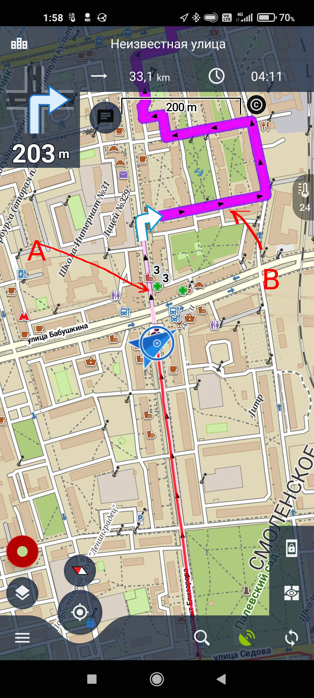
Yesterday I started a navigation along the route, but route line was poorly visible (half-transparent pink line used instead of bold ping) . Strange. It never happened before.
After precise looks I understood that only first few thousands of meters is draw with half-transparent line, after that line is bold. Edge between bold and half-transparent is moving =)
Attaching screenshots. I call line marked (A) half-transparent, and line (B) - bold line.
Question is - what is this? It's bit annoying, as navigation route it poorly visible. Did not find anything related in the manual.
 The same problem
Hello Victor,
We apologize for any inconvenience.
Please try restarting the application first and inform me about the progression.
Thank you
Have a nice day
Andrea
Hello Victor,
We apologize for any inconvenience.
Please try restarting the application first and inform me about the progression.
Thank you
Have a nice day
Andrea
Same after restart. Maybe it has something to do with original .gpx file. Attaching it.
Same after restart. Maybe it has something to do with original .gpx file. Attaching it.
Hello Victor,
Thank you for your message.
Unfortunately, we cannot simulate the problem.
Do you only have this problem with this route or does it happen to you on another route? Or can you try it?
Thank you for the clarification. .
Have a nice day
Andrea
Hello Victor,
Thank you for your message.
Unfortunately, we cannot simulate the problem.
Do you only have this problem with this route or does it happen to you on another route? Or can you try it?
Thank you for the clarification. .
Have a nice day
Andrea
Hi Andrea, hi Victor.
I know what's going on.
So with this file delivered! ( Strange trajectory though)
Navigate > Set line style basic. (Original purple)
Advanced settings > Frequency of commands set Medium.
But this should not happen due to following:
https://help.locusmap.eu/topic/improve-strict-navigation-mtb-comfort
The Locus-realisation was performed differently than suggested in the simple drawing by means of an unambiguous target distance.
I don't know to what extent the target distance is ultimately represented in this way? Something with xxx pixels and apparently depending onto the map zoom?
Method introduced for more optimal display when there are multiple (mtb) track overlaps or as in in this oh so strange overlapping City trajectory here ;-).
So the flaws that I notice are:
- At the start of navigation, the (standard) ticker purple navigation line track is immediately bleached out.
This should not be the case, this should only happen about 150 m further on later, after your actual arrow position
- The active purple line is (for this strange traject example) still much too long to clearly indicate the direction of the navigation line to follow at overlaps.
- It should even indicate perfectly the direction to follow in case of multiple track overlaps if you set the Frequency of command to None. (No Big Navigation Arrow available than).
For discussion see the original idea...but there was no further reaction for a possible optimization or a better more nice and fine graphical presentation ;-)
So once again is this the most optimal method to display the differences of the closest track with the farther away track ?
Is just paling out the most optimal presentation method or not ? Or is there a better graphic design proposal ? Anyone ?No graphical fine artists here?
I was thinking of high density contrast arrows on top of the tick purple navigation line for the first 150 m trajectory or so. Is + 150 m even the most optimal distance or is not ?
> Do you only have this problem with this route or does it happen to you on another route?
> Or can you try it?
Only this route, yet (well, I am not sure, I've seen other "broken" routes for complex crossing routes, but I am not sure how it was broken and if it was same issue or different or not-issue).
100% always reproducible with this route, even If I re-import the .GPX.
> At the start of navigation, the (standard) ticker purple navigation line track is immediately bleached out.
> This should not be the case, this should only happen about 150 m further on later, after your actual arrow position
yes, exactly!
0709, but did you reproduce it too?
Hello Victor,
I apologize for the inconvenience and the longer delay with the answer.
Your issue should be fixed in the new version of the application.
Then let me know about progress.
Thank you for understanding.
Have a nice day
Andrea
Hello Victor,
I apologize for the inconvenience and the longer delay with the answer.
Your issue should be fixed in the new version of the application.
Then let me know about progress.
Thank you for understanding.
Have a nice day
Andrea
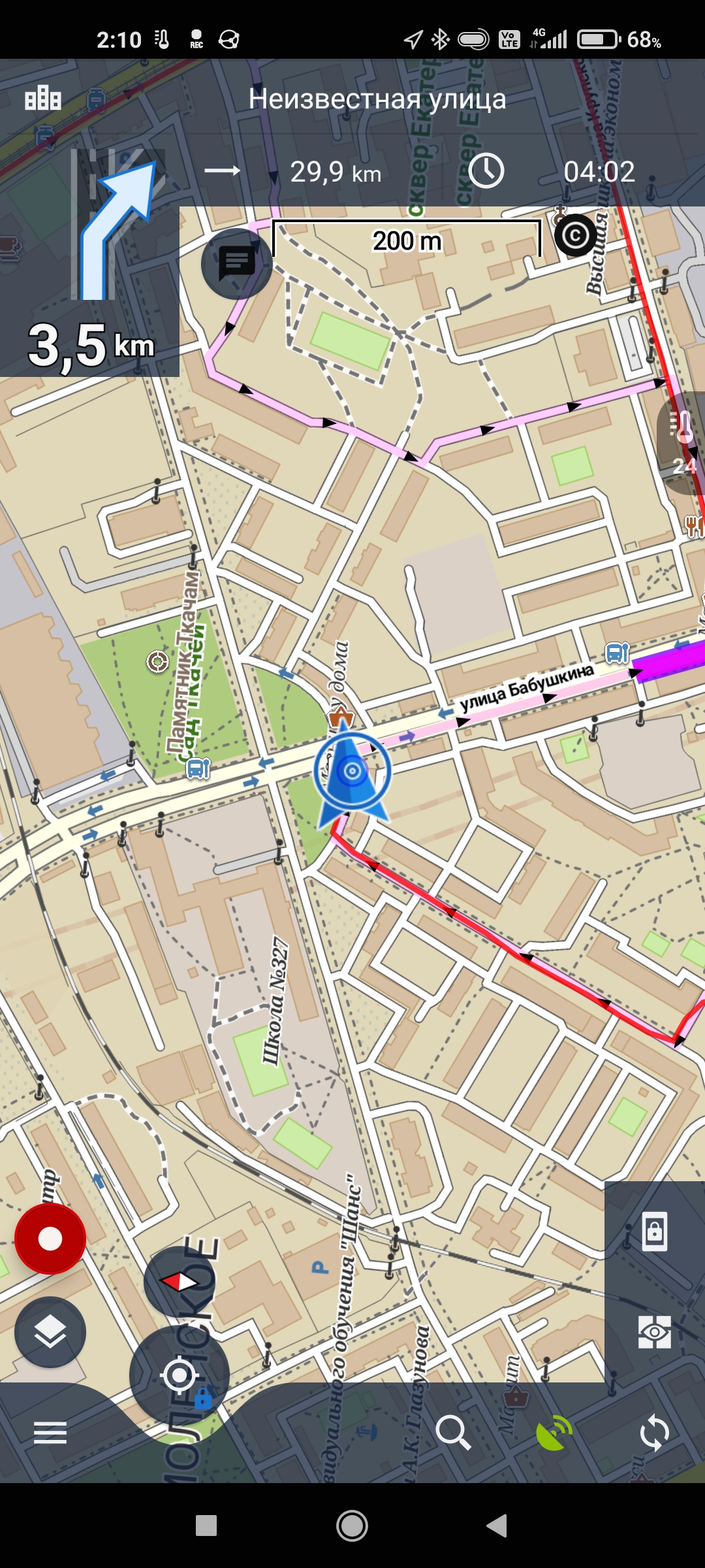
Does not look fixed. Attaching today's screenshots and exported route. Version for android - 4.4.1
Does not look fixed. Attaching today's screenshots and exported route. Version for android - 4.4.1
Today different track (attached), but same issue (attaching screenshots). Version for android 4.4.3
Today different track (attached), but same issue (attaching screenshots). Version for android 4.4.3
Hello Vector,
thanks for your feedback. You are of course correct. Seems that one additional issue remained in the drawing system of the navigation. I've detected and fixed this issue as well. Unfortunately new version will be probably published in November, not sooner. Issue has only esthetical effect, so believe this is not a problem.
Thanks,
Jiří M. aka Menion
> I've detected and fixed this issue as well. Unfortunately new version will be probably published in November, not sooner.
Ok, no problem. Will wait. Thanks!
> Issue has only esthetical effect, so believe this is not a problem
actually not only esthetcal. It's hard to use navigation when issue persists. Harder to understand direction to ride to.
You are right, not only aesthetical. Hmm, temporary solution should be in the navigation settings, choose other then "Basic" line style. In other cases, line is fully colored = no difference between part you already passed and part "before".
You are right, not only aesthetical. Hmm, temporary solution should be in the navigation settings, choose other then "Basic" line style. In other cases, line is fully colored = no difference between part you already passed and part "before".
Thanks
Thanks
> I've detected and fixed this issue as well. Unfortunately new version will be probably published in November, not sooner
seems still not fixed? attaching screenshot, version 4.5.5.
> I've detected and fixed this issue as well. Unfortunately new version will be probably published in November, not sooner
seems still not fixed? attaching screenshot, version 4.5.5.
Hello Victor,
thanks a lot for the extra information sent over the private ticket. Few more iterations and we will for sure fix this old problem :). No seriously, I've found a reason why the current track displayed highlighted part incorrectly, so please check it with the next app version. I'm sure, it will be ok.
Replies have been locked on this page!