
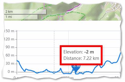
Add to graph cant tilt of route. See SCR. RIDE WITH GPS. At the same time, kilometers labels would also be suitable. See SCR. I am sorry for my bad English.
This object is in archive!
Display slope at point of mouse on Chart
Completed
It would be quite useful to also view the current slope at the point of mouse on the Chart along with Elevation & Distance.
Files:
Screenshot_2021...
 I like this idea
I agree with both points, but that should probably be separated into 2 ideas (inclination and km markers).
Another way to display inclination might be using color coding (like Brouter). The one in elevation chart is more detailed, color coding might be better for quick check. May i ask what is SCR?
I agree with both points, but that should probably be separated into 2 ideas (inclination and km markers).
Another way to display inclination might be using color coding (like Brouter). The one in elevation chart is more detailed, color coding might be better for quick check. May i ask what is SCR?
Hi, thank you for this idea. I am currently working on the improved (extended) charts. Slope will be included. You can expect it in December :).
Regarding the distance markers - this is another idea. @Josef Žajdík, please, can I ask you to create it and add some details to description. Thanks
Hi, thank you for this idea. I am currently working on the improved (extended) charts. Slope will be included. You can expect it in December :).
Regarding the distance markers - this is another idea. @Josef Žajdík, please, can I ask you to create it and add some details to description. Thanks
https://help.locusmap.eu/topic/24036-add-inclination-to-the-graph
https://help.locusmap.eu/topic/24036-add-inclination-to-the-graph
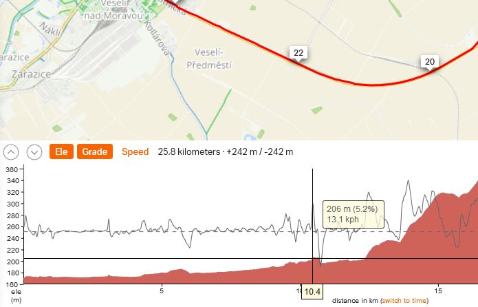
Hi there, improved charts are deployed to the production. One of the new features is added slope. I believe this is more that what was asked here :).
Hi there, improved charts are deployed to the production. One of the new features is added slope. I believe this is more that what was asked here :).
Ahoj Ondřeji, vypadá to dost dobře. Za sebe bych měl asi jen tři spíše podněty než chyby.
1) u delších tras je zobrazení více údajů takové nahňahňané kvůli tloušťce obrysové čáry, nemohla by být trochu tenčí?
2) hodnoty rychlosti v legendě by to chtělo zaokrouhlit na nějaká celá čísla. 7,2 nebo 14,4 je zbytečné.
3) nemohly by se v bublině zobrazovat vždy všechny údaje? I když třeba nemám zobrazený profil Slope, při najetí myši by bylo hezké kdybych viděl, jaký sklon v tom místě byl. Stejně tak s rychlostí. Písmo v bublině může být klidně trochu menší.
Díky, jinak dobrá práce
Wonderful. Now the last reason for having to use brouter.de is gone :)
I just noticed that both elevation and slope charts even show min+max - thats a really nice little detail!
The only enhancement i can still imagine is coloring the course by slope too (and on recorded tracks by other metrics like speed/hr etc - as what strava or garmin do) - but that could be a separate idea with much lower priority.
I would also vote for showing slope data in the bubble even if slope chart is not shown - and i would round the slope values to the nearest integer too.
Very small cosmetic bug is the "<" handle for hiding the route planning panel over lays the Elevation checkbox (it still could be clicked, but is a bit finicky).
Another observation - looks like the elevation data is a bit coarse. I see rather large and sharp steps of slope on the asphalt road - it would probably be better to do some smoothing there so that it does not look so discrete.
And onother little detail - when you do a mousever over elevation+slope chart - the corresponding position on the map shows correctly. But it does not work the other way round - if you do a mouseover on the route in the map, the corresponding place in the chart is not shown (it would be also great if the map was panning when navigating by the chart - so that i would not need to fiddle with the map - to avoid chaos, it would suffice to only recentre the map after the click)
But overall - an excellent job!
The slope is displayed exactly for this point. I have checked a few points and they are not correct. I have a mountain with 12% and there are values displayed up to 27%. I think it comes from inaccurate elevation data.
A solution would be not to display exactly for this point. But an average value from this point 50m before to 50m after. Or 200m. Possibly adjustable.
So the information would be much more helpful.
Translated with http://www.DeepL.com/Translator (free version)
Replies have been locked on this page!