This object is in archive!
Remove top line navigation direction icon
Completed
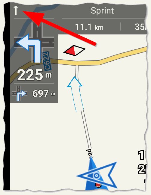
See icon on left side of top line in screen capture below. The direction (straight ahead) is wrong, and anyway redundant. The correct direction as shown by the bigger icon is Turn Left in 225m. I suggest the top icon be removed. 
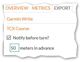
This particular route was created with RideWithGPS then exported as TCX
Course with turn instruction 50m in advance of the actual turn (although it could have been created within Locus):

The direction for top icon is only based on geometry of road at the coordinate of the turn instruction, however this coordinate is not always the actual turn, as in this example. Advance turn instructions have advantage (naturally) of giving cyclist more time to prepare for turn.


 I like this idea
+1 agree
+1 agree
Hello guys,
this is probably small missunderstanding. Or better, wrongly choose icon.
This line display name of street. In case of this icon, it display "current street". If you tap on this line, Locus change icon to small right arrow and it will be street after next navigation command, so "next street". I just wanted to display some information if street name is current street or next.
I'm not sure about second part. There are some problems with using exported TCX track? If so, please share this track with me for test. Thank you.
The above arrow is indeed a VERY functional Button ! ( A misleading Icon ? A better Icon suggestion ?)
See pse by tcx info here: Realised = BOLD !
http://forum.locusmap.eu/index.php?topic=4178.msg42614#msg42614
And use the small example tcx file in attachment here:
Simulate: Use virtual navigate, by the well known system shifting the center map postion.
In a Coursepoint (By any nice performant router) : Extra Nice Information can be added in the <desc>attribute.
For example a "Streetname" or maybe in a "Future Locus edition" some usefull info delivered by B-router ? Example: "Cobble stones"
In attachment example: Street names available in <desc>:
Little arrow button pointing forward: The information top field line in map display does show you the actual streetname you're driving at.
Little arrow button pointing to the right: The information top field line in map display does show you the streetname AFTER the next direction order.
Actually this extra navigation message is mostly only showing you the: "Unknown street" message" ;-) Not very informative.
Set the navigation instruction in advance. Only necessary for some imperfect (diplomatic talk) Garmin cycling equipment !
As for example when using Edge 705 cycle gps series.
If not advancing this turn information by this trick, users do receive a turnwarning mostly just AFTER passing a turn.
Locus is smarter without such a hack. Locus set the warning at the turn and than generates the navigation message before arriving at the turn. Advanced warning (timing) to be set by personal preference(s) and according to speed in config.cfg.
Advancing all turn indications (L/R/S) 60 meter before turns in a city environment with many small and short streets. Only results in a messy map display. Not nice ! Really not. (I was an Edge 705 user).
@0709 - "Advancing all turn indications (L/R/S) 60 meter before turns in a city
environment with many small and short streets. Only results in a messy
map display. Not nice ! Really not. (I was an Edge 705 user)."
it's completely up to the user of course, for me it is great feature in RWGPS; but really just "side issue" for this topic
I would have a more radical idea to (by user preference) remove completely all navigation fields so they can be replaced by user's dashboard. This will require dashboard repository includes Next turn symbol field with interactive behaviour (not tap-proof). I could open context menu from it.
With auto-activate dashboard on specific activity, the Locus built-in navigation/guiding dashboard could be completely removed and Locus will create default editable dashboards for navigation and guiding on first init.
By now I have during navigation user dashboard overlayed on top built-in. By my suggestion there would be only one and with less updated fields which I find more clean.
Replies have been locked on this page!