
Please add an option to use the old POI display from locus 2.19
Disclaimer: This is slightly bitchy, but only because I like this software alot.
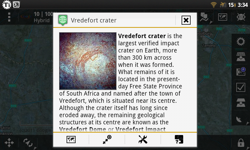
The new interface when a POI is clicked is an absolute downgrade. My primary use for Locus involves browsing geospatial data....where information is contained in the description field.
After upgrading to .20, instead of pulling up a POI and instantly seeing what I'm looking for, the -entire- screen is filled with:
* a minimap, which is neat but not worth the 150 pixels that should be displaying a .kml's description field.
* a coordinate display that's excessively wasteful of vertical space, and:
* less functional than the old, elegant, single line display that let me -copy- the coordinates via long press*
* a category display that trolls: it -looks- like one should be able to change the category. But it's not.
This is on a phone where I've already increased the screen density.
TLDR: Yes, I have to scroll down...it's not alot of work, but it's an extra annoying, pointless step.
A REALLY annoying step, when it's repeated over...and over...and over... Apologies if I sound harsh, I'm not angry, just really adamant about this, and I do use Locus alot :>. It's affected me enough that I've gone back to .19.
(.19 is still a good panoramio browser, btw)
There was nothing wrong with the old display except for the narrow horizontal space. If including the old layout (perhaps with the horizontal width removed) is unfeasible...
*please* add an option to put the title and description above everything else.
(and consider replacing the awful coordinate display with the one from .19. It was really elegant and slim, compared to the new hippopotamus).
PS: Please ^^ I *hate* to see good things get mangled by sweeping UI changes that degrade functionality and usability. Like firefox's next version. =[
BEFORE
AFTER
 [/img]
 The same problem
Hello Atomic,
appreciate quality feedback, thank you.
---
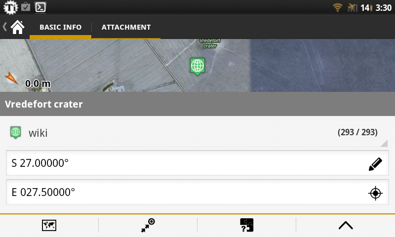
With your screen, I see two major problems
1. You have tablet (or highly modified DPI), but your android is still old 2.X version. I do not optimized this screen for high DPI for older devices. On 4.X Android, map is only at right corner and a lot smaller.
2. You use advanced edit for coordinates, so they appear on two lines instead of single line.
Thanks to this, your desciption appear a lot lower then usually can on tablets.
---
Second - from my point of view, is important to look on a things from overview of all users and choose best options that will be useful for most of them. In prev. versions were three screens for points. Dialog you see on map, screen for editing and also geoaching has own screen. Purpose of this screen is merge them all into one.
---
Some of problems you wrote about are now solved in 2.20.1 version. Also you won't probably see a map, but not because of your topic, but because 2.X Androids has serious problems with low memory, so I removed map on these devices.
---
I personally like new screen and I received more possitive responses on it, so sorry, there are no plans to allow to display old dialog. Planned are only improvements on this new system
Hello Atomic,
appreciate quality feedback, thank you.
---
With your screen, I see two major problems
1. You have tablet (or highly modified DPI), but your android is still old 2.X version. I do not optimized this screen for high DPI for older devices. On 4.X Android, map is only at right corner and a lot smaller.
2. You use advanced edit for coordinates, so they appear on two lines instead of single line.
Thanks to this, your desciption appear a lot lower then usually can on tablets.
---
Second - from my point of view, is important to look on a things from overview of all users and choose best options that will be useful for most of them. In prev. versions were three screens for points. Dialog you see on map, screen for editing and also geoaching has own screen. Purpose of this screen is merge them all into one.
---
Some of problems you wrote about are now solved in 2.20.1 version. Also you won't probably see a map, but not because of your topic, but because 2.X Androids has serious problems with low memory, so I removed map on these devices.
---
I personally like new screen and I received more possitive responses on it, so sorry, there are no plans to allow to display old dialog. Planned are only improvements on this new system
Honestly I'd consider the new screen an improvement save for the large vertical offset of the description, and the coordinate display...those two issues mitigate the improvements and make the screen a downgrade. Perhaps I should have chosen a different title:
"Please add an option to display the title and description on top"
In config.cfg would be fine. Disabling gui_coordinate_panel_advanced_mode helped a little, I forgot about that, sorry. The elimination of the minimap, will help too, but only if I don't upgrade the OS. Vertical space would still be eaten with things like category, ui whitespace, and the 'description' string blocking the actual description.
"gui_poi_description_first" or such would make poi ui optimized for viewing as it was in .19...better infact, with the width improvement.
FYI, this isn't a tablet, it's a Samsung epic4g with 512 megs of ram, and runs everything quite well. The DPI is 195, and the OS is 2.3.* because there would be memory issues in 4.*
As I told in the other post (link) the new Geocache screen is very slow. So if you are not able to speed it up, maybe the easiest way is the call the old version out of the repository and an a switch in the config!?
As I told in the other post (link) the new Geocache screen is very slow. So if you are not able to speed it up, maybe the easiest way is the call the old version out of the repository and an a switch in the config!?
Sorry, but this won't happen. Current screen was created to merge three different screens into one (dialog on map, geocache screen and editing screen), so add back old code is for me worst possible solution.
Anyway this issue is mainly about visibility of description part. In latest version were added possibility to hide map preview, which I hope almost solved this problem. I know, it's still not as before, but your (@atomic dryad) use-case is very specific.
I've not noticed speed issues, and was more carping about vertical space than a desire for the old screen. (perhaps the title could be changed)
That said, with the minimap hiding it's better, but would you consider removing 'description'?
I've not noticed speed issues, and was more carping about vertical space than a desire for the old screen. (perhaps the title could be changed)
That said, with the minimap hiding it's better, but would you consider removing 'description'?
I think major problem here is that you have tablet with 2.X android. Because I plan probably on this year, remove support for 2.X devices, I also do not optimized this new screen on 2.X tablets, and leave it in default layout, no matter how big your device is.
On attached screenshot you may see how it looks on 7'' tablet with 4.X Android. All labels are on left side, so it do not waste space above fields.
I understand that it do not solve your issue, but I think that with ability to hide map, wasting of space above real description is minimal.
I support Menion's decision for what it is worth! At some "point" it is best to leave the restrictions and problems of old OS versions behind. If not, then why would they improve the OS anyway? Mobile is fast paced and the competition is fierce.
I support Menion's decision for what it is worth! At some "point" it is best to leave the restrictions and problems of old OS versions behind. If not, then why would they improve the OS anyway? Mobile is fast paced and the competition is fierce.
Replies have been locked on this page!