
V4 GUI improvement by offering more freedom of panel placement
In a nutshell: Please allow spacial customization of panel to make functions easier to reach by thumb during one handed usage. Could become redundand if "alternate menu panel" can be opened not only by side panel button (see https://help.locusmap.eu/topic/28030-alternate-menu-panel-questions-concerning-usage-and-settings).
Currently, all side panel content is at very bottom and very right. I am a tall man with big hands. For me, reaching the bottom right of the screen with the thumb is a very uncomfortable & cumbersome thumb movement during one handed use of the mobile – especially when I need a really firm grip (e.g. while hiking or on a boat) and thus my thumb's base is at the device's edge at ⅓ to ½ of the device's length, so far away from the bottom right corner where bottom+side panel are "magnetically attracted" to. You can see it in the video. Thus, v4 is not an improvement in ergonomics/usability for me compared to side panel of v3 which was attracted to top right – so most of its content was easy to reach, while now, most panel conent is hard to reach.
To really improve ergonomics for all hand sizes plus for 1 as well as 2 handed operation, I would like to
- have a empty bottom menu ending below the big "center view" button, so I can see the map instead a useless (because empty) menu band
- freely decide at which point in device's length the side panel shall be centered (or, if it's easier to join with current implementaion, to which y coordinate it is attracted to / it starts from). So instead of always bottom in v4 and always top in v3, I could choose ½ or ⅔ of device's length, measured from bottom.
- freely decide how many columns the side panel has instead of a fixed width of 1. This reduces the heigth (top & bottom of a tin long bar are hard to reach) while increasing the width (moving to the middle which is easy to reach)
An alternative would be a positions manager for freely distributing buttons across the screen, as mentioned in https://help.locusmap.eu/topic/make-the-bottom-panel-more-customisable#comment-14206 – which would IMHO be pretty simple to implement: Just make all function buttons selectable in the dashbaord editor 😎
A mockup of the current and my personal future layout that brings all buttons within easy reach of my thumb: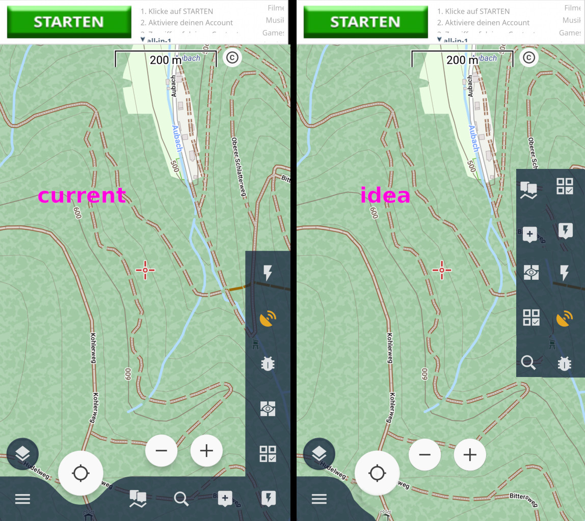
Please note the zoom buttons + and - are by intention not at the very bottom and by intention a little more to the left, because that position is much easier to reach by thumb. You can see that in the video.
Yes, I am aware that it looks not as elegant as current layout, but it is much more ergonomic. Same as with shoes – elegant high heels are usually not chosen for activity/walking but for sitting and not using them 😉
Centering & zoom buttons color in the "Light mode" (for best visiblity)
-
27%
-
73%
 I like this idea
@Menion: Thank you, now I understood it's "Completed" because you went through my 3 points and implemented what you see fitting to the overall UI approach. FYI, "Partial auto-hide" is not exactly what I wanted: While it causes a layout as desired by me, it does so only while hiding mode is on, i.e. only while I do "nearly nothing" – as soon as I become active and double tap the map to interact with side panel, the bottom panel has full size as if it was filled while it is in fact empty.
Still hoping dashboard approach will be taken and one handed usability will finally become really comfortable 🙂 after it became already a little less uncomfortable in the course of this topic.
Georg, I wish I could add +10 for # votes. I've mentioned a few (many) times on similar topics. I find some LM4 ergonomics a backward step compared to LM3, and the closer spacing, lower contrast of the zoom buttons very problematic with gloves hands or even fat fingers. Menion added some "ignore" space between these buttons but I never found it an improvement. Why so close together??
Your idea mockup could be refined even further to optimize screen space:
Unlike buttons on the other panels, it is not possible to increase the size of the bottom buttons - /locus/config.cfg dev_gui_main_rescale_value=1.2 is ignored
Another idea: offer "blank" button(s) which could be used as a "spacer(s)" between functional buttons. I did have a help topic on this subject from many years ago, but lost amongst 1000's, and the help "search" system is very rudimentary.
other related topic https://help.locusmap.eu/topic/25808-add-zoom-buttons-to-list-of-function-panel-buttons
Andrew, your reply shows perfectly that one standard layout won't satisfy everyone – you'd prefer the zoom buttons to move more to the bottom right to increase padding (useful during glove useage), while that position is exactly what I do not want. Both of us would find satisfaction if button placement was more flexible/customizable.
I like both of your ideas, so to add the zoom buttons (like in v3) as well as "blank spacers" (which is an already existing feature but in dashboards only) to the available elements of the button panel. I never really understood why some functions appear only in dashboard, some in quick settings, some in button panels,... because in the end, all of them are icons that do trigger some action if the prerequisites are met (e.g. GPS signal exists), so why not having all icons available in all customizable GUI elements?
Hi guys,
I do not like these UI tasks too much to be true. They have two big issues
---
So, what may I do for you now?
---
Permanent reduction of the bottom panel, two vertical functions panels etc. are nice, but these changes are major and may take a few days to implement properly while keeping the existing system working. This will have to wait on the next generation of the Locus Map, sorry.
So is there anything simpler (I know, only myself may say if this is really simple to implement) that may help a lot? Are zoom buttons in the function panel that thing? Anything else?
Hi guys,
in the recent 4.10 version was introduced an option to align the side functions panel in the middle (a little step back to v3 version ...).
I was thinking it should be enough, but today I've decided to add one more help, mainly to the zoom system, so in the next app version will be also an option to increase the size of zoom buttons as visible on the screenshot. Hope this helps.
Jiří M. aka Menion
nice, although zoom buttons still frustratingly close together
nice, although zoom buttons still frustratingly close together
@menion in your screen shot the theme is dark right? I like the high contrast (dark) of the zoom buttons, but overall prefer the light colour theme elsewhere. Impossible combination @ present.
@menion in your screen shot the theme is dark right? I like the high contrast (dark) of the zoom buttons, but overall prefer the light colour theme elsewhere. Impossible combination @ present.
I do not really understand why this topic is marked as "Completed" 🤷♂ I – as the original author – can not yet place the buttons in a way that they are comfortable to reach for me in one handed usage. Hence, I simply hope the topic stays visible for the dev team despite it's marked as "completed"
I do not really understand why this topic is marked as "Completed" 🤷♂ I – as the original author – can not yet place the buttons in a way that they are comfortable to reach for me in one handed usage. Hence, I simply hope the topic stays visible for the dev team despite it's marked as "completed"
Currently only the map screen Center Map & Zoom buttons are affected by the Dark Theme setting i.e. all other buttons & panels always have a fixed dark background. Could the Zoom buttons at least follow or allow the same convention i.e. fixed dark background, independent of the Dark Theme setting? Dark buttons on a light themed map provide better daylight contrast - as demonstrated @menion on your own screen capture!
Currently only the map screen Center Map & Zoom buttons are affected by the Dark Theme setting i.e. all other buttons & panels always have a fixed dark background. Could the Zoom buttons at least follow or allow the same convention i.e. fixed dark background, independent of the Dark Theme setting? Dark buttons on a light themed map provide better daylight contrast - as demonstrated @menion on your own screen capture!
Hello guys,
@GeorgD
the bottom panel visibility may be set to "Partial auto-hide" that do exactly what you need. I've also created an option to center side function panel to the middle of the screen. And the last points > multiple columns for the side function panel is something, I do not agree with so this won't change.
@Andrew Heard
good point with the color. I'll think about it.
Replies have been locked on this page!