
UI regresions with new folder structure
Firdtx thanks for the general idea! However in oractice it has some drawbacks:
1) When I launch library through a dedicated button on my panel, it opens correctly opens in the same folder I last worked. So far so good. But when I press Android "back" button, it goes one level up and does notngo back to map. This is infuriating!
2) there seems to no longer be a way to display or hide a folder with one click as before. Instead a menu opens when the visibility icon is pressed. Please return a way to do this with one tap (maybe the menu can be long press?)
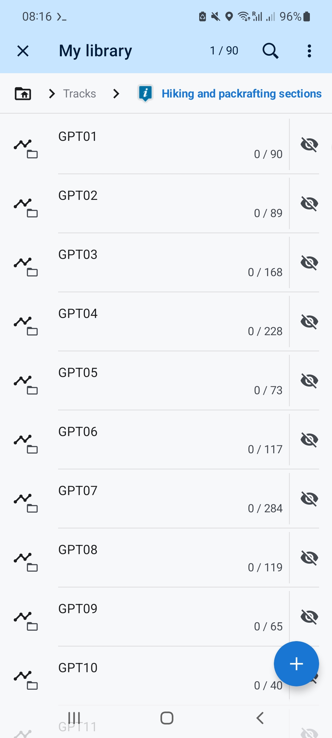
3) In a folder that has only folders in it, there is a lot of (white)space wasted (see screenshot). Could please be done something about that?
4) The upgrade reseted all my visibility settings (everything was hidden).
5) Folders with only folders in it (that have tracks in them) have a generic waypoint icon to it: see screenshot too. That feels weird.
6) When I have a lot of folders in a folder and I scroll down tomopen a folder and then go back, the view resets to the top. This is suoer annoying. Could please be the visibility remembered (so going back or up would still show the folder I was looking at).
7) When I open library (tens of thousands of items in it), it sometimes showed "loading" for several seconds. That did not use to happen. But now I am unable to reproduce that - I guess it cached something, so I am just moting it here, if I notice a pattern, I would report back.
 The same problem
@Tomas Hnyk:
1) Closing the library works with the X button at the top left and not with the back button.
2) When I click on the eye icon to the right of a folder, a menu with 3 options appears, including "Dispay all" and "Hide all". So two clicks.
3) This was discussed during the long test phase of the new MyLib version (see this topic). I no longer know why the list could not be made even more compact.
4) See this topic.
5) I cannot reproduce this.
6) You want to keep the scroll position? That's probably not possible.
7) Since I don't have that many items, I don't have the problem.
2: It used to be one long click to show or hide everything. now it's 2 clicks. I don't think that one long click is much faster than 2 short ones. But I would also prefer it.
3: you are using the slim style. In full style it is less white. I would also use the slim style because it is tidier and clearer. But then tracks are also displayed in slim. and I always want tracks in full. That's why it would be nice to be able to select Slim and Full Style for folders and tracks7points separately.
I don't care about the waste of space. But I would like my own icon to be bigger and the small folder to be gone.
7: Many titles were already loading before. Especially with tracks. That's why I often use the function to display the first 50 tracks. Unfortunately, the function is somewhat hidden. It could appear with a long click on the folder.
1) Yes it does, but it is far (up, difficult to reach with one hand) and it is not how it was working previously. Previousky, back went back from library. In general, in all other views/tools I use, "back" goes to main screen. only here it does not. It is inconsistent. Better aproach would be to replace the "x" button at the top with aback button that would apply to going up one level and keep the main app button consistent with everything else in the app.
2) Yes, precisely, this was one click previously: a regression. Previous behaviour, where the menu only appeared when it was unclear if one wants to unhide only a previously shown subset of items was much preferrable. Oh, and now I see this is gone! That is a shame!
3) Specifically discussed for the case of folders? It seems the same size is used for folders and for tracks. But a lot less info is shown for folders.
4) Ok, I repaired it manually, I can live with that.
5) I think it might come only from importing such folders when upgrading. When I try to edit the folder and change its icon, the nice blacks one used for ither folders that do not have this problem do not seem to be accessible? The info icon is just ugly!
6) If 1) was solved, this would a lot less painful. I am by mistake going up a folder all the time, losing my scroll. However, I seem to remember how "my library" used to work, it remembered the scroll position.
7) The slow loading is random. I sometimes get a "loading" display, but it does not happen as a rule. Probably some caching. But it does feel a lot more sluggish.
A completely new library brings with it changes that you may have to get used to. I find it very practical that "back" takes you back one folder level. I got used to using the X button after a short time. (1)
The displayed tracks/points can also be quickly hidden temporarily using the brush icon next to "My library" in the map-screen content panel. Or you can put "My library" in the right sidebar, then just long-click and "Hide all" appears.
Of course, things have changed and not everyone will like everything the same, but the improvements outweigh the changes and the rest is a matter of getting used to. And of course not everything is perfect, but Locus is constantly being developed. :)
Thank you Graf Geo. The x fits so far. There are also other options to get to the map. e.g. preview image. I am also in favor of keeping it that way.
I am not satisfied with everything either. But it's a start for something new. Some improvements are already underway. and there will certainly be more to come. I think we have to wait for more feedback from others. and then we will work on the little things. and some will also require suggestions for improvement.
Translated with DeepL.com (free version)
Issue 7) reported by somebody else here:
https://help.locusmap.eu/topic/36964-new-library-has-varying-performance-sometimes-very-slow
6) Here it is suggested scroll position used to be remembered on Android: https://help.locusmap.eu/topic/36292-remember-the-my-library-vertical-scrollbar-position I seem to remember that too. If it is confirmed scroll position used to be remembered, I will fill a separate issue.
As for 5, the nice icons are in "Default (tracks)", so that is no longer a problem. During import, I got "point" icon for some folders that only have tracks, so that probably should not have happened, but is not a big deal and by now most people have already transitioned, so just let us let it be.
4. is solved as well.
3. I wrote up here : https://help.locusmap.eu/topic/37343-consider-making-an-even-more-compact-style-in-the-new-library-especially-for-folder-display This would be nice to have.
2. I made it into a separate issue: https://help.locusmap.eu/topic/37343-in-the-new-library-make-it-easier-and-quicker-to-hidedisplay-content-of-a-folder
it is not a dealbreaker but is still annoying.
1. I wrote up here separately: https://help.locusmap.eu/topic/37343-android-back-button-behaves-inconsistently-in-the-new-library - it still drives me crazy.
With that, I think this can be marked as solved. It is more practical to have one thread per issue, I think.
Replies have been locked on this page!