
Option to not show the top left navigation arrow boxes
Hi Menion,
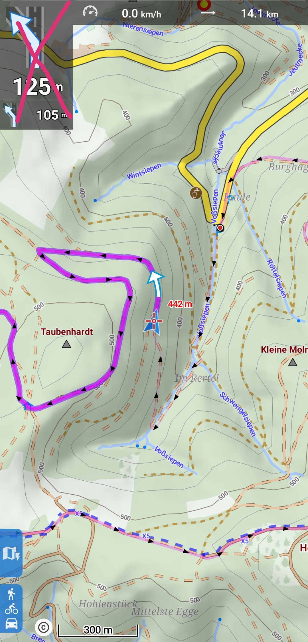
in the German community we have a discussion going where some people, depending on how Locus is used, do not need the navigation arrows to the top left.
https://forum.locusmap.eu/index.php?topic=7016.msg60090#msg60090
I realized that I also do not need them for informational purposes (in a hiking situation, that is). I just use it to tap there, in order to access the functionality behind it, like stop nav, change volume etc.
In a hiking situation I listen to voice nav commands. If the situation is unclear, I need to look at Locus. In such a case, the top left arrow does not help. It is useless, because it holds the same information as the voice command. Only looking at the map, the route and the arrow which is displayed ON THE ROUTE helps to find the right way.
Most available space for map is always good. Personally I am using Dashboards when navigating and I even had to work around my dashboard (start right beside that arrow box instead to the left of the screen). But that's just me.
Just a first idea: maybe you could add checkboxes at nav start which allow to enable/disable a) Nav arrows top left b) sound out.
And if something like this sees the light of the day, also bind to presets. :-)
Thx
 I like this idea
And guys. Before voting down please keep thinking about:
a) What is an option?
b) Locus Pro is being used in different situations
And guys. Before voting down please keep thinking about:
a) What is an option?
b) Locus Pro is being used in different situations
Well, and also consider that most probably one more button has to be added back to the map screen because as you correctly mentioned, these "arrows" bring access to the main navigation menu. Btw, in navigation advanced settings is an option to disable the second command (smaller bottom arrow), so at least something.
Well, and also consider that most probably one more button has to be added back to the map screen because as you correctly mentioned, these "arrows" bring access to the main navigation menu. Btw, in navigation advanced settings is an option to disable the second command (smaller bottom arrow), so at least something.
Hello, started the thread in the German community mentioned above.
Thank you for all the answers so far.
In my opinion those arrows are very large. I think the good capabilities of locus to change a lot of options is great. Imho the arrows are somewhat misleading if you prefer a clean screen. They use a lot of space!
As a workaround I disabled the turn instructions in the brouter profiles. Now only the distance to finish of the track is shown in a somewhat smaller box....which I prefer, but now i have to live without spoken instructions....
To use the normal track/view (Zielführung) would also be a possible workaround but
not for me, because i really need the automatic route rearrangement while cycling...
Why not include an option to deactivate this arrows....? So everyone who wants to navigate without arrows is free to do so...
Thank you very much!
Michael
Thank you for the answer,
i understand your point!
But maybe there is a possibility in future releases!
Thank you for the answer,
i understand your point!
But maybe there is a possibility in future releases!
Dear Locus map Team,
I highly support the proposal of Tapio.
On a lower resolution device (i.e. Hammerhead Karoo cycling computer) there is no map left next to the navigation arrows.
This is a real pity, because youR wonderful app is not usable on this device where it could be an extraordinary ans powerful tool.
Thank you very much for your attention and possible consideration.
Best, Jan.
;-)
;-)
Hi guys,
in the next Locus Map 4 version, in the Expert settings will be for testing purpose option to hide all navigation panels like you may see on the screenshot.
"Primary navigation symbol" offer now also small size and option to completely hide. In both new cases, new small button appears above track recording button with access to main navigation menu.
@0709, thanks for the nice idea with the toggle. Anyway as I do not use this in any place on the main screen, I'll rather stick with simple on/off in the app settings.
Menion
Are you also considering to replace that annoying unknown street msg by discreet - - ? Transparant panels ?
Are you also considering to replace that annoying unknown street msg by discreet - - ? Transparant panels ?
In 4.1.1.2 beta I now have settings as follows:
My intention is to hide all navigation information. For my navigation "style" I find it more reliable to just observe the map & route, and minimize other non-map "clutter".
But a new navigation button (bottom arrow) is now displayed, while the (yes smaller) Primary navigation symbol is still visible (top arrow):
So now two buttons/ icons.
Could you maybe consider:
More Locus menus than trees in a forest.
For a simple suggestion even extra menus?
Suggestion: Tap to hide the Big Arrow Y/N.
I prefer simple, by a fast flip in and out panel
So quickly return to the normal nav controls.
Unknown (no) street ? Display: - -
By transparent field very discreet.
(imo)
By the way, find in another recent idea tread.
Someone requested a Larger Nav Button panel ;-)
▼ Toggle button: Flip in/out.
In v4.3.0 the settings for display and size of the navigation symbols have moved from expert settings to the main Navigation settings. With "Two commands at once" = "Yes" , and "Next turn panel" = "Small" the second turn symbol is no longer displayed, but the announcement is still made. I believe in the previous version the symbol was displayed. Not sure if this was a deliberate change or not, but personally I would have expected that if the second turn announcement is enabled then so should be the symbol even in "small" mode.
Perhaps someone else could confirm if the above is true, and also whether it was intentional.
Replies have been locked on this page!